Dodonut - Creating a Sustainable Brand and Strategy from the Scratch

Sign up to our newsletter


Co-founder and Head of Design of the Dodonut agency. Lean UX enthusiast, a Certificated Design Thinking moderator, and a workshop facilitator.
Date added
Read time
8 minWe share the journey of Dodonut, our sustainable design agency, from its inception to strategy and branding. Discover how we prioritized sustainability, value-driven work, and a commitment to positive impact.
- The set of ambitious metrics aims for minimal data transfer, server distance, and CO2 emissions.
- Dodonut’s marketing strategy focuses on SEO, blog post conversion, readability, newsletter sign-ups, mobile traffic, and homepage insights.
- Our branding process involved selecting a memorable name, reflecting fun and environmental ethos, designing a distinctive logomark with a dodo bird theme, and choosing colors and pictograms that align with sustainability values.
Table of contents:
Before Design - Sustainability as a Strategy
Creating a website and building a new brand is a journey that begins with a clear understanding of business needs. At the heart of our approach is a deep dive into the business context before any design work starts. This was especially true for our brand, where we meticulously noted every detail in each area of our newly established business.
Why sustainability?
When we started thinking about our agency, we knew we wanted to be different from others. We learned from our time at Bejamas that fast and well-performing websites and apps were important, but we wanted more.
Our Agency's Inception:
- Seeking Uniqueness: We aimed to stand out from the beginning, learning from Bejamas that while fast and efficient apps are crucial, there was more we could achieve.
- Sustainability Focus: Interest in sustainable website design grew as clients requested it, leading us to discover a unique strength in this area.
Beyond Business Goals:
- Making an Impact: Our aim was not solely about being different or profitable.
- Driven by Values: We, the founders, were united in our desire to contribute positively to the world.
- Skill Utilization for Good: Using our skills for sustainability became a key focus.
- Long-Term Vision: It was essential for us to work on projects that had lasting value and real-world impact.
Values
When we started our agency, we had a clear idea of what we wanted to be, thanks to our values and our focus on sustainability. We always try to be open and honest in everything we do. We like to keep things straight and simple. It's important for us to keep learning and asking questions because we think everyone has something valuable to share.
We believe in growing and getting better, both as people and as a company. Supporting each other is really important to us – we're like a team that sticks together no matter what. We work remotely, which is good for us and the planet.
We're responsible with our work. It doesn't matter where we are or what time we work. What matters is what we get done. And we always aim to do better than the day before.
All these values, plus our care for the environment, helped us figure out what our agency should be about. They showed us the right way to go and became the heart of our agency. They materialized in the sustainable web manifesto, where we declare publicly our values and highlight our mission and beliefs.
For who?
Our customer persona is central to our strategy, defined by unique traits and a strong focus on sustainability. Here's a snapshot of who they are:
- Commitment to Sustainability: Our primary customers are organizations deeply invested in sustainability.
- Diverse Backgrounds: They are often mid-level managers in corporations or individuals with successful startup experience, now focusing on sustainability, typically aged 35+.
- Data-Driven: These customers value evidence-based approaches and trust data to inform decisions.
- Design Preferences:
- Accessibility: Prioritize designs that are user-friendly for diverse audiences.
- Scalability: Favor designs that can easily adapt and grow.
- Effectiveness: Look for efficient and practical solutions.
- Cross-Functional Utility: Require designs that cater to a global audience, suitable for various countries and cultures.
Metrics
In our pursuit of ideal metrics, we set ambitious targets that guide our efforts to minimize our environmental impact as much as we can:
- 0 Data Transfer: Striving for minimal data transfer to maximize efficiency.
- 0 Distance from the Server: Aiming for the shortest possible server distance to reduce latency.
- 0 Data Storage: Working towards minimal data storage requirements.
- Lighthouse Score: Targeting high scores in Google's Lighthouse for optimal website performance.
- CO2 Emissions per Visit: Focusing on reducing the grams of CO2 emitted with each website visit, a metric directly tied to data transfer.
While fully achieving these numbers might be challenging, we are committed to getting as close as possible. Our approach is to push the boundaries of optimization and innovation, constantly working towards enhancing the efficiency and sustainability of our services.
In addition to these technical metrics, our business-related goals include:
- Newsletter Subscriptions: Tracking the growth of our newsletter subscriptions, a reflection of our success in spreading sustainability knowledge.
- Feedback on Knowledgebase: In our 'Design 101' section, receiving user feedback is a crucial metric for us, as it helps us improve and tailor our resources.
- Contact Page Inquiries: Monitoring the number of contacts made through our contact page, an indicator of engagement and potential business interest.
Marketing Strategy
Designing a website with an effective marketing strategy in mind is crucial. In our case, the primary focus is on SEO, which shapes several key aspects of our approach:
- Blogpost as the Entry Point: We prioritize enhancing conversion rates on these pages because most visitors will likely land on a blog post first.
- Optimizing Blogpost Readability: It’s essential to ensure that our blog posts are easy to read and navigate, providing a seamless user experience.
- Newsletter Sign-Up Strategy: We concentrate on strategies to encourage visitors to subscribe to our newsletter, a vital component in building our community and retaining interest.
- Mobile Traffic Priority: Recognizing that most of our traffic will be from mobile users, we design with a mobile-first approach.
- Homepage Traffic Insights: Given that our homepage is not expected to be the most visited page, we allocate our resources accordingly, focusing more on areas of the site that will drive higher traffic.
These insights direct our web design and development efforts, ensuring that every element of the site aligns with our SEO-driven marketing strategy.
Branding
Naming
When we were thinking of a name for our brand, we had some ideas in mind. The name needed to be fun and something people would remember easily. It was also important that we could use the name with a “.com” top-level-domain as the extension of our domain name. And we wanted the name to be about caring for the environment somehow.
We also thought about using drawings in our brand because they look nice and work well online. This made us think of having a special character for our brand. We chose the name 'Dodo' because it's the name of a bird that isn’t around anymore because of what people did long ago. We picked this name because it reminds us and others to take care of the Earth.
In the end, something really fun helped us make our final choice. We found out we could use emojis to show our company name. We used a dodo 🦤 and a nut 🌰 emoji, like this: Dodo 🦤 Nut 🌰. But as some can notice, this wordplay also includes ‘Do’ and ‘Donut’ 🍩, which emphasize the creative spirit of the agency. In this discovered brand name, we found a great way to show what we are about – being fun and caring for the environment. This simple but cool idea made our brand special and showed everyone what we stand for.
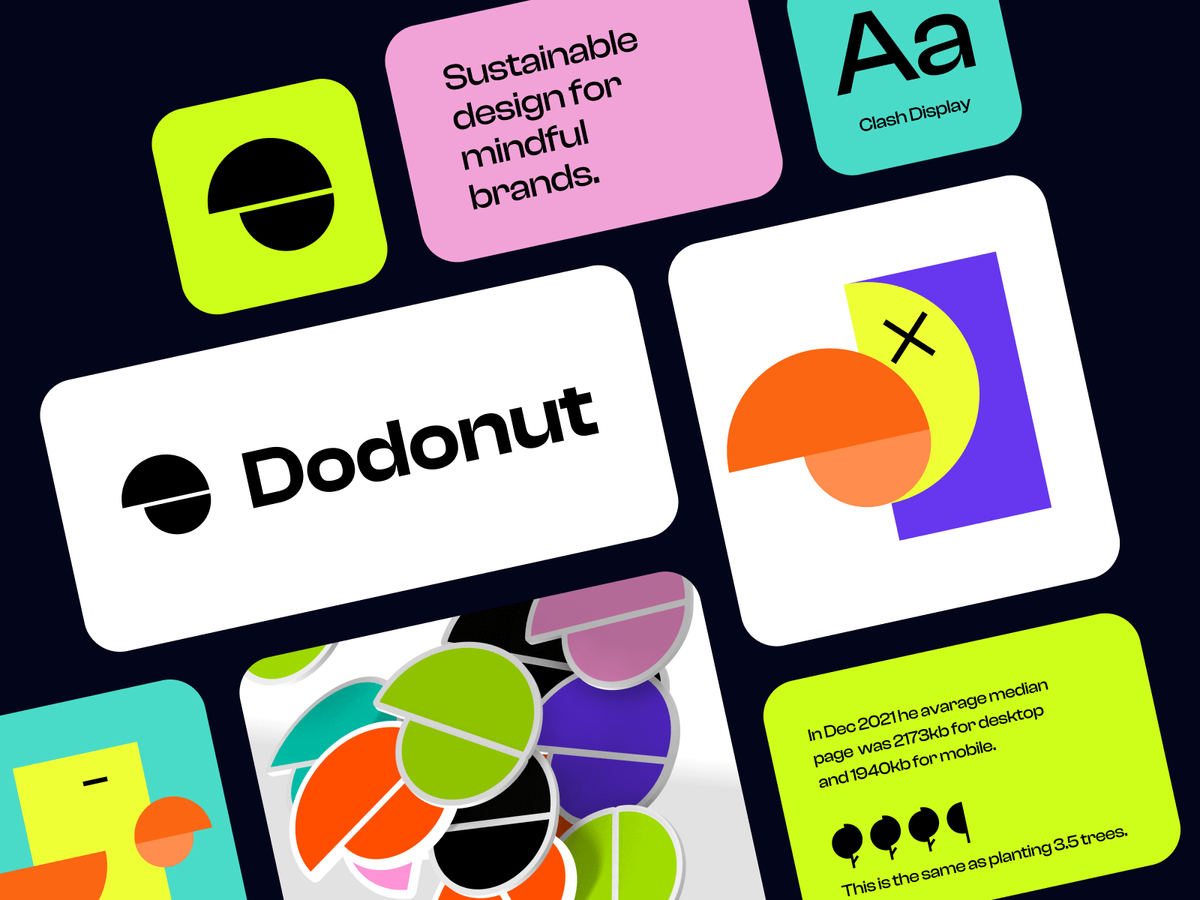
Logomark
Developing the logomark played a vital role in shaping the branding identity of Dodonut.com.
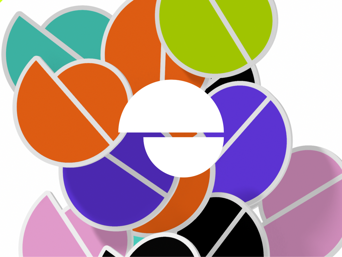
Centered around the dodo bird, our brand hero, we focused on the following:
Dodo's Beak as the Highlight:
After several designs, we settled on featuring the dodo's distinctive beak, symbolizing our unique brand identity.
For the design, we incorporated Golden Ratio Grid. This was used to reflect our commitment to precise, organized design, ensuring the logomark looks good and aligns with our core values of meticulous craftsmanship.
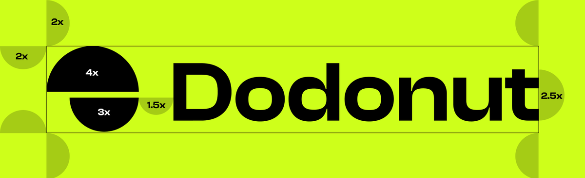
The result was a logomark that perfectly represents Dodonut.com's unique character and design philosophy.
Colors
The Impact:
Deciding on the right colors for Dodonut.com relied on balancing aesthetics with environmental consciousness. We delved into research and embraced a unique approach to stand out in sustainability.
Here's how we made our choices:
- Energy Efficiency: Avoided power-intensive colors like blue, based on existing research.
- Breaking the Green Mold: Choose to diverge from the typical green associated with eco-friendly brands.
- Eco-Friendly Vibrance: Sought colors that were both environmentally friendly and visually appealing.

These color choices allowed Dodonut.com to truly stand out, offering a fresh and distinctive identity in the eco-conscious market. More importantly, they reflected our deeper values of innovation and care for the planet, resonating with our audience, who values both style and sustainability.
Our Color Palette Decision:
After considering various options, we decided on a vibrant neon lime as our primary color, complemented by a rich violet as our secondary color. This combination not only made our brand visually striking but also aligned with our commitment to sustainability.
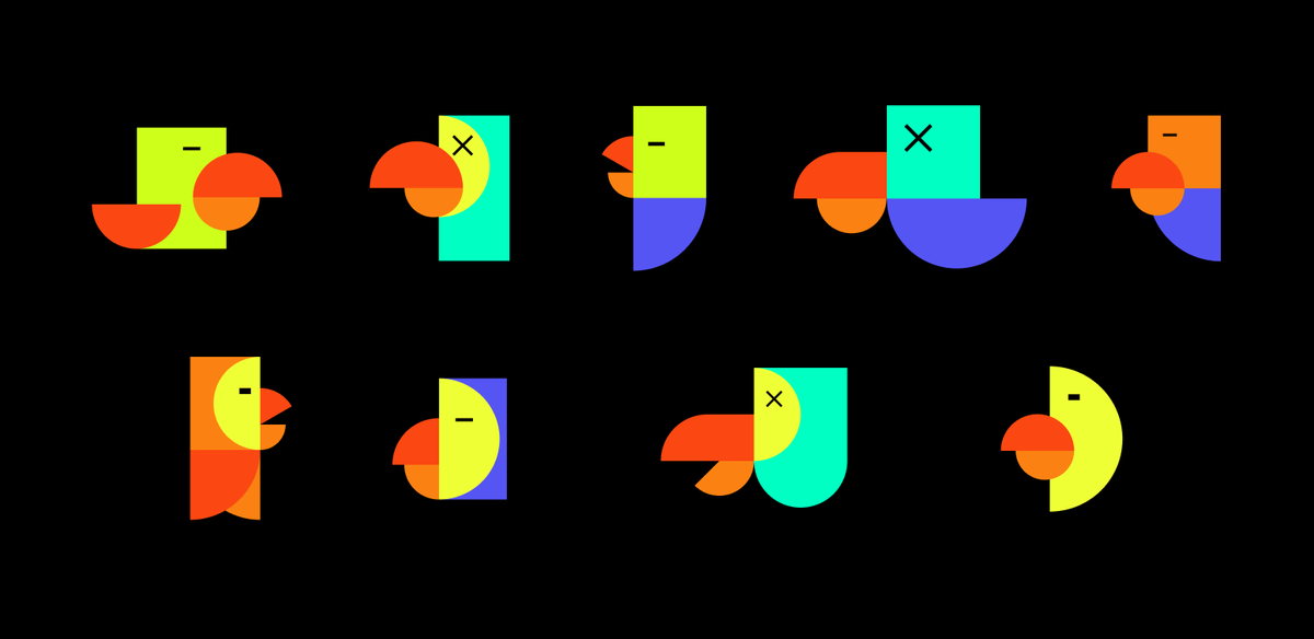
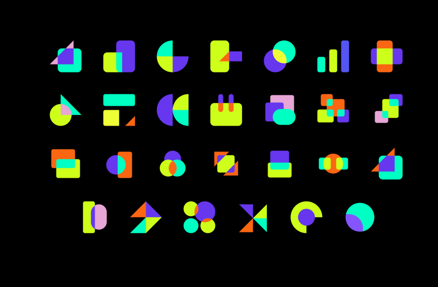
Pictograms
When conceptualizing the visual language of Dodonut.com, we decided that our brand should emphasize straightforward, minimalistic shapes. This decision was driven by our goal to incorporate icons in SVG format, which necessitated a simple yet effective language of signs and pictograms. Our intent was clear: to create icons that were not just visually appealing but also functionally robust.
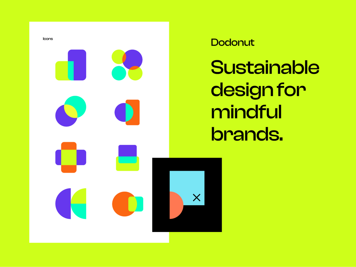
In addition, our exploration into the neubrutalism style influenced our approach. This style, known for its stark, bold simplicity, encouraged us to adopt a more streamlined iconographic approach. We crafted a series of unique shapes, including a few Dodo variations, each made with a minimal number of shapes. Complementing these was a set of basic yet distinctive icons specifically designed for use throughout the website. This strategy aligned with our aesthetic vision and ensured clarity and recognizability, integral to the user experience on Dodonut.com.
Logo Presentation
Final Words
In the journey of Dodonut, we've shared our commitment to creating a sustainable brand and strategy from the ground up. From the inception of our agency, where the drive for uniqueness and a deep sustainability focus emerged, to the definition of our values and customer persona, every step reflects our dedication to positive impact.
For us, Dodonut.com is more than a brand. It represents our values, a commitment to sustainability, and a pledge to make a lasting impact.
As we conclude this chapter of our case study, we invite you to stay tuned for the second part, where we delve into the exciting design and development phase. Learn how Dodonut.com transforms its vision and values into a visually stunning and functionally robust website embodying the essence of sustainability. Join us as we continue this journey toward a greener and more sustainable digital landscape.
Need a Full-Stack Design Team?
Our team handles all aspects of design, making your ideas a reality.
This article emits ~0.23g of CO2.


