Dodonut’s Path To Eco-Friendly Web Design And Development

Sign up to our newsletter


Co-founder and Head of Design of the Dodonut agency. Lean UX enthusiast, a Certificated Design Thinking moderator, and a workshop facilitator.
Date added
Read time
11 min
Dodonut prioritizes sustainability in web design, emphasizing a green approach in typography, layout, and development.
- Sustainable images and typography: Notable strategies include a 50kb font budget using Variable Fonts and system fonts for efficiency, choosing illustrations over traditional images, and conscious design choices for optimal website performance.
- Accessibility: Implementation of dark mode, adherence to accessibility standards, and strategic script deployment further enhance sustainability.
- Sustainable web development: Adopting the Astro framework, selective tool usage, and hosting with Cloudflare contribute to Dodonut.com's impressive performance and minimal carbon footprint.
The case study serves as a practical resource, inspiring digital professionals to adopt eco-friendly web practices and reduce their digital impact.
Table of contents:
Sustainability lies at the core of Dodonut, our web design agency that not only provides clients with solutions to make their websites and applications faster and more user-friendly but also endeavors to make them more efficient, resilient, and sustainable. Designing for sustainability goes beyond implementing eco-friendly practices within the company; it involves sharing these practices with others, imparting knowledge, inspiring, and fostering collaboration. In this way, we actively participate in the global movement of individuals dedicated to addressing climate change, leveraging our skills and efforts to contribute positively.
In the recent case study, we examine and unveil our strategy behind the creation of Dodonut and its branding process. In this one, we are going to delve into the intricacies of Dodonut's design choices, concentrating on the theme of "Typography, Font Budget, and Beyond." From the meticulous consideration of the 'font budget' to the strategic selection of Variable Fonts and system fonts, Dodonut's journey stands as a testament to the intersection of creativity, efficiency, and environmental consciousness.
Design
Typography
Font Budget
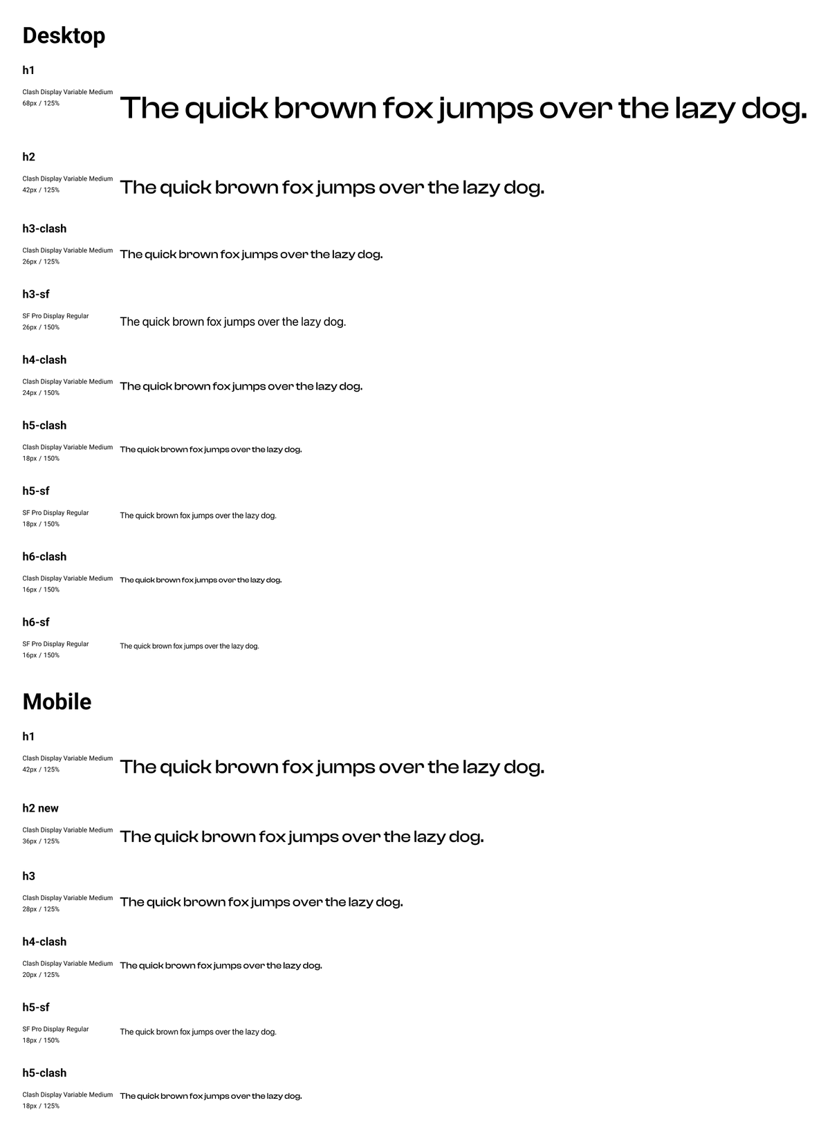
In the design of Dodonut.com, we paid special attention to 'font budget' – the maximum kilobytes of fonts loaded onto our website. At Bejamas, we managed to keep this to 350kb, but for Dodonut, we set an ambitious target of just 50kb. To put this in perspective, an average font in a single weight typically takes about 200-300kb. If you want additional styles like bold or light, it can double.
Variable font
To meet this stringent font budget, we turned to Variable Fonts. This relatively new method of implementing fonts has been a game-changer. Instead of loading multiple files for different styles (like light, bold, regular, extra bold), Variable Fonts allow us to load just a single file. This is a big win for performance, as it significantly reduces the total data transfer. We chose to use a variable font for our headers, striking a balance between style and efficiency.
Our choice was Clash Display, which is 41kb weight in total.
System fonts
For the paragraph text, we opted for system fonts. Since we already used a custom header font, using system fonts for body text was a strategic choice. Why system fonts? They cost virtually nothing in terms of data, as they are already installed on most computers. Plus, they are versatile and well-suited for a wide range of applications. This decision helped us maintain a sleek, user-friendly design without compromising performance or readability.
Using the 'system-ui' font properties for our paragraph text was an incredibly efficient choice, costing us exactly 0kb. But what about the disadvantages of system fonts? While they are well-crafted and globally recognized, supporting many languages, there's a notable caveat. On Windows, the displayed font is Segoe UI, whereas on Mac, it's SF Pro. This means there's a slight variation in appearance depending on the operating system. We can discern these subtle differences as designers, but it's worth noting that most of our visitors are unlikely to spot them. This minor inconsistency is a small trade-off for the significant performance benefits these fonts provide.
Latin Characters Only
One of the main challenges with popular fonts like Poppins is their size. A single font file often includes thousands of characters, but a typical English website visitor uses only around 180 characters. It means that over 90% of the loaded characters are not utilized each time someone visits a page.
To address this, we focused on narrowing down the character set to match our specific needs. For Dodonut.com, we chose to include only Latin characters, covering essentials like lowercase and uppercase letters, numbers, punctuation, currency symbols, typographic marks, math symbols, alternate punctuation, lower and upper accents, and diacriticals. This strategic selection allowed us to significantly reduce the font file size, bringing it down to an efficient 20kb. By tailoring the font to our exact requirements, we optimized the website's performance and ensured it remained accessible and visually appealing to our audience.
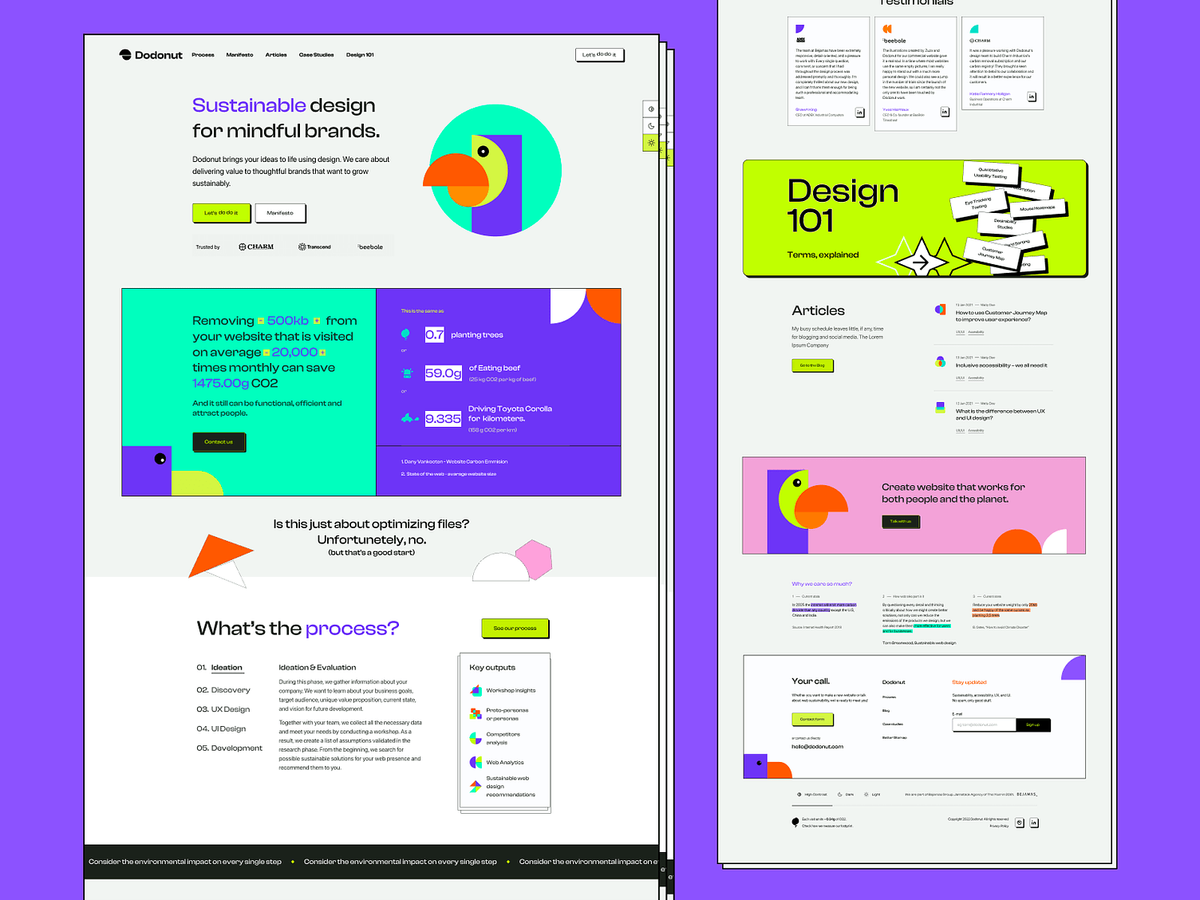
Illustrations & images
In developing Dodonut.com, we chose to focus on illustrations for several reasons:
- Remote Work Limitations: Our remote working setup limits access to original photography, and we prefer to avoid generic stock photos.
- Data Transfer Considerations: Traditional images can significantly increase data transfer loads.
- SVG Format for Lightness: We committed to creating illustrations in SVG format to keep them light and fast-loading. However, these needed to be simple to maintain a low data footprint. SVG format helped us also reuse illustrations elements to create new one, and this way minimize the amount of generated resources and its carbon footprint.
From the beginning we new that we want to use custom illustration to highlight the creative character of our web design agency. Initially, we used basic illustrations from our branding process. But as we progressed and we searched for the proper visual style with illustration from different illustrators, we decided to add a bit more flair and complexity.
Finally, we found this “perfect match” in Justyna Lasota’s illustrations. We choose her isometric illustration style that responds to the neubrutalism of our website, using our hero - Dodo bird to describe in creative way different contexts and situations. that consistently follow our neubrutalism style, This led to the creating of an additional set of more intricate illustrations, used selectively based on specific use cases. This approach allowed us to add visual interest and variety to our site without compromising on performance.
Exploration of the Dodonut’s illustration style:


Layout efficiency
In designing Dodonut.com, we draw attention to the impact of layouts on the website's JavaScript (JS) load and overall performance. Designers often overlook how certain design elements can significantly increase a site's resource usage. For example, data shows that a basic carousel can ramp up CPU usage by 6% while also demanding more JS, leading to a heavier website.
In our design approach, we consciously decided to avoid features that would hinder the site's efficiency:
- No Heavy Animations: We steered clear of animations that could slow down the website.
- Skipping Carousels: We omitted carousels to avoid their impact on CPU and JS load.
- Simple Hover Effects: We avoided complex hover effects that add unnecessary weight to the site.
- No Background Videos: We chose not to use video backgrounds to maintain faster site speeds.
- Minimal Photos: We limited the use of photos to ensure the site remained streamlined and quick.
- Avoid Heavy CSS Effects: We stayed away from CSS multiple effects like blending modes that increase CPU usage.
These strategic design choices were crucial for ensuring that Dodonut.com would deliver a smooth, efficient user experience free from elements that could potentially slow it down.
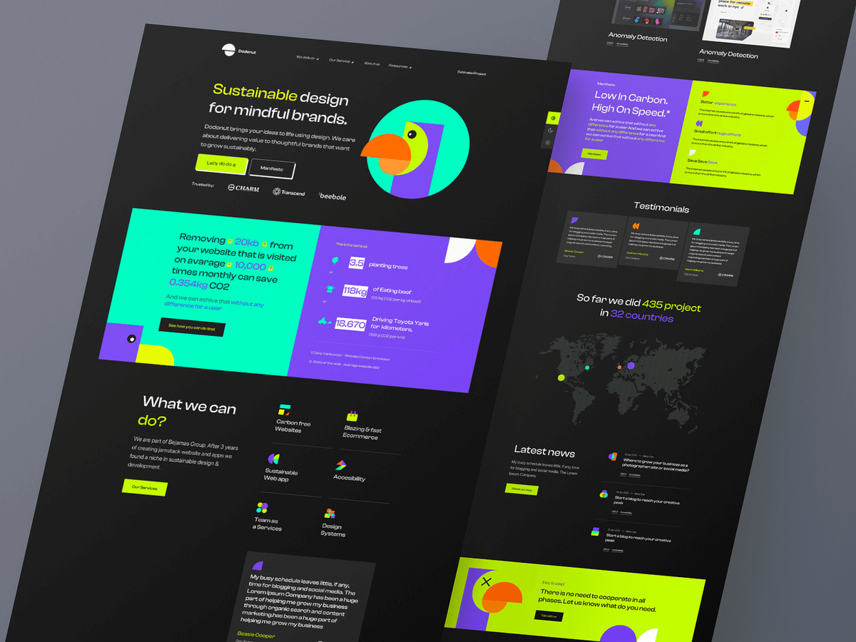
Dark mode and contrast mode
For Dodonut.com, we chose themes that save energy and are easy to use. We knew from our research that dark mode saves battery and is better for the environment, so we included it. Our design was made to easily add more themes later. We designed everything in white first and then used variables in development to create three themes:
- Light Mode: A bright, standard theme.
- Dark Mode: Saves energy and is good for darker settings.
- Contrast Mode: high contrast version done for fun
This way, we made our website not just sustainable but also flexible and accessible for all users. Because of design token implementations, it takes us a few minutes to set up a new theme.
Accessibility
Making Dodonut.com accessible to everyone is a key priority, serving both inclusivity and environmental goals. By enhancing accessibility, we minimize the need for extra browsing tools and devices. Our approach includes two main strategies:
- WCAG Compliance: We strive to meet or exceed the AA standards set by the Web Content Accessibility Guidelines (WCAG) and conduct additional audits to ensure thorough compliance.
- Use of Standard Solutions: Our design relies on standard HTML and CSS, making the website accessible even on very old devices. However, it's important to note that we don't support extremely outdated browsers like IE 6-8.
This approach ensures our website is user-friendly and reduces the environmental impact by being compatible with a wider range of devices.
Development
Recognizing the pivotal role of sustainability in fostering a responsible digital footprint, we prioritized and integrated sustainable web development principles into the construction of our website. Thanks to Bejamas we integrated sustainable development recommendations into the construction of our website, adhering to the following principles:
- Use WOFF2 Fonts: Prefer WOFF2 over TTF for its efficiency and support.
- Local Fonts: Use local fonts to avoid external requests and boost load speed.
- Minimize Font Weights and Styles: Reduce file sizes and simplify design.
- Variable Fonts: Offers customization and flexibility with fewer files.
- Optimize Font Loading: Employ font-display for controlled rendering and fallbacks.
- Regular Font Review: Eliminate unused fonts to lessen font load.
- Efficient Image Formats: Choose webP or AVIF over JPEG or PNG for their efficiency.
- Responsive Images: Utilize srcset and sizes for device-appropriate images.
- Code Minification and Compression: Streamline file sizes for faster loading.
- Leverage Browser Caching: Store static files locally for quicker access.
- Utilize CDNs: Serve files from multiple locations to reduce latency. Ensure CDN proximity to the user for faster content delivery.
- Static Web Technologies: More efficient than dynamic frameworks in some cases.
- Mindful Use of Scripts: Be aware of the performance impact of third-party scripts.
- Block Unnecessary Bots: Preserve server resources by blocking unwanted traffic.
- CSS over JavaScript: Prefer CSS for animations and interactivity for performance.
- Performance Testing: Regularly use tools like Lighthouse or WebPageTest for optimization.
- User Caching Strategies: Implement caching mechanisms for repeat visitors to enhance speed.
- Green Hosting Choice: Opt for hosting solutions that prioritize environmental sustainability.
Astro
Astro emerges as a superior choice for creating high-performing websites, and here's why:
- Optimized Page Loading: Through server-side rendering (SSR) and static site generation (SSG), Astro ensures rapid content delivery, directly impacting user experience and SEO.
- Flexible Architecture: Its component-based structure lets developers use popular UI frameworks while minimizing the burden of JavaScript on the client side.
- Selective JavaScript Loading: Astro's partial hydration feature loads JavaScript only where necessary, further speeding up the website.
Astro's approach is distinctively minimalistic, prioritizing less client-side JavaScript. This not only accelerates page load times but also aligns with sustainable web practices.
Comparing Astro with other frameworks:
- WordPress Limitations: We ruled out WordPress for our project due to its inherent heavy JavaScript load, which can hinder performance.
- The advantage over Next.js/React: While Next.js and React frameworks are efficient, Astro, particularly when combined with Svelte, surpasses them by offering leaner, more efficient website builds.
Astro’s blend of speed, efficiency, and minimalistic design makes it an ideal framework for developers who prioritize performance without compromising environmental sustainability. Check out the detailed Dodonut case study on how to use Astro.JS to create a sustainable website.
Scripts
In shaping Dodonut.com to be as efficient as possible, we've taken a strategic approach to the scripts we incorporate:
- Choosing Statsy for Analytics: To maintain the lightweight nature of our site, we opted for Statsy as our analytics tool. Its minimal 3kb size represents a substantial reduction compared to the heavier 70kb of Google's gtag, resulting in a significant decrease in our overall data load. Additionally, it was extremely important to us that Statsy is privacy-friendly, measure performance metrics and carbon footprint of specific pages. This choice allows us to demonstrate respect for the privacy of our users, and concentrate on analyzing and creating content strategy based only on the relevant metrics.
- Selective Tool Deployment: Instead of constantly running tools like Hotjar or heat maps, we use them only periodically. This decision is rooted in:
- Data Transfer Reduction: Minimizing script usage directly cuts down on data transfer.
- Performance Balance: We strive to strike a balance – harnessing the benefits of these tools without compromising our website’s speed and efficiency.
This methodical approach to scripts reflects our ongoing commitment to maintaining Dodonut.com as not just a user-friendly platform, but also one that upholds our sustainability goals.
Hosting
In our journey to make Dodonut.com as sustainable as possible, choosing the right hosting was pivotal. We needed a host that was not only technically compatible with our Astro setup and Jamstack stack but also aligned with our sustainability goals. After careful analysis, we found our solution in Cloudflare for its green hosting capabilities. Key factors in our decision included:
- Technical Fit: Cloudflare perfectly matched our technical requirements.
- Sustainability Commitment: Their listing on the Green Web Foundation confirmed their eco-friendly practices.
- Annual Emissions Report: Cloudflare's commitment to transparency and reducing environmental impact is evident in their emissions report, which you can view here.
This blend of technical compatibility and a strong environmental ethos made Cloudflare the ideal choice for hosting Dodonut.com, aligning with our mission to create a sustainable online presence.
Performance and Sustainability Results of Dodonut.com
Website Weight: The total weight of our website stands at approximately 430kb, significantly lower than the average website weight of 3.2mb. This lean structure contributes to faster load times and a better user experience.
Lighthouse and GTmetrix Scores: We've achieved the pinnacle of website performance metrics:
Lighthouse Score: A perfect 100.
GTmetrix: 100% performance, earning a Score A rating. This showcases our site's exceptional efficiency and optimization.
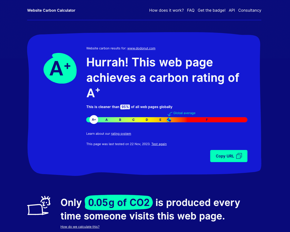
Carbon Emissions: On average, a visit to our website emits just about 0.04g of CO2, earning us an A+ rank on Website Carbon. This places Dodonut.com at the forefront of environmentally friendly web design, solidifying our commitment to sustainability.
Conclusion
In the world of digital design and development, Dodonut stands out not just for creating websites but for fostering a commitment to sustainability. Our journey goes beyond pixels and code; it's a blend of creativity, thoughtful choices, and a dedication to minimizing our impact on the environment.
We share our case study not just to showcase our achievements but to provide value to others in the digital space. By sharing our journey, insights, and challenges, we aim to inspire and guide fellow designers, developers, and business representatives towards more sustainable practices. Our case study serves as a practical resource, illustrating how thoughtful choices can lead to a greener future and minimize the digital carbon footprint.
Need a Full-Stack Design Team?
Our team handles all aspects of design, making your ideas a reality.
This article emits ~0.23g of CO2.


