Everything You Need to Know About Figma's Vertical Trim Feature

Sign up to our newsletter


Co-founder and Head of Design of the Dodonut agency. Lean UX enthusiast, a Certificated Design Thinking moderator, and a workshop facilitator.
Date added
Read time
7 min
Vertical-trim in Figma revolutionizes typography and spacing, providing precise control and consistency across design elements. It shifts focus from line-height to cap height and baseline, ensuring optimal text alignment and visual balance. Although it presents a learning curve and requires awareness of its CSS limitations, with potential workarounds like fixed element height or using React libraries like "leading-trim" and "Capsize," designers and developers can achieve harmonious, pixel-perfect designs. As the feature gains browser support, its full potential will be unlocked, significantly enhancing the design-to-development workflow.
Table of contents:
What is vertical trim?
Vertical Trim transforms the approach to calculating spacing between typography-based elements in Figma, offering a significant shift from traditional web practices.
Traditionally, web elements have relied on line-height as the primary metric for determining spacing. However, this method can be somewhat unreliable, as it doesn’t provide complete control over the spacing dimensions. Vertical Trim addresses these challenges, ensuring a more accurate and controlled spacing calculation, which is essential for creating harmonious and visually consistent designs.
Basics of typography
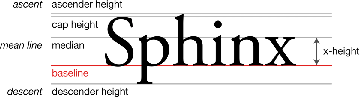
To understand Vertical Trim, it is helpful to have a basic understanding of typography. There is no need to be familiar with all the terminology; however, a good starting point is the concept of the baseline.
Baseline: This is the imaginary line on which most letters and characters in a font appear to rest. The exceptions are characters with descenders (like 'g', 'j', 'p', 'q', and 'y') that drop below the baseline.
A good example can be found here from W3C. Although there are many other typographic terms, the baseline is particularly important. It serves as a reference line from which spacing is calculated, and it is to this line that Vertical Trim adjusts the content.
The second important term to understand how vertical-trim works is “cap height.” Cap height is the distance from the baseline to the top of the uppercase letters in a typeface. In simpler terms, it’s how tall the big letters are. Not all uppercase letters reach exactly to the cap height (like the letter 'E'), but many do (like 'H' or 'T').
How does Vertical Trim work?
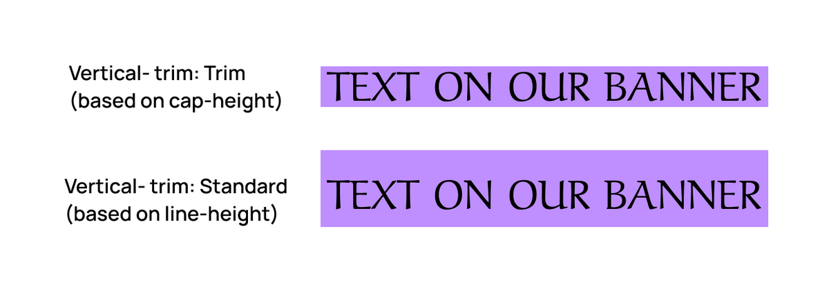
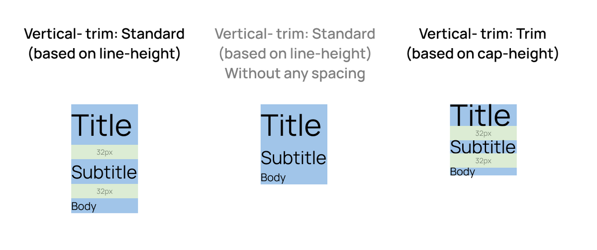
In the example shown below, you can see how a browser typically interprets a single line of text. Various elements are involved, such as the half-leading, extra space reserved by the font, cap height, and additional space at the bottom. Typically, a browser calculates height based on the entire line height.
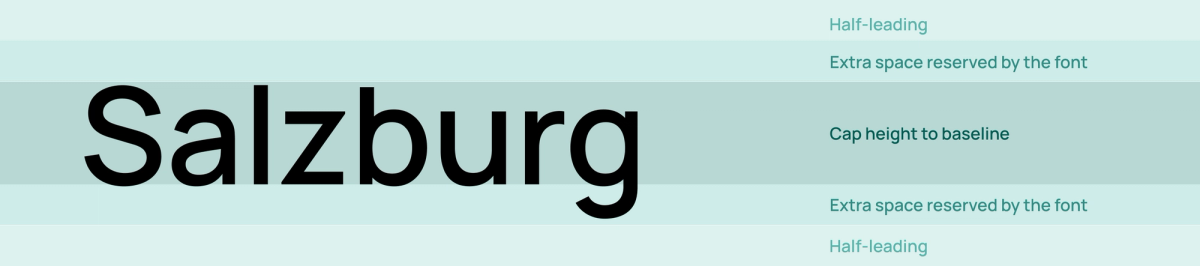
However, when Vertical Trim is enabled, it starts to base its calculations on the cap height, which is highlighted in dark shades in the example.
Why do we need a vertical trim?
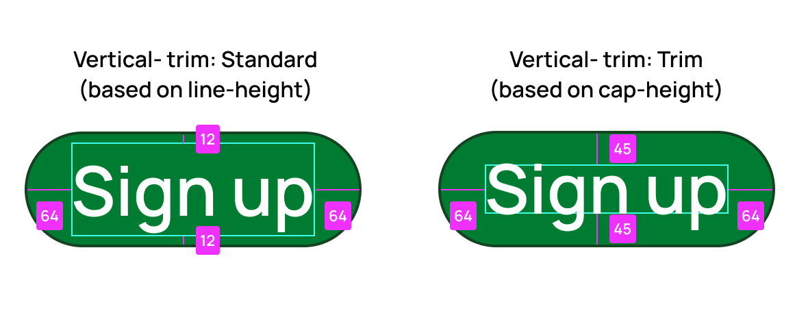
This challenge often surfaces in collaborations between developers and designers, particularly when implementing text within buttons. Upon implementation, it's common to notice that the text appears a bit lower than the optical center, creating a visual imbalance.
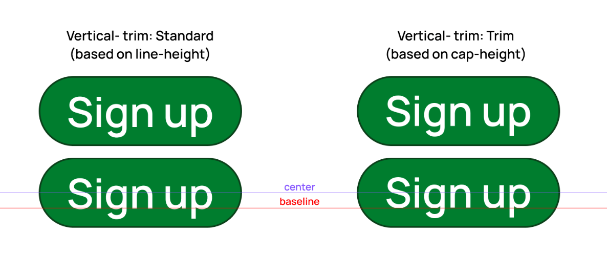
With Vertical Trim activated, the text within the button appears more optically centered. This improvement occurs because Vertical Trim aligns the text based on the space occupied by the majority of the letters, resulting in a more balanced and visually appealing presentation.
Designers sometimes find themselves requesting developers to adjust the text position to achieve the desired alignment manually. This need for manual adjustment stems from the web's reliance on line height for text alignment, which, as previously discussed, does not offer precise control over leading spaces or the extra space allocated for fonts. Additionally, variations in how different browsers interpret fonts can further complicate achieving consistent text alignment.
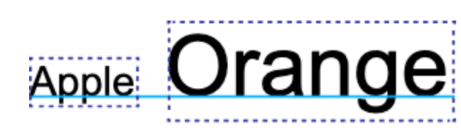
In the second illustration, the "Aref" font—previously installed on my computer—is showcased. It's evident that the leading of this particular font is quite irregular, leading to substantial challenges in achieving consistent spacing across the design and, consequently, disrupting the design's visual flow. Utilizing Vertical Trim effectively resolves this issue, ensuring even spacing and maintaining the design's aesthetic integrity.
By addressing these issues, we can enhance the collaboration between developers and designers, ensuring a smoother design implementation process.
What are the benefits of using vertical trims in Figma?
- Eliminates the need for development workarounds such as 'line-height: 0' for ex, buttons
- Uniform Spacing: Ensures consistent spacing and alignment across different elements and layouts.
- Consistent Visual Hierarchy: Helps maintain a clear and consistent visual hierarchy in design.
- Pixel-Perfect Designs: Allows designers to achieve precise alignment and spacing, ensuring that the design looks polished and professional.
- Even when we changed the font, the difference between them will be significantly smaller.
How to enable it in Figma?
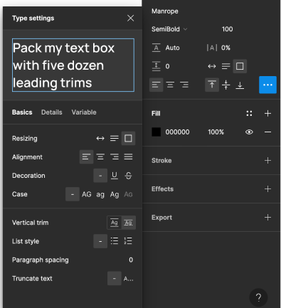
Enabling Vertical Trim in Figma: A Step-by-Step Guide
- Select Your Text Layer: Click on the layer that contains the text you want to adjust.
- Access Typography Settings: Look for the typography section in the properties panel and click the three dots to reveal more options.
- Locate Vertical Trim Option: Scroll through the extended list of options until you find “Vertical Trim.”
- Enable Vertical Trim: Click on the option to activate Vertical Trim for your selected text layer.
Why you shouldn’t use this feature for some time?
Default CSS Value - Leading-Trim
Initially, implementation may seem straightforward, and developers might not require a deep understanding of it as they automatically receive the appropriate CSS values by default. Consequently, many developers tend to bypass scrutinizing the contents of this box, opting instead to copy all the CSS properties directly.
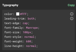
The issue arises from a small icon located on the right side of the panel. Upon hovering over this element, a message appears, indicating that “leading-trim” and “text-edge” are draft CSS properties. This might lead one to suspect potential compatibility issues across different browsers. In reality, the challenge is more significant as these values lack support from nearly all browsers.
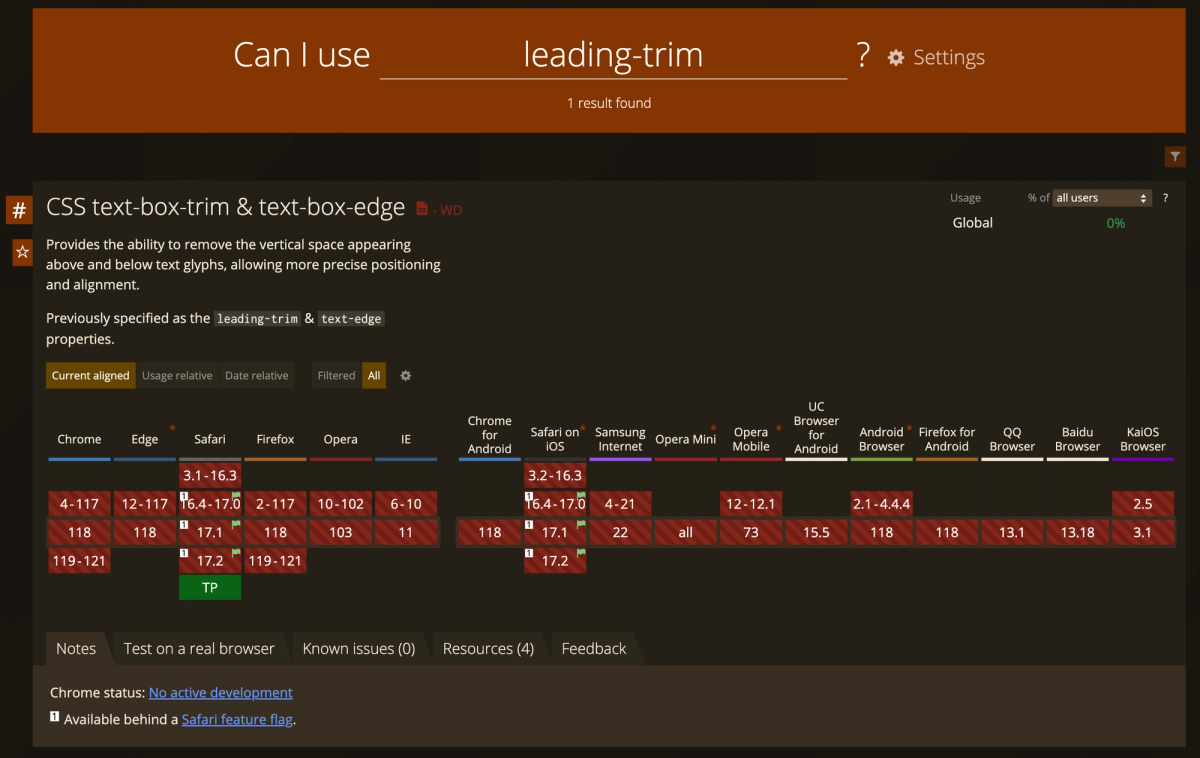
The primary takeaway is that, from a developer's standpoint, this feature currently holds limited utility and tends to create more issues than it resolves. This is primarily because many developers remain unaware of its usage, leading to significant discrepancies between the implemented design and the original design mockups.
In practice, when values are copied directly from Figma, we encounter a situation where Figma operates under the assumption that users are familiar with the concept of leading-trim. However, most typical browsers lack the capability to interpret this property, resulting in disproportionately large padding values. This discrepancy throws off the design alignment, making the final product noticeably inconsistent with the initial mockups.
In a basic layout consisting of a title, subtitle, and paragraph, a component that incorporates margins and padding with cap height enabled actually appears smaller than a component that employs standard spacing techniques but has no additional spacing. Consequently, when developers are unaware that a designer has utilized cap height adjustments in Figma, it can result in unexpectedly large spaces between the layout elements, deviating significantly from the intended design.
Long story short. If you use this feature - please let developers know about it!
So, how to implement it vertical-trim?
While CSS doesn't natively support this feature, there are several workarounds available. Let's explore these potential solutions.
Fixed height
If you consider implementing Vertical Trim despite its current limitations, one potential workaround could be to apply a fixed height to each element. This approach might be feasible for simpler, smaller websites—such as those built with Webflow—where you can style each element in a very detailed manner. However, it's important to note that this method is generally not advised, especially for more complex systems, as it can lead to scalability and maintenance issues. While not an ideal solution, it may offer a temporary fix in certain scenarios.
0% Line-Height
Using a really small space between lines, like 0% of line height, can seem like an easy way to line up text in small spaces like buttons. But it's not a fix for everything. Sometimes, the middle of the text doesn't line up just right—it can be off by a little bit, which might not look great (compared line height to vertical trim). Also, if you try to use no space between lines for bigger text, like titles, it won't work. The words would all squish together, making it hard to read and not nice to look at. So, even though no space between lines can work in some cases, it's not the best for everything in design.
React Libraries
To provide full transparency, we have not conducted tests on these solutions; our considerations for incorporating them into our project are based solely on documentation. It’s crucial to start using this feature at the commencement of your project. Implementing it midway or making adjustments to existing sections independently can lead to discrepancies and impact the components that have already undergone quality assurance, potentially resulting in inconsistencies and additional work to align the design and implementation.
NPM - LEADING TRIM
https://www.npmjs.com/package/leading-trim
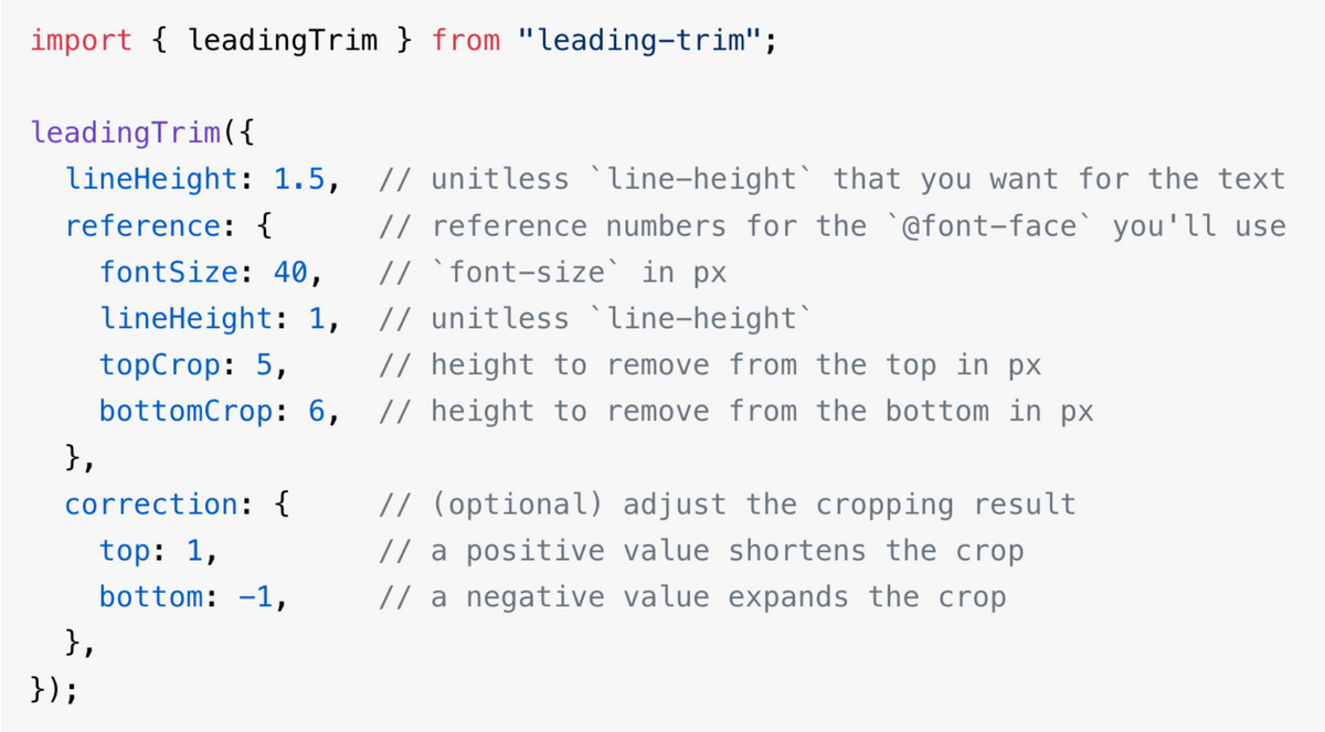
This React library provides functionality mirroring the feature currently available in Figma. Despite being somewhat manual in its application, it ultimately delivers identical results. However, it's important to note that utilizing this library may slightly prolong the development process.
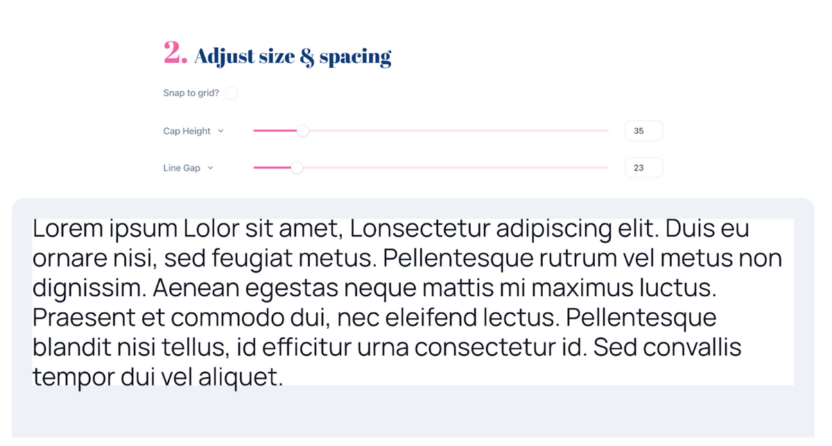
Capsize
https://seek-oss.github.io/capsize/
This solution appears highly promising, essentially fulfilling the anticipated functions of a leading-trim CSS property. The creators advocate for these properties, acknowledging their draft status. As stated on their website, "By leveraging font metadata, text sizing can now be precisely aligned with the height of capital letters, simultaneously eliminating excess space above these letters and beneath the baseline."
The demonstration provided offers a convincing showcase, suggesting that this tool could indeed be the effective solution we've been seeking.
Conclusion
In conclusion, while Vertical Trim in Figma presents a revolutionary step towards a more precise and balanced typographic design, its practical application is currently hindered by browser support limitations and a lack of awareness in the developer community. The road ahead requires education, adaptation, and perhaps most importantly, collaboration between designers and developers to fully harness the potential of Vertical Trim and pave the way for its widespread adoption in creating visually stunning and harmoniously spaced designs.
Need a Full-Stack Design Team?
Our team handles all aspects of design, making your ideas a reality.
This article emits ~0.23g of CO2.


