Neubrutalism - UI Design Trend That Wins The Web

Sign up to our newsletter


Justyna is a book author and researcher, diving deep into digital design and new media art. She's also a street art enthusiast and curator of art projects.
Date added
Read time
9 minNeubrutalism is a trend in web design focusing on creating structures and layouts that are simple but also impactful, utilizing bold colors, sharp lines, and geometric shapes to create a unique look. This UI design style combines elements from the past with modern-day approaches.
- Core values: simplicity, functionality, and minimalism.
- Clean layout: uncluttered whitespace, basic geometric shapes, modern typography, bright clashing colors, and flat illustrations.
- Origins: inspired by unfinished materials of raw brutalist architectural style.
- Priorities: UX and web functionality.
- Creativity: it's the perfect choice to highlight the brand's creative spirit.
Find out what you can gain from this popular web design trend.
Table of contents:
What has in common 1950's architectural movement, colorful pop-art style with a relatively new UI design trend? Modern, minimal look that, through simple and rude forms, highlights the functionality and UX. Intrigued? Enter the world of this popular modern design approach and check if it fits your needs.
What is neubrutalism in web design?
Neubrutalism, or new brutalism, is a design style that's been gaining popularity in today's web design. It started with the idea that the web should be seen as a place for experimentation and play, highlighting at the same time its functionality and structure. This web design aesthetics have also begun to reflect the Y2K mania, which has taken over pop culture. It represents web graphics inspired by turn-of-the-century design with bare HTML or a glitchy, grungy look. Essentially, denying many previous rules, so can be even called anti-design.
The new trend in web design that has been taking over the web for several years emphasizes simplicity, clear navigation, function, and minimalism. It is characterized by a clean and uncluttered layout, the use of basic geometric shapes and typography, and limited use of color and imagery. The focus is on creating a user-friendly and efficient experience. This aesthetic is inspired by the architectural style of the same name, characterized by raw concrete, steel, and glass constructions.
The history of brutalism - the cycle of trends
History comes full circle. It's not the first time we see styles and trends come back. This applies not only to clothes, gadgets, or interior design. Web design joins this circularity of directions, which is represented, for instance, by neubrutalism. Through cultural remixes, styles not only return, but also reach beyond their creative fields. Thus, the distant precursor of the neubrutalism style in design is brutalist architecture.
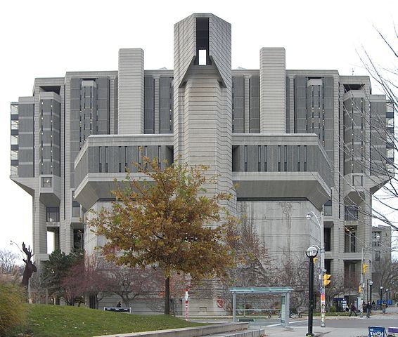
Brutalism in architecture was a style that emerged in the 1950s in the United Kingdom. It developed in some postulates of the previous modernist style and has been impacted by the ambiance of the post-war era. Minimalist constructions and structural elements over decorative designs characterize brutalist buildings. They utilize exposed, unpainted concrete or bricks, angular geometric shapes, and predominantly monochromatic color schemes, among other materials, such as steel, timber, and glass.
Neubrutalist websites are built with the same modern minimalism approach and use the same principles as brutalist architecture — a rough, unadorned surface and a strong focus on concrete and steel — but apply them to digital design and primary structure of blocks and colors. Neubrutalists believe that this can help users see their surroundings differently by creating an experience that's more emotional than practical.
Neubrutalist website characteristic
Indeed, people get tired and bored of neumorphism and glassmorphism web styles with repeatable schemas of their rounded edges, subtle, pretty gradients, and soft, colorful shadows. This boredom in aesthetics created the space and encouraged designers to get into the field of new web design with a different, refreshing approach.
Even though websites built with new brutalist design leave a vast and diverse area for stylistic solutions, we can distinguish several repetitive basic design principles that build up this style:
Flat design
At first glance, this design can look ugly. It can put somebody in a nostalgic mood, in which it recalls the times of the Internet of the HTML1 era with severely hewn forms, while others may be repelled and disliked.
Unlike earlier popular styles such as neumorphism or glassmorphism, neubrutalism bases its style on a flat design (let's not confuse this with the flat design term describing minimalist style used mainly for GUIs since 2002). It is made up of flat components, illustrations, patterns, and huge text blocks, which on the one hand, can introduce a sense of chaos. On the other hand, they can skillfully steer the recipient's attention, leaving him with a strong sense of seeing something that stands out from other pages. With a matter of flat design, neubrutalism is a style that prioritizes function over form.

Modern, good typography
Typography plays a very important role in neubrutalism. Often it is an element which creates the main decorative part on the site, dominating its visual effect. While you scroll through those websites, you can quickly notice quirky grotesque typefaces that reign in the textual and visual layer. Modern typography, both with serif fonts and sans serif, often appears on the homepage as one of the leading visual effects.
Minimalist approach
New brutalist websites seem more sustainable in weight and performance through their simplicity and retro look. It also translates into the technology used in their building, rather basing on HTML instead of CSS and Javascript. This advantage also inspired us at Dodonut while we created our web design. The simplicity of forms and stressed functionality, even if it makes sense of chaos and randomness at first glance, has a well-thought purpose that puts readability and the best user experience first.
Clashing color palette
To achieve the effect of emotional engagement in the design, dominating and building a strong user experience upon the color, neubrutalism uses bright, contrasted shades like red and blue or red and green. It gets rid of aesthetically-pleasant desaturated colors to which we got used. It's not afraid of pure black, avoided in other web design styles. Instead, it leaves us even with an afterimage caused by high-contrast color sets. This has its pros regarding accessibility because contrasting colors can help content to be more readable for some users. However, they can also cause anxiety for others, that’s why they should be considered carefully.

Illustrations and components
There is no one proper form dominating design topics of created illustrations and components in neubrutalism. It provides users with various illustration styles. However, objects seem to resemble cartoonish manners inspired by old games, adverts, and other pop-culture artifacts. This style loves flat objects with clashing colors and raw neubrutalist shadows placed as rectangle underneath them. It avoids blur and isn't afraid of high contrast, like pure black and white colors.
In the subject of objects and shadows, neubrutalism often uses another black rectangle below the buttons, providing that "in your face" contrast instead of a barely noticeable border. Furthermore, most shadows and fake 3D objects use isometric views at 45° angles. Both components, like buttons, icons, and other illustrations, often have thick black outlines. Sometimes even containers and placeholders look like they would be in the state of low-fidelity wireframes because black lines of different thicknesses surround them.
Function over the form - emphasized UX
It is a style that prioritizes functionality over form. That's why it includes a lot of whitespace between other objects and text, pushing for maximum readability of the content. It also helps to create a pure and simple website's structure improving its navigation and, thanks to that also, user experience.
Creative feeling
Why neubrutalism has the potential to be explored more by the design community? First of all, it represents a website that is difficult to forget, i.e, through its weirdness and eccentricity, it evokes many feelings. They can be both positive and negative, but they never leave the user with a neutral impression - it is somehow provocative.
By using the raw building blocks and containers instead of fragile and sophisticated layout design, new brutalist websites tend to unbalance the world of web design and undermine layout rules and composition principles of more traditional layouts. That's why they are a perfect choice for companies, brands, and people representing the creative industry, like design, culture, art, fashion, and everyone who wants to highlight creativity as an essential value.
What's the difference between neubrutalism and brutalist web design?
Neubrutalism and brutalism have a similar edgy appearance, clashing color schemes, and bold designs. However, it is impossible to find any elements of conventional design in brutalism web design, which results in some shocking objects. In contrast to minimalism and flat design, neubrutalism is more structured, has clashing color schemes, and incorporates animations and illustrations. It doesn't totally abandon minimalism or flat design, but it bends a few rules. Neubrutalism maximizes readability by using structure and space around elements, while brutalism appears to be more chaotic in its form.
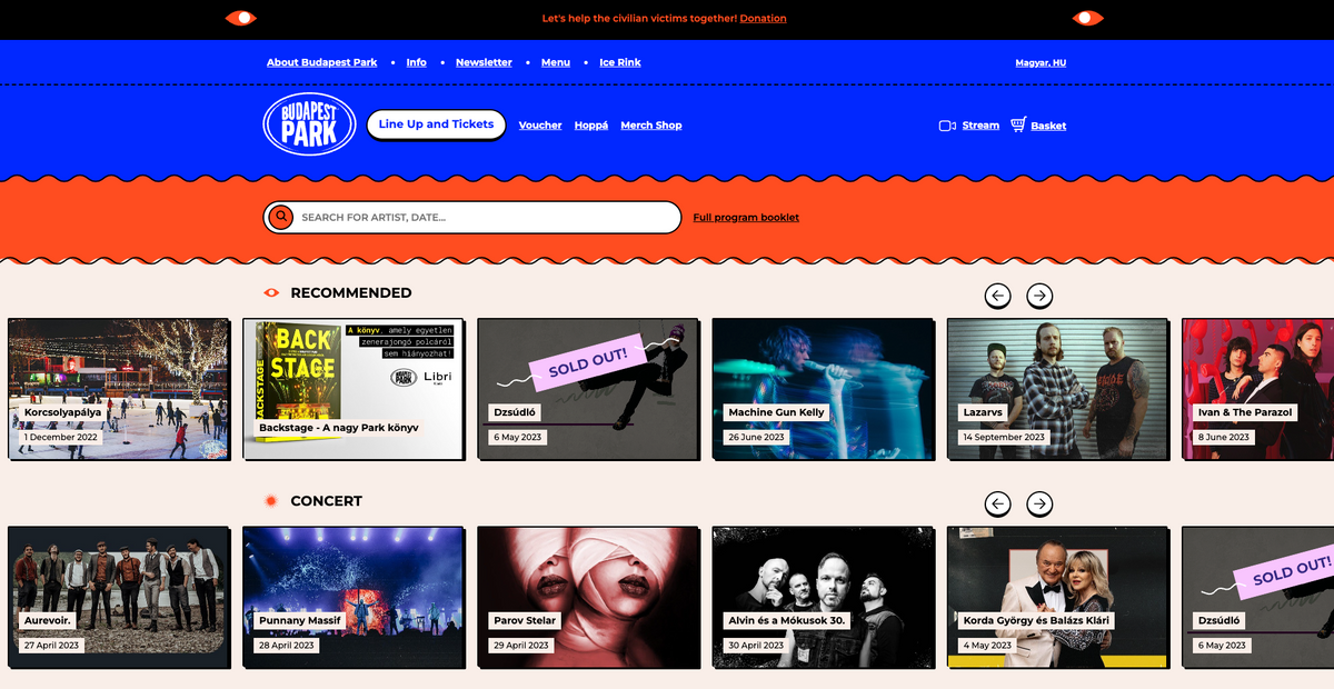
Check the below example of brutalist websites to see the difference between regular brutalism and neubrutalism web design.
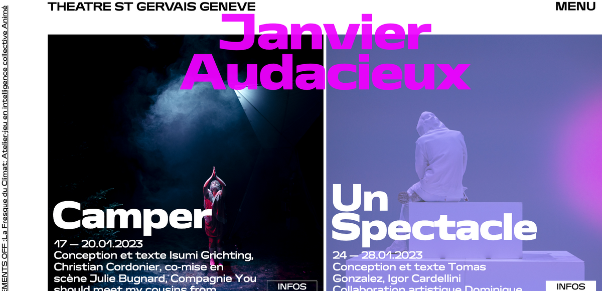
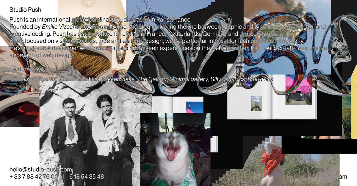
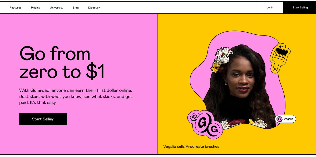
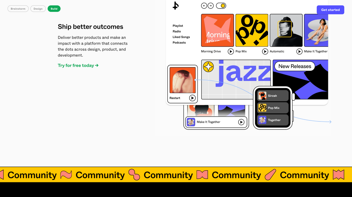
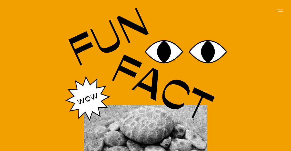
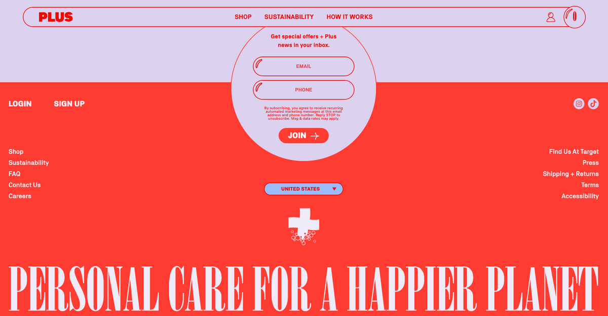
Examples of neubrutalism in web design
Nowadays, there are multiple and various website examples that incorporate neubrutalism into their layout. One of the most famous examples that often inspire other web creators is the style of Figma and Gumroad. Neubrutalism became a trend as other companies and designers modeled their approach after theirs, adding more depth and ideas to the style. It's always encouraging to see well-known brands try something original like that since it allows the technique to mature and gain a new perspective at the same time. Check out below a few chosen web designs in the new brutalist style and explore even more on Dribbble.
Does the new brutalist web design fit every case?
However, neubrutalism is a good design choice to make the website stand out from the crowd, this web design isn't a good solution for each new apps and websites. Even though it can make your brand identity unique and will attract part of your audience interested in alluring design, it can discourage those users who are mainly focused on simplicity and clarity. In fields such as finance, healthcare, and banking, where navigation and structure are crucial and have to accent the reliability of those fields, there are better choices than new brutalist design.
Why we chose neubrutalism for Dodonut web design style?
There are several reasons why we used neubrutalism on Dodonut, and being trendy is not our purpose at all. What do we gain with this design style?
- Sustainable web design
Thanks to simple structure both in code and graphic side, low-weight elements, and imagery, we created a website that doesn’t require too much energy to perform, reduces its emission of CO2, and, thanks to it, is environmentally friendly.
- Faster loading time
Due to the lack of unnecessary code and embellishments created with JavaScript, our new brutalist website loads very quickly, enhancing user experience and SEO. Jamstack, implemented by our web development company Bejamas, makes this possible.
- User experience at the core
With a simple structure, we could improve user experience by offering our visitors clear navigation guiding them around our content.
- Minimizing cost and resources
We could minimize the required resources, time, and budget to create it. By focusing on a simple page without confetti and fireworks, we could also reduce the time and cost needed to create a page with the essential elements without enchanting users with attractive image carousels.
- Creativity matters
We value creativity highly! As we are a web design agency that cares both for the functionality of the website, but also its visual form, we wanted our website to reflect our innovative approach to design.
Future perspective of neubrutalism design style
Conclusion
Is new brutalism in web design a trend that will stick around with us longer, or will it be "gone with the wind"? So far, it has graced our screens for many years. Although it is not going to replace Material Design with ready-every-use components and universal clean layouts, it can be treated as a refreshing and relieving strategy in web design, liberating from the apathy of everyday life.
It is an undoubtedly valuable source of inspiration. Finding its rules, pros, and cons, you can always strike a good balance between techniques of brutalism with modern minimalism to stay safe with the final result and still create strong emotions around designing the brand.
What is essential, also for us in Dodonut, is that it is not a repeating vain and short-lived trend that forces web owners to redesign their websites every year. Instead, using the best practices in web design trends we promote a responsible and sustainable approach in web creation that can meet both business and users' goals, leaving them satisfied with what they get.
References
-
Malewicz Michał, Neubrutalism is taking over the web, Hype4Academy
-
Wright Hermione, What is the Neubrutalism Web Design Trend?, EnvatoTuts+, May 19, 2022
-
Taneva Maria, Neubrutalism style in UX: a twist on the dominant modern minimalist, Jul 26, 2022
-
SVGator, Embracing The Ugly: Neubrutalism in Web Design, October 17, 2022
-
Shviro Nofar, What Is Brutalism in Web Design?, Elementor Blog, 24.05.22
Need a Full-Stack Design Team?
Our team handles all aspects of design, making your ideas a reality.
This article emits ~0.23g of CO2.


