Skeuomorphism in UX Design - Digital Style For Inclusivity


Content Designer happily located in the intersection between technology and art. My experience working as a content writer ranges from marketing all the way to product design. I have a vivid interest in innovation for making people's lives better one word at a time. Fan of pan dulce, dogies and cafe hopping.
Date added
Read time
7 minSkeuomorphism speaks for the visual technique in which objects mimic the esthetic of a real-world counterpart. It combines two Greek words: "skeuos," which means tool, and "morphē," which means form. Skeuomorphic design's key in UX and UI is to give people visual cues on how to interact with a digital product by making it more intuitive, approachable, and friendly.
Core values:
- aesthetics over functionality;
- sense of familiarity and realism;
- components' look inspired by real-world textures, shapes, and drop shadows (and mimicking them);
- sense of 3-dimensionality;
- affordances indicate possible actions that can be taken on a digital object or user interface.
Table of contents:
Introduction to skeuomorphism in the graphical user interface
You might have already heard about skeuomorphism as a digital design style used in apps and websites, but its use goes beyond digital products. The origin brings us back to ancient civilizations, where without a defined concept, the idea of referencing the shapes of everyday things to enable innovation started.
Imagine you were an artisan during the Cooper Age creating artifacts with new materials, assigned to shift from wood and stones to metals. How would you help people adopt the new materials? Correct! By imitating and incorporating the design features inherent in the original objects made of wood and stones. People recognize those materials and can transfer value to new ones, including economic, social, and emotional value.
Our ancestors utilized skeuomorphism to break the boundaries of innovation, so we did during the 1990s and early 2000s to simplify what could be the biggest moment of cultural and technological transition yet: the digital era.
The boom of skeuomorphism started with the arrival of massive-consumption digital products. Designers started exploring how they could translate the complexity of text-based interfaces to average consumers who were not keen on what digital devices like computers and smartphones could do.
Product designers soon realized that to solve the adoption curve and take inventions from early adopters to big markets, they would need to put intuitive and friendly user experiences at the center of the process. This moment is when Apple, led by Steve Jobs, took over the scene to reinvent technology consumption forever. With skeuomorphic design as their flagship used in graphical user interface, they attracted millions of consumers who had never considered buying a smartphone.
Characteristics of skeuomorphic design
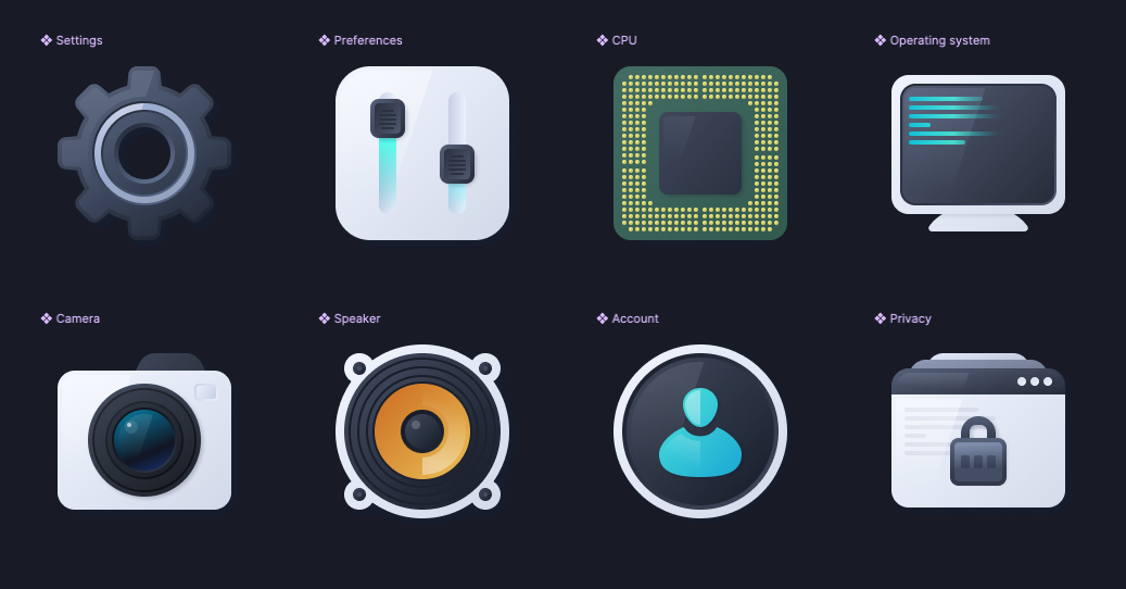
Graphic icons
Icons and UI elements with skeuomorphic style gained popularity thanks to their graphic elements, saturated color palette, and bold shapes that mimic comics and cartoons. For instance, food thematics games were illustrated with cheese hamburger icons, digital library apps with bookshelves, and voice recording apps with microphones.
Interaction and sound
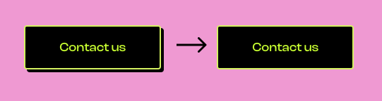
As we said, skeuomorphism takes inspiration from the real world. It imitates our interaction with elements that surround us during our everyday lives. For instance, when we press a key on the keyboard, we add physical pressure to the element, so our sense of touch sends the message to our brain that something is being activated. Skeuomorphic UI and interaction design in buttons mimic this same behavior by adding shadows and animations to resemble the movement of a pressed button, expressing an active-inactive state.
This design method also takes inspiration from sound elements to represent digital actions; for instance, the sound of crushing paper is used when moving archives to the bin icon to symbolize the act of deleting files. Other great examples are the camera shutter sounds -in Japanese カシャkasha- that our phone cameras make when taking a picture which creates the mental image of a physical camera capturing a photo.
Texture
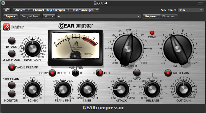
Skeuomorphism uses visual elements to build realistic shapes that feel like they are scaping the screen. Bold shapes, rounded forms, usage of shadows to create deepness, and an effort to bring elements to a 3D form are the baseline. For example, the wooden texture used in the app 'Garage Band' symbolizes a guitar, and the glossy finish resembling physical piano keys creates a tactile feel.
What makes us feel attached to skeuomorphism?
The psychological link
Humans' mental process functions mainly by creating relationships between experiences and learnings. We lean on stereotypes and existing mental models in our decision-making process; for instance, turning on and off a light bulb. The skeuomorphic design takes advantage of this basic mental model by bringing back elements from the real world that live in the cognition to reinterpret new objects. Turning on the lamp in our phones would be super easy if we had a visual design that resembles a real light switch.
The emotional link
We already reviewed how this design method can help users interact more easily with the graphical user interface design (GUI) components. But it also can evoke positive social memories associated with its live counterparts.
Tobias Broscha, Klaus R. Scherer, Didier Grandjean, David Sander, "The impact of emotion on perception, attention, memory, and decision-making," 2013.
The best illustration of this is one of the latest hardware additions to Apple gadgets, the Apple Pencil, released in 2015. This gadget's design resembles the feel and functionality of an ink pen, which is a signal of familiarity and emotional attachment to our experience-based mental process. Just imagine what a more commonly used object for humans than a pen or pencil that accompanies us from our early years during school to adulthood. Another example is Samsung which designed the S pen to create sound feedback when writing something on the screen, which resembles the effect of paper writing.
Drawbacks of skeuomorphism in UX design
As with any cyclic process, trends have a life cycle, where they appear, have a rise, reach the peak, and decline after a variable period. Skeuomorphism isn't an exception. The term boomed during the early Y2K, and our smartphones were flooded with colorful icons and realistic elements; skeuomorph design took a backseat as companies felt they needed to ambition a more sophisticated and futuristic look that was against the skeuomorphic aesthetic.
Even Apple, who once was the biggest advocator of the trend, understood that to gain brand acceptance from a younger generation, they needed to add minimalism and simplicity to the product's core. In 2007, with the release of Apple's iOS 7, Forbes announced: "is the time of Skeuomorphism to die." The trend lost the battle against flat design when cozy looks that targeted our emotions and vivid memories passed to be a second priority when functionality, accessibility, and visual clarity were put at the forefront of design.
Visual clutter on skeuomorphs causes cognitive overload because all the elements that take part in a realistic design depend on a high volume of information which takes excessive thinking to comprehend. This negatively impacts the accessibility of digital products, especially for people with cognitive disabilities.
A study from Georgia Tech and the University of Toronto suggests that minimizing the "visual clutter" in everyday objects might help folks with Mild cognitive impairment (MCI) to improve object perception. This design shift led to flat design dominating modern UI design and the digital world.
In addition to its impact on cognitive overload, this design method can tend to be inflexible because the live counterpart that resembles is clear and well-recognized, which doesn't allow UX and UI designers to explore further with more creative representations.
Benefits of skeuomorphism to improve digital inclusivity and user experience
We must consider that there's no correct and wrong position when discussing and choosing between design trends. Even if skeuomorphism isn't the best decision to achieve visual simplicity, some studies have found that skeuomorphic icons are better comprehended than flat designs for the old population. During an investigation, this cohort responded with familiarity to skeuomorphic icons, recognized and understood them quicker than flat icons, and aesthetically, they appreciated skeuomorphic icons more.
Inês Cunha Vaz Pereira Urbano, João Pedro Vieira Guerreiro & Hugo Miguel Aleixo Albuquerque Nicolau, "From skeuomorphism to flat design: age-related differences in performance and aesthetic perceptions." 2020
This context is critical when today, the gap between the oldest and youngest groups of adults that use the internet is closing. In the U.S.A, 96% of adults from 50 to 64 consume internet, and 75% of 65 and older report being internet users.
These numbers reflect the importance of human-centric design for making digital products accessible to everyone. Think about it this way: for someone who grew up with traditional books and newspapers, a digital reading app that mimics the appearance of a physical paper book or features page-turning animations can be super inviting.
Skeuomorphic vs Material and Flat Design
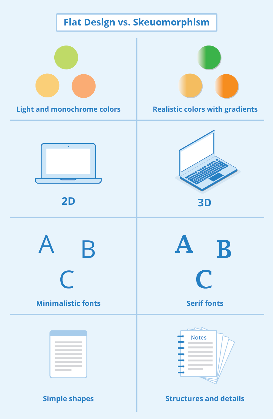
In the world of user interface design, two other prominent design styles and tools emerged as a response to the excessive use of Skeuomorphism, namely Material and Flat Design. Google's Material Design aims to create a visually appealing and coherent interface through depth, grid-based layouts, and realistic motion. It emphasizes the use of shadow, animation, and vibrant colors. On the other hand, Flat Design takes a more minimalist design approach by eliminating unnecessary elements, using simple shapes, and focusing on typography. Flat design is often considered more versatile and suitable for different screen sizes and devices.
Neumorphism and Neubrutalism have also gained popularity as alternative style of design in recent years. Neumorphism combines elements of Skeuomorphism and Flat Design, creating a soft-realist interface through the use of subtle gradients and shadows. Neubrutalism, contrasting with the visually appealing nature of other styles, aims to embrace brutal simplicity and raw aesthetics.
Skeuomorphic design trend in UX approach: challenges and opportunities
The design trends come and go and attend to multiple socio-economic variables. That's why thinking of them as something that can expire and needs to be thrown off is a drastic and limited mindset. A great approach would be to understand what kind of design serves us better to improve our audience's (humans) experience and decide accordingly. Incorporating design elements resembling real-world objects and interactions is another way to get there.
Some of the opportunity areas where skeuomorphic design can impact are:
- Help to evangelize people about digital tools.
- Improve digital inclusivity for older generations.
- Add personality to digital interfaces.
References
-
Blitz, J. H. (2015). Skeuomorphs, Pottery, and Technological Change. American Anthropologist, 117(4), 665–678
-
Vaz Pereira Urbano Inês Cunha, Vieira Guerreiro João Pedro & Albuquerque Nicolau Hugo Miguel Aleixo, “From skeuomorphism to flat design: age-related differences in performance and aesthetic perceptions.” 2020.
-
Gošić Milena, Skeuomorphism, Boundary Objects and Socialization of the Chalcolithic Metallurgy in the Southern Levant. September 2015. Issues in Ethnology and Anthropology 10(3):717-740
-
Frieman, Catherine. (2013). Innovation and identity: the language and reality of prehistoric imitation and technological change.
-
Broscha Tobias, Scherer Klaus R., Grandjean Didier, Sander David, “The impact of emotion on perception, attention, memory, and decision-making," 2013.
Need a Full-Stack Design Team?
Our team handles all aspects of design, making your ideas a reality.
This article emits ~0.23g of CO2.


