Web Design Psychology Principles for Crafting Effective Call To Action

Sign up to our newsletter


Danilo is a freelance writer with a psychology background who crafts content infused by his unceasing passion for learning and human behavior.
Date added
Read time
14 minCrafting a compelling Call to Action (CTA) involves leveraging psychological principles to influence user behavior.
- Best practices for CTA. Clear and directive language, visibility and positioning, visual distinction, action-oriented, trackable and measurable relevance.
- Psychological principles to enhance user engagement: sparking curiosity using best CTAs phrases and their elements, promising satisfaction or information, and offering rewards.
- Best CTA strategies: Clear Benefits, Simplicity, Clearness, Social Proof, Call to Emotion, Low Risk, Long-term Benefits, Customization, Obstacle Minimization, Content Alignment, Limited Time, Social Benefits.
- Action Words. Using action or power words in copywriting is extremely important to engage readers and trigger specific neural pathways associated with emotion and motivation.
- The role of visual elements, such as micro-animations, gradient backgrounds, hover effects, visual consistency, custom illustrations, and video CTAs.
- Real-life CTA examples to inspire from companies like Starbucks, Walmart, Nightfood, Apple, and Xiaomi showcasing successful CTA strategies.
Learn how to write an effective CTA that invites the target audience to take action.
Table of contents:
Introduction: What Does Call to Action Mean?
CTA stands for Call to Action, is a fundamental concept that drives the success of many marketing campaigns and website interactions. In this comprehensive primer, we will delve into the Call to Action definition and what sets it apart from other elements in the digital landscape.
A Call to Action (CTA) is a strategically crafted element within marketing materials, websites, or content that encourages the target audience to take a specific action (encouraging them to make a purchase, sign up for a newsletter, download a resource, and so on).
Six Key Characteristics of a CTA:
Now, stating what a Call to Action means, we can review six vital attributes of CTA.
- Clear and Directive Language:
CTAs employ direct language with no room for ambiguity. Phrases like 'Buy Now,' 'Sign Up Today,' 'Download Your Free Guide,' or 'Get Started' explicitly convey the desired action.
- Visibility and Positioning:
CTA positioning is planned to get people attention. They are often placed prominently within web pages, email campaigns, or advertisements, making them easily noticeable.
- Visual Distinction:
Visual elements like buttons, banners, or text are used to distinguish CTAs from surrounding content. They often employ contrasting colors, typography, or graphical elements to stand out.
- Action-Oriented:
The language and design of a CTA emphasize the action the user should take. Strong Call to Action phrases have action verbs, driving users to make decisions and move forward.
- Trackable and Measurable:
CTAs are often tracked to measure their effectiveness in conversion rates. Analytics tools provide insights into how many users interacted with a CTA and completed the desired action.
- Relevance:
Effective Call-to-action is contextually relevant to the content or offer they accompany. They align with the user's current stage in the customer journey.
Let's see a couple of examples.

In the example above, the CTA is positioned at the top of the web page in a visible size, making it impossible to go unnoticed. It uses clear, direct language and invites action with a highly striking slogan, "Love Things That Last." It also adds that they travel the world to ensure you get the product you are looking for.
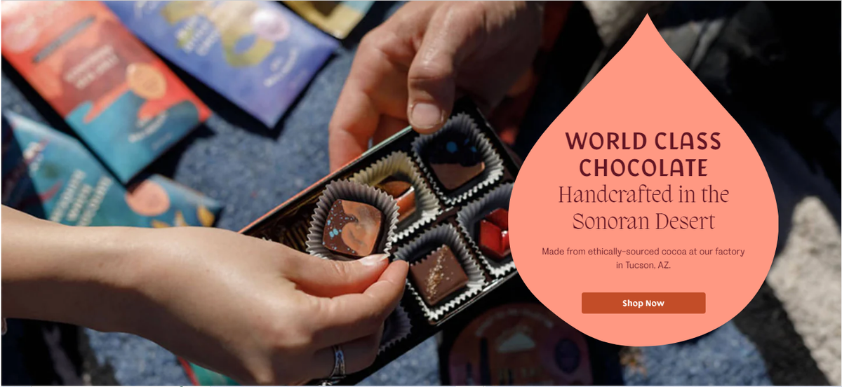
Monsoon Chocolate claims to use ethically sourced cocoa and craft-made process in their world-class product. They use a few words to highlight their best qualities and evoke a lasting image in the customers' minds. Simple, powerful, and effective.
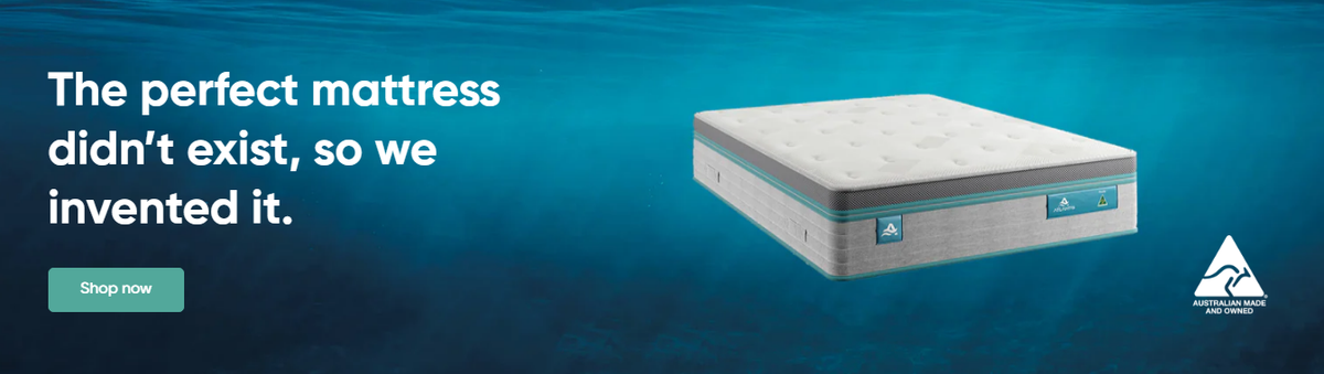
This is another powerful example of good use of direct language and word choice. "The perfect product did not exist, we invented it." Clear, effective, and catchy message, inviting people to click your CTA and learn more about this perfect item.
Psychological Principles that spark curiosity… and drive the action you want your audience to take
Create a perfect call to action that entices users with the promise of discovering something new or gaining knowledge. Use CTA phrases with words like Ultimate Guide, Secrets, or Tips & Tricks to spark curiosity and increase click-through rates.
Ensure your call-to-action (CTA) is clear and easily visible to the user.
To ensure people notice and respond to your call to action is essential to match their perceptual expectations. One way to do this is by making your button look like a button and making your Call To Action obvious. Intensifying expectations and creating a smooth transition into the CTA can make your call to action more effective.
The CTA sparks natural curiosity.
Humans are innately curious about what happens after a particular event, which applies, as well, to the CTA experience. This curiosity is powerful because, as in the proverb, curiosity killed the cat. The promise of satisfaction beyond what we currently know makes inquisitiveness so intense.
Arousal is a powerful force contributing to curiosity, making it captivating to discover what happens after clicking a Call To Action. Users are aware that they will gain information or confirmation of a product or service, which is helpful to some extent. As we can see in the example from the previous section, the mattress case sparked a good amount of curiosity and wanting to know more.
The CTA strengthens the feeling of being rewarded.
Call To Action is psychologically linked to individuals' reward behavior. The perceived rewards guide the actions. When awarded for specific actions, we learn to repeat those actions to receive the same recompenses. Over time, this behavior becomes almost habitual.
In the case of the CTA, previous experiences have taught users that clicking or signing up results in a feeling of reward. As a result, the neural pathways have become so well-established that they often click and convert without even thinking about it. Promising a reward will increase CTRs by enhancing the desire for psychological compensation.
12 Strategic Elements for Effective CTAs
1. Clear Benefits: Must inform short and clear the benefits for users when they click the CTA. What do they earn? How will it help?
2. Simplicity: Keep the Call To Action simple and direct. Avoid using complicated and long phrases. Make it easy for users to understand what to expect.
3. Clearness: Use clear and specific language in the CTAs. Avoid ambiguities and assure users know what will happen after clicking the CTA.
4. Social proof: Add social proof as testimonials from satisfied clients, numbers of clients, or positive reviews to gain trust and credibility.
5. Call to emotion: Bonding emotionally with users can be a powerful tool. Use phrases and words to evoke emotions related to desire, satisfaction, and happiness.
6. Low risk: Offer guarantees or cancellation or return policies to reduce the perceived risk for users to take action.
7. Long-term benefits: Emphasize the long-term benefits related to the client's actions. This strategy can be effective in sales and monthly or yearly subscription sales.
8. Customization: Use demographic information or user behavior data for Call To Action customization and capture the users' attention.
9. Obstacle minimization: Remove any friction in the conversion process. More simple and easy, a smooth experience is better for users to take action.
10. Content alignment: Make sure the CTA is closely related and consistent with the surrounding content and style. It must be relevant and contextually appropriate. And don't use them too much. One CTA button per post is enough.
11. Limited time: You can use a limited-time offer to create a sense of urgency, with phrases like Just for 24 hrs or Limited time offer. Also, this could create a very useful psychological strategy: The FOMO (Fear Of Missing Out), evoking strong emotions of missing a unique chance, is like taking advantage of creating a subtle displeasing state to literally call to action. But be careful and use it wisely and in a responsible way; do not abuse it.
12. Social benefits: Emphasize the benefits to the community and others to motivate users to take action for a greater cause.
The Most Effective Match for Succeeding CTAs: Copy and Visual Elements
Visual elements: Enhance CTA designs
The visual elements play an essential role in improving the Call To Action. The correct choice of colors, images, icons, legible typography, good element distribution, and, sometimes, visual effects can raise the effectiveness of the CTA. When adapting the elements to brand identity and specific goals, the users' participation can increase and achieve the expected results in their behavior.
- The context: Always praise the modular message you want to communicate. If the CTA is for bid deals discounts, a coupon image or red percentages can attract the users' attention and guide them to click a Call To Action.
- Typography: The right font choice for the CTA can improve the force, attractiveness, supporting text, and meaning of the main message. Also, the typography must be coherent with the web and brand style and in the proper format, size, and readability to be user-friendly.
- Blank space: The position and distribution of blank spaces are influential aspects of the Call To Action organization. A design with ample white space around the CTA can enhance its impact and make it more remarkable. To do so is relevant to avoid visual chaotic designs and overexposure to information. Ensure a good position for the CTA on the web to respect visibility and reachability for the final user.
- Visual effects (animations): This could be a good addition used smartly, more interactive, and attractive, but it must always be moderate to avoid distracting the user or negatively impacting the website's workload.
We've just covered fundamental points to consider. Now is the time to delve into some lesser-known elements that will help to have a wider range of options when designing them.
Advanced Visual Elements for CTA Designs
Micro-animations: Micro-animations are subtle, attention-grabbing movements or transitions that happen when a user interacts with a Call to Action. They can provide visual feedback, enhancing the user experience. For instance, when a user hovers over a CTA button, it could subtly change color, size, or elevation.
These micro-interactions add an element of delight and help users understand that the CTA is clickable. It is crucial to balance adding micro-animations for engagement with website speed and avoiding overwhelming visitors.
Gradient Backgrounds: Gradient backgrounds have made a strong comeback in web design, and they can be a potent tool when applied to CTAs. Gradients can infuse your Call to Action with depth and visual interest. Gradients can convey different emotions depending on the color palette used. They can bring about energy, sophistication, or playfulness. Experiment with gradients that align with your brand personality and the emotional response you want to elicit from users.
Hover Effects: Hover effects are another way to create an interactive and engaging CTA experience. When a user hovers their cursor over a call-to-action element, it can trigger a subtle transformation. For instance, the Call-To-Action button can grow slightly in size, change color, or cast a soft shadow. These effects provide visual feedback, indicating that the element is interactive. Be mindful not to overdo it; the effects should enhance usability, not distract.
Visual Consistency: Maintaining a consistent visual style across your website is vital, and this extends to your CTAs. Consistency fosters familiarity and trust. Users should be able to recognize clear Call to Actions by their design elements, such as color, shape, and typography. When all CTAs share a cohesive design language, it reinforces your brand identity and guides users intuitively. Consistency in visual style can also extend to iconography and button styles.
Custom Illustrations: To create unique CTAs, consider using custom illustrations. These illustrations can align perfectly with your brand identity and convey complex ideas or emotions. For example, if you run an eco-friendly business, a custom illustration of a lush, green world can serve as a compelling CTA backdrop for your environmentally-conscious audience. Custom illustrations add a personalized touch to your CTAs.
Video CTAs: Video content continues to dominate the digital landscape, and integrating video within your CTA can be a game-changer. Instead of a static image or text, you can use a play button overlaying a thumbnail image or even embed a video directly in your CTA.
Video can be highly engaging and can pique users' curiosity. For instance, a Watch Now CTA with a captivating thumbnail can encourage users to click and view your video content. Remember to keep your video content relevant and valuable to the user.
Unique Shapes and Layouts: It can attract more attention by deviating from the usual rectangular buttons and trying out distinctive shapes and designs. Irregularly shaped CTAs or those strategically placed in unusual positions on the webpage can create intrigue. However, it's crucial to maintain usability and ensure users can easily recognize these unique CTAs as interactive elements.
CTA Copy: Great Call To Action phrases!
Use creative and unique phrases to captivate users' attention and entice them to click on the CTA. Appeal to their emotions and needs, encouraging them to explore what lies beyond the Call To Action button. Here you have some options that can serve to achieve the goal of arousing interest in users to craft good Call to Action phrases:
Join a hundred people who already changed their lives with us.
The future is now. Are you ready?
Discover a world of options.
Your journey began here.
Don't become a relic of the past. Embrace modernity and be a catalyst for change.
Take the first step toward a better life.
Your success is one click away.
Find what are you waiting for.
Don't let this unique chance escape from your hands!
Be the main character of your own story! Click here.
Success awaits. You have the audacity?
Ready for THE big change? Start.
THIS is your moment. Don't let it go.
Always strive for what you truly deserve.
Start your free trial.
If you pay attention to the Call to Action phrases above, you can observe the conversational tone is direct; the words used appeal to emotions or evoke an emotional response and also appeal to desired goals to achieve the reaction from the user. Also, remember, when it comes to good Call to Action phrases, all we love to read are the words: 'free,' 'gift,' 'brand new,' 'no commitments,' 'cancel anytime,' 'no credit card needed,' and so on.
Now, examine how successful companies are doing it in the next sections with some examples.
Action words
Action words, also called action verbs or power words, are the lifeblood of effective copywriting. In modern content creation, the strategic use of action words plays a crucial role in engaging readers, evoking emotions, and persuading them to take specific actions.
Neuroscience suggests that action words trigger specific neural pathways associated with physical movement and emotion. For example, the word "inspire" activates areas of the brain associated with motivation and drive, while "transform" stimulates the change and achievement-related areas.
Recent references on this topic emphasize that action words have the power to make copy more compelling and persuasive. They create a sense of immediacy and encourage readers to visualize themselves taking action. Here are some examples of powerful action words currently favored in copywriting:
1. Transform: This action word implies significant change, which can be very persuasive in marketing and sales copy.
2. Ignite: Suggests sparking something new or exciting, making it effective for calls to action.
3. Empower: This word evokes a sense of ability and control, which can be persuasive in motivating readers to take action.
4. Elevate: It conveys the idea of improvement and suggests that taking action will lead to a higher state or better results.
5. Unleash: This action word implies the release of potential.
Action words in copywriting create movement and urgency, encouraging active engagement. Action words make your content more dynamic and help it stand out in a crowded digital landscape. They can help you to write a call to action that really works.
In the fast-paced world of online content, capturing and retaining the reader's attention is a challenge. Action words are your allies in this endeavor, driving readers to make decisions and take the desired actions.
Now, examine how successful companies are doing it in the next sections with some examples.
Real-Life Call To Action examples
Call to Action definition has not only the written part; we have already reviewed basic elements to consider in the visual composition. Now, it is time for real-life case analysis.
In the cup of Starbucks
First, let's look at the example of a well-known coffee company and its strategies to make people download their app and increase sales.
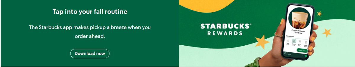
They promise rewards for using the app and offer a more expedited service through it. Good hook. Also, they use a good size and color font, clear and short message, and respect brand scheme with design and colors evoke what they are.
The minimalist Walmart designs
This turn is for one of the kings of sales and the number of locations in the US:
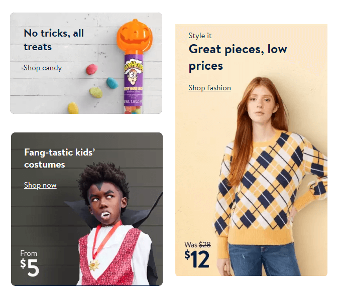
In the case of Walmart, as we can see, they have a great and catchy line to drive users to click in the right place. In the first place, they claim “great prices, low prices” and show an offer from 28 to 12 USD. We can see and almost touch the big discount offered, so they appeal to customers with good prices and the brand reliability.
In the second image, they say “No tricks, all treats” again, appealing to big deals, great prices in candies, and also is accompanied by a delicious and appropriate smiling pumpkin candy bar.
At the bottom on the right side, the phrase with an excellent choice of words (and better image) is “Fang-tastic kids costumes,” and again, they target the low prices offered when they say the range prices start just at 5 dollars.
Sweet dreams…
It is time for a lesser-known brand but one that is very ingenious in its execution:
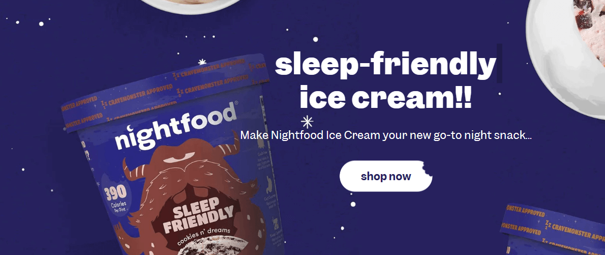
All the choices in the concept of this CTA are right. Colors are well-suited and consistent with the brand style. Also, apart from that point, an excellent choice of flavor name (Cookies n’' Dreams). The phrase appeals to more gluttony feelings, evoking a sense of indulgence with a hint of guilt, and also puts in the mind the idea that the product is good for sleep and tasty.
Xiaomi and Apple differences
This time, we will focus on this brand's home page, where they advertise their recent flagships, but I invite you to do the exercise and find out the present elements and the differences between each other.
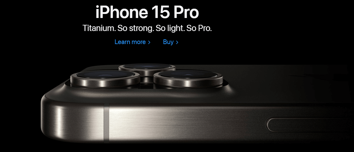
Anyway can't unsee the statement of simplicity implicit in the image, careful minimalism, soberness in colors, and special mention to the "so, so, so" excellent word and phrase election.
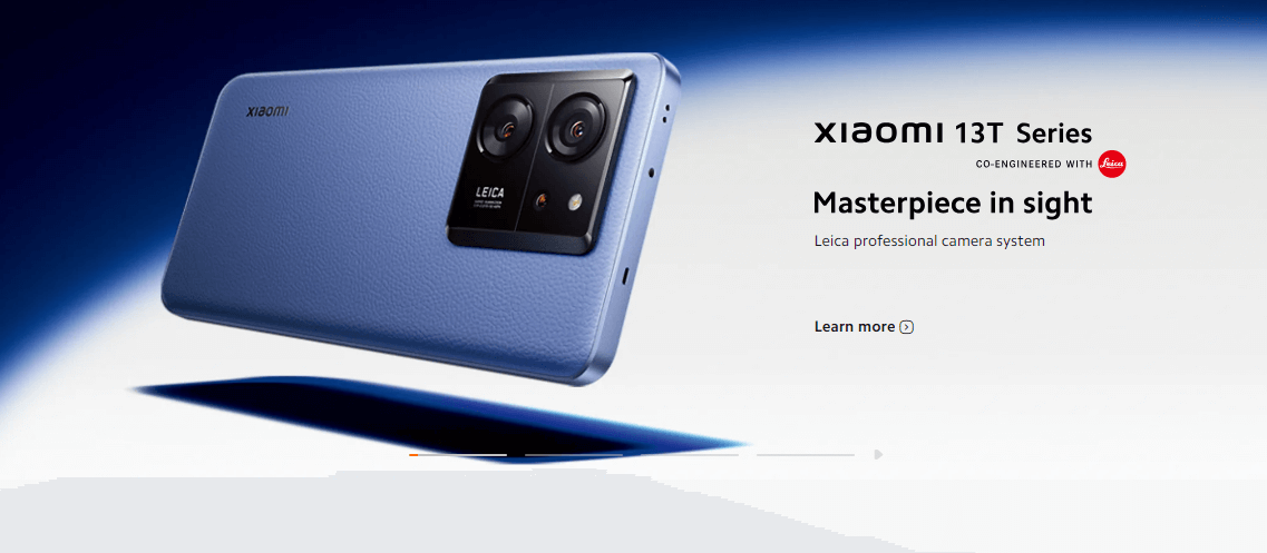
In this case, the brand emphasizes the camera quality, focusing on image and text to highlight it. The colors chosen are in the line of image harmony.
Overview of relevant information and the best Call-To-Action strategies
The essential elements to consider at the moment of CTA design and creation are, in the first place, recalling the psychological mechanisms of rewards, anticipation, expectations, and curiosity that sway attention and people's behavior. This strategy will help focus efforts on incorporating these elements into the CTA design process.
As stated earlier in the article, it is relevant to consider strategic elements in the CTA that explicitly communicate clear benefits.
- Use simplicity and clarity
- Appeal to the emotional sphere
- Guarantee a low-risk process and long-term benefits
- Minimize obstacles.
- Customize the CTA.
- Moderate visual elements addition
- Keep the elements and word count minimalist (use and try the phrases and keywords given before!)
- Ensure the colors and shapes align with the brand essence.
- Use advanced strategies with sobriety and only when necessary (i.e, FOMO).
Conclusion and final words on effective CTA
As we review in the previous paragraphs, we always need to consider how human psychology plays a crucial role in the marketing strategies and designing process of CTAs.
Procure to have an eye on the basic elements of the jigsaw puzzle: visuals and copy. Every piece, corner, color palette, button shape, gradient, choice of call to action phrases, and placement should be carefully considered and justified. Pay attention to every single little detail. Additionally, put yourself in the user's shoes on the other side of the screen to gain valuable insights. Finally, practice to master your craft in perfect CTA designing!
References
-
AB Tasty, Call to Action: A Simple Guide to More Conversions, 2020.
-
Barth, Barthel, Gröbel, Linden, Wolf, Walther, Inside the host's mind: Psychological principles of viral marketing, International Journal of Internet Marketing and Advertising 2016
-
Mejtoft, Hedlund, Söderström, Norberg, Designing call to action: Users’ perception of different characteristics, University of Maribor University Press 2021.
Need a Full-Stack Design Team?
Our team handles all aspects of design, making your ideas a reality.
This article emits ~0.23g of CO2.


