Web Font Optimization For Web Designers


Co-founder and Head of Design of the Dodonut agency. Lean UX enthusiast, a Certificated Design Thinking moderator, and a workshop facilitator.
Date added
Read time
12 min
Optimizing web fonts is crucial for creating fast and user-friendly websites. Designers should:
- set a font budget,
- use variable fonts,
- leverage system fonts,
- choose proper web font formats,
- decrease characters on each page to optimize web fonts.
This will help to create visually appealing and efficient websites that perform well across different devices and browsers.
Table of contents:
As designers, we are responsible for designing visually appealing and user-friendly websites while ensuring optimal performance. It includes well-thought, prepared, and optimized imagery but also selecting and optimizing fonts that align with the website's design goals and brand identity and contribute to a smooth and enjoyable user experience. By understanding the importance of font optimization, implementing best practices, and continually striving for improvement, we can significantly impact the websites we create and the experiences we provide to users.
The impact of font optimization on user experience and website performance cannot be overstated. Unoptimized fonts can lead to slow loading times, poor readability, and inconsistent rendering across devices and browsers. These issues can deter users from engaging with your website that's why it's important to optimize them.
You might think font optimization is the developers' job, but that is a faulty approach. Without a basic understanding, even with high optimization, developers can't do much. Font optimization is a complex issue; at first glance, web designers can feel overwhelmed by it. There are many methods you can use to better deliver your fonts. That's why we have created this comprehensive guide with web font optimization techniques, and the best tips and tricks for using web fonts that make your website faster, user-friendly, and sustainable.
Importance of web font optimization
Font optimization is crucial in web design for several reasons:
- Improved website performance: optimized fonts improve page speed and better overall performance of your website.
- Enhanced user experience: a carefully selected font ensures that users can easily read and engage with your content, which increases user satisfaction and potentially reduces bounce rates.
- Better SEO rankings: faster loading times and improved user experience can lead to higher search engine rankings, making your website more visible to potential visitors.
- Consistent branding and design: choosing and optimizing the particular fonts help maintain a consistent brand identity and visual appeal across all devices and browsers.
- Sustainable website: the font you use across the web impacts the final page weight and its page loading process, so also the final carbon footprint of your website.
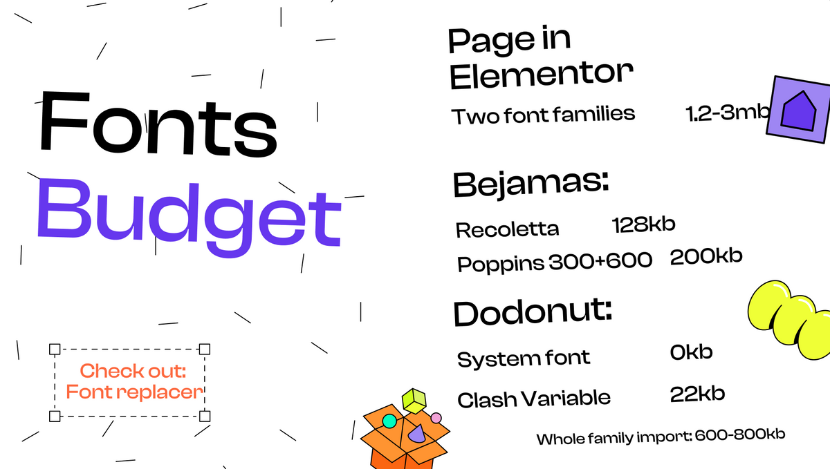
Set Font Budget: number of fonts, fonts variants, weight, specific characters
What is the font budget?
Font budget refers to the total file size and the number of font files you allocate for your web design project. It is a crucial aspect of optimizing your website as it affects loading times, performance, and overall user experience.
By setting a font budget, you ensure conscious decisions about which fonts to include in your project and an understanding of how they will affect your website's performance.
A well-planned font budget helps you strike a balance between maintaining a visually appealing design and ensuring that your website loads quickly and functions efficiently across various devices and platforms.
How to set up a font budget?
In practice, setting up a font budget involves making several important decisions that influence your website's performance and user experience. Consider the following factors:
- Font families: decide how many font families you want to use in your design. Limiting the number of font families can help maintain a cohesive visual aesthetic and reduce the overall file size.
- Font weights: determine the number of font weights you need for your project. Each weight adds to the file size, so choosing only the necessary ones is crucial.
- Character sets: consider the character sets required for your website and the letters you wish to download. If you only need English characters, your font files will be smaller compared to those supporting multiple languages.
- Total file size: establish the maximum file size (in kilobytes) for the font download and font stack you will import into your website. It will help you maintain a balance between design quality and website performance.
Comparing a page without a font budget to one with a well-organized font budget demonstrates the impact of these considerations. Web pages without a font budget might have multiple font families, numerous weights, and extensive character sets, resulting in larger file sizes and slower loading times. In contrast, a well-organized font budget streamlines the design, minimizes file sizes, and improves website performance without sacrificing visual appeal.
Good practice
When setting up a font budget, it's important to adhere to good practices to ensure your website performs well without compromising design quality. Here are some recommendations:
- Limit the number of font weights to a maximum of three per project. By doing so, you can maintain a font budget of around 330kb, which is considered acceptable for most websites.
- Avoid loading the entire Poppins font family or any other large font families if you don't need all the available weights and styles.
- For projects that don't require support for multiple languages, consider steering clear of Google Fonts and Adobe Fonts, as they often include extensive character sets. For example, the Poppins font contains over 2500 characters, while you only need around 100 characters to display a website in English. It means a user would download 2400 unnecessary characters they will never use.
- Explore the use of system fonts and variable fonts, as they can offer optimized performance and compatibility without sacrificing design quality. Both options help streamline your font usage and minimize the overall file size (more about it below).
Use Variable Fonts
Variable fonts are a modern approach to typography in web design, offering a unique solution that combines multiple font styles and weights into a single file. Understanding the concept and benefits of variable fonts can help designers make informed decisions when optimizing their websites.
Understanding variable fonts
Variable fonts are an innovative type of font that allows designers to access a wide range of styles and weights within a single font file. This capability makes it easier to fine-tune typography to suit various design requirements, providing greater flexibility and customization options. With variable fonts, designers dynamically adjust attributes like weight, width, and slant, creating a seamless and adaptive design experience.
In summary, you need to download each weight separately with regular fonts – light, semi-light, regular, bold, etc. With variable fonts, you only need to download a single font file, and you can manipulate the weight using CSS. This approach streamlines font usage and reduces the overall file size, improving website performance and optimizing user experience.
Advantages and disadvantages of variable fonts
Advantages
- Streamlined design process: variable fonts eliminate the need to preload multiple font files, simplifying the design process and reducing the overall complexity of managing typography on a website.
- Reduced file sizes and improved performance: consolidating various font styles and weights into one file significantly reduce total page size and improve performance of your fonts compared to traditional font files. This reduction in file size leads to faster font loading times and improved website performance, contributing to a better user experience.
Disadvantages
- Browser compatibility: although support for variable fonts is growing, some older browsers may not support this feature. Designers need to ensure that fallback fonts are in place for these instances to maintain a consistent user experience.
- Limited availability: as variable fonts are a relatively new technology, there may be fewer font families available compared to traditional static fonts. Designers might face limitations when looking for specific fonts that meet their design's requirements.
By understanding what variable fonts are and weighing their advantages and disadvantages, designers make informed decisions when optimizing typography for websites, ensuring the balance between design flexibility, user experience, and website performance.
Examine the table - we downloaded several popular fonts from Google Fonts (unfortunately, Google only allows downloads in TTF format) to make a comparison with the Clash font, which we use on our website.
Interestingly, a single variable font can replace not only the bold weight but also the width (to create condensed or extra condensed versions of a font). In this case, one variable font has replaced over 18 files!
| Family name | Standard | Variable |
|---|---|---|
| Montserrat (ttf) | 995 kb | 223 kb |
| Montserrat with italic (ttf) | 1 988 kb (2mb) | 448 kb |
| Clash Disolay (woff2) | 98 kb | 29 kb |
| Open Sans (ttf) | 2 197 kb (2.2mb) | 505 kb |
| Open Sans with italic (ttf) | 4 500 kb (4,5mb) | 1 058 kb (1mb) |
Leverage System Fonts
System fonts, also known as native fonts, are pre-installed on devices and can provide an excellent alternative to custom fonts in web design. They offer various advantages and are suitable for specific use cases, such as longer paragraphs where the difference between custom and system fonts is less noticeable. Popular system fonts are Arial, Tahoma, and Times New Roman.
Advantages of using native fonts
- Faster loading times: since system fonts are already installed on user devices, users don't need to load them together with your website. It results in faster loading times and improved website performance. It means that in your budget system font costs you 0 kb :)
- Better compatibility across devices and browsers: system fonts are web safe fonts because they are designed to work seamlessly across different devices and browsers, ensuring consistent rendering and display. This compatibility helps reduce potential issues related to custom font rendering and provides a more consistent user experience.
- Since system fonts are designed to work on millions of devices, they effectively cover all the edge cases you might encounter, ensuring a smoother design experience across various platforms.
- Since system font is available on every system, and they are pre-installed on computers, you don’t need to bother about extra characters.
When to use system fonts?
There are several scenarios where using system fonts can be an advantageous choice for web designers:
1. I recommended using system fonts for paragraph text in some past projects. The headers are often styled with custom fonts, while paragraphs can benefit from a clean and consistent look of system fonts. Most users won't notice the difference between custom and system fonts in paragraphs, except for designers with a keen eye for typography.
2. System fonts can also be a useful fallback for edge cases where your primary font doesn't provide adequate support. For example, at Dodonut, we encountered an issue with the superscript "2" in CO2. In this situation, we loaded a system font to address this problem and ensure proper display.
3. Another use case for system fonts is designing a website with minimalistic aesthetics. If your design features simple and clean lines, using system fonts can help achieve a consistent and uncluttered look across various devices and platforms while optimizing website performance.
In conclusion, system fonts can be a practical and effective solution in various design scenarios, from paragraph text to edge cases, and in maintaining a minimalist design.
Utilizing default system fonts for different operating systems
As a designer, you can choose a "system font" that automatically loads the default font for each platform, such as San Francisco on macOS and Segoe UI on Windows. This approach has some advantages, for example, reduced loading times and better compatibility across devices and browsers. However, the disadvantage of using default system fonts is that you don't have 100% control over how the design looks.
When opting for the "system font" approach, an appropriate font will be loaded depending on the user's platform. It means that on macOS, users will see your design with San Francisco, while on Windows, they will see it with the font called Segoe UI. Although this may result in minor variations in the appearance of your design on different devices and platforms, these differences are generally minimal and do not impact the overall user experience.
It is precisely the approach we have adopted at Dodonut. You will see slightly different fonts on Windows and Mac.
By carefully weighing the pros and cons of using default system fonts, you can make an informed decision that balances design aesthetics, user experience, and website performance. Maintaining a consistent brand identity and visual appeal is crucial, but it is equally important that your website loads quickly and functions efficiently across various devices and platforms.
Proper Web Font Formats
Selecting the web font format is crucial for compatibility and performance when designing websites. Different font formats offer varying levels of support across browsers and devices, which influences user experience.
Evaluating different web font formats for compatibility and performance
- WOFF and WOFF2: Web Open Font Format (WOFF) and WOFF2 are the most widely supported and recommended font formats for web use. WOFF2, the newer format, offers better compression and smaller file sizes, which results in faster loading times. Both formats are compatible with most modern browsers.
- TTF and EOT: TrueType Font (TTF) is an older font format that some browsers may still support, but it doesn't offer the same compression benefits as WOFF and WOFF2. Embedded OpenType (EOT) is another format designed for use with Internet Explorer. With modern browsers phasing out support for EOT, it is becoming less relevant in web design.
Choosing the right format based on browser support
When selecting a font format, it is essential to consider browser support and compatibility. WOFF and WOFF2 are generally the best choices, as they are supported by most modern browsers and offer better performance. However, if you need to support older browsers, you may need to include TTF or EOT formats as fallbacks.
Decrease characters
Optimizing the characters of every font can significantly improve your website's performance. By implementing chosen font subset and focusing on necessary language support, you can reduce file sizes and load times while still maintaining a visually appealing design.
Implementing font subsetting and decreasing characters
- Removing unused characters and glyphs: font files often include a large number of characters and glyphs that may not be necessary for your specific project. By applying font subsets, you can remove unused characters and reduce the file size, ultimately improving website performance.
- Determining the required characters: to display a website in English, you generally need around 100-150 characters, including uppercase and lowercase letters, numbers, and punctuation marks. Including only the required characters in your font files helps streamline your design and optimize your website's performance.
Focusing on necessary language support
- Identifying target languages: determine which languages your website needs to support and include only the required characters for those languages in your font files. This targeted approach ensures that you only include the characters your audience needs.
- Balancing design needs with optimization goals: it's essential to balance maintaining the visual appeal of your design and optimizing your website's performance. Carefully consider the characters and glyphs necessary for your target languages and prioritize their inclusion in your font files.
By decreasing characters in your font files through subsetting and focusing on necessary language support, you can optimize your fonts without sacrificing design quality. This approach helps balance design needs and speed optimization, ensuring a positive user experience across various devices and browsers.
Summary: how to optimize web fonts for a faster website?
Optimizing fonts for web design is essential to creating user-friendly and well-performing websites with the highest score of Core Web Vitals. It is crucial to balance design aesthetics, user experience, and website performance. Key areas to focus on when optimizing fonts include:
- Setting a font budget: determine the number of fonts used and needed and prioritize essential fonts for core website elements while balancing design goals with website performance.
- Utilizing variable fonts: embrace the flexibility and customization options provided by variable fonts, which consolidate various font styles and weights into one file resulting in reduced file sizes and improved performance.
- Leveraging system fonts: avoid using custom fonts and limit fonts that are not pre-installed on the computer. Instead, consider using default system fonts such as San Francisco for macOS and Segoe UI for Windows for faster loading times and better compatibility across devices and browsers.
- Choosing proper web font formats: evaluate different web font formats, such as WOFF, WOFF2, TTF, and EOT, for compatibility and performance, and select the most appropriate format based on browser support.
- Decreasing characters on each page: implement font subsetting techniques and focus on necessary language support to streamline font files, reduce file sizes, and improve website performance.
By carefully considering these factors and applying best practices, designers can create visually appealing and efficient websites that offer a positive user experience and perform optimally across various devices and browsers.
Need a Full-Stack Design Team?
Our team handles all aspects of design, making your ideas a reality.
This article emits ~0.23g of CO2.


