Beebole - Excellent UX and brand identity for SAAS web design

Beebole is an all-in-one time management tool for companies. The Dodonut team's work on their new web design resolved several challenges they struggled with, including branding, improving page speed, and supporting multiple languages, by conducting thorough research and utilizing our expertise and modern technology.

- Client
- Beebole
- Type
- Corporate website, web development
- Industries
- SAAS
- Services
- UX, UI design, illustrations, web development by Bejamas
I. Introduction
The Beebole website project was a challenging and exciting opportunity for our Design Team to deliver a high-quality, user-centered website with stunning illustrations for a SaaS company. This case study highlights the importance of user-centered design and the role that research, wireframes, branded illustrations, and modern technology play in delivering exceptional website design.
About customer
Beebole is an all-in-one time management tool for companies. It offers project time tracking, time and attendance, and powerful reporting features for teams and businesses to optimize their operations and increase efficiency. Beebole SaaS headquarters are located in Belgium, and it was founded in 2008. It has customers all around the world and provides top-notch support in English, French and Spanish.
Challenges and objectives
- Standing out from competitors: Beebole faces competition from other SaaS companies in the time tracking and project management space. The challenge was to differentiate the brand and create a unique vibe for a website that sets it apart from the competition.
- Multilingual approach: Beebole operates globally and serves customers from different countries. The challenge was to adopt a multilingual approach that caters to the diverse needs of its international user base.
- Improved page speed: A fast and responsive website is crucial for delivering a seamless user experience. The challenge was to optimize the website's performance and reduce page load times to improve the overall user experience.
- User-friendly and scalable CMS: An easy-to-use and scalable CMS is crucial for managing and updating the website effectively. The challenge was implementing a CMS that provides a streamlined and intuitive user experience while allowing for the flexibility and scalability needed to support the company's growth.
II. Research, exploration, and wireframes
Initial research
The initial research for the Beebole project involved an in-depth analysis of the SaaS market and the competition. We thoroughly reviewed similar solutions, examining their architecture, features, and user interfaces. It helped us understand the market landscape and identify opportunities for differentiation and innovation.
Additionally, we analyzed the materials provided by the client, including their business goals, target audience, and technical requirements. It allowed us to gain a deeper understanding of their needs and helped inform the design and development of the new website. The research phase was a critical step in ensuring the project's success as it provided the foundation for a user-centered design that met the client's and their users' needs.
Information architecture and wireframes
To ensure that the new Beebole website was easy to use and delivered a seamless user experience, we created an information architecture and wireframes. The information architecture defined the structure and organization of the website's content, while the wireframes provided a visual representation of the user flow and interactions. It allowed us to validate the design and make adjustments before moving into the UI phase.
The wireframes also helped us determine the requirements for the custom illustrations. We used them to identify the key areas where illustrations would be most effective in enhancing the user experience and reinforcing the brand identity. We then shared these requirements with Zuza Gadomska Studio, our illustration contractor.
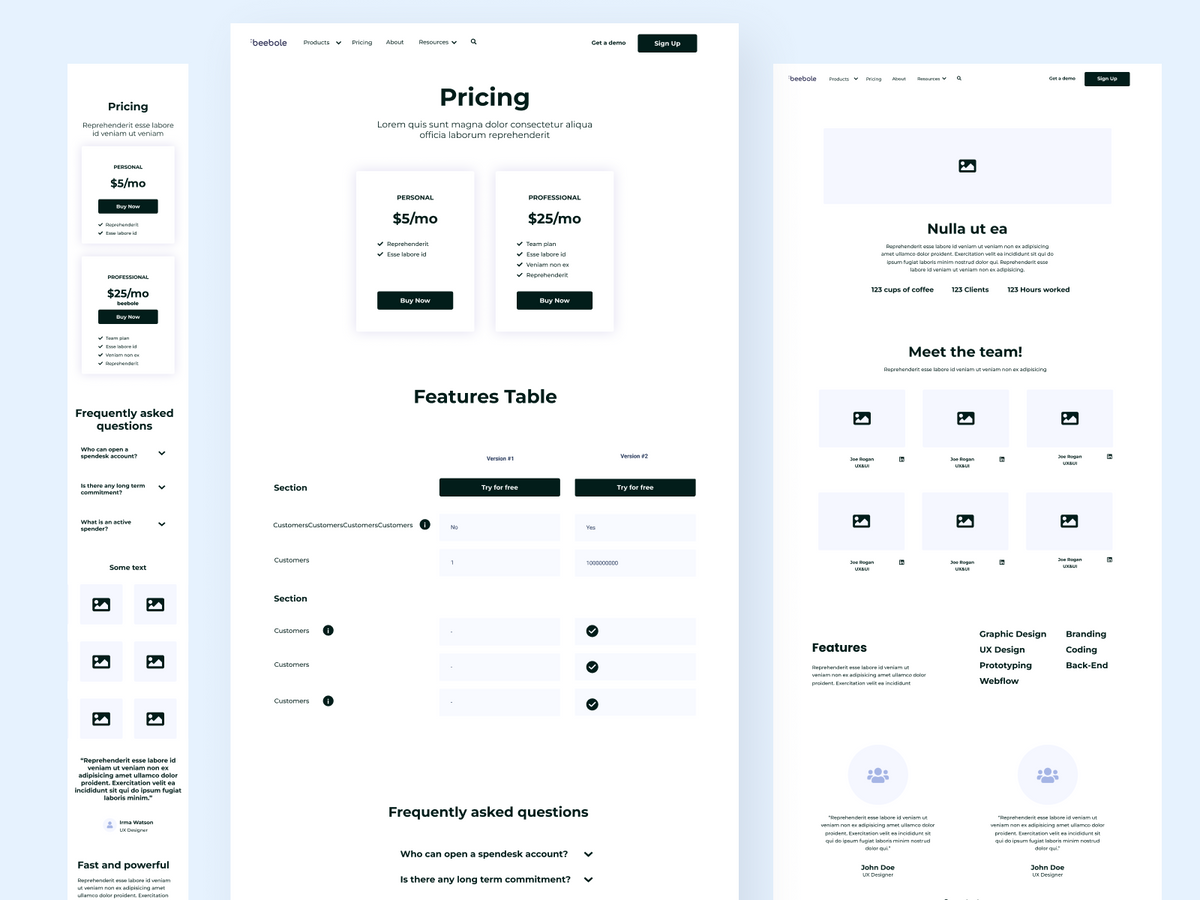
Illustration exploration
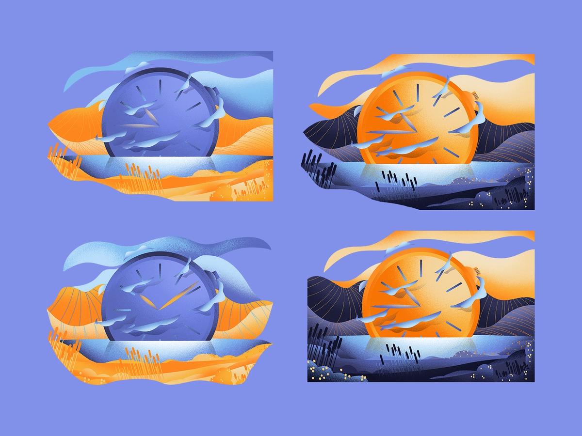
Based on our initial research, we worked with Zuza, an experienced illustrator, to develop custom illustrations that reflected the brand's essence and conveyed its key messages.
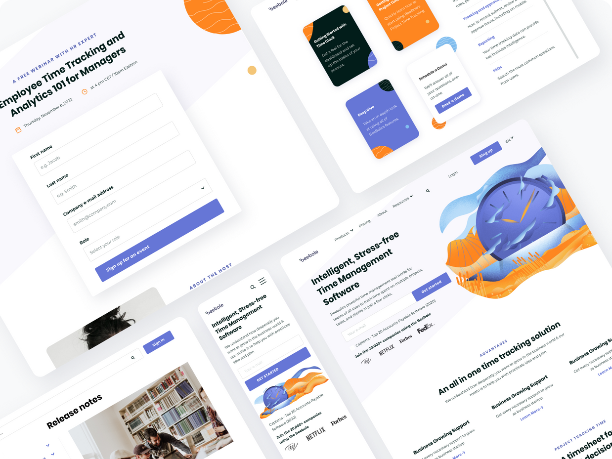
The choice of style was an important factor in creating a visually appealing and memorable experience for Beebole's target audience. After presenting a range of options, we found that the customer was particularly drawn to the illustrations on Bejamas.io website. We decided to build on this style, using vivid colors, textures, and abstract shapes to create a unique and engaging visual identity.
Additionally, we engaged the customer in the review process to confirm that the illustrations met their needs and aligned with their brand identity. This collaborative approach and Zuza’s talent set Beebole apart from its competitors, helped build brand recognition, and reinforced the company's unique value proposition.


III. Design and development
Design
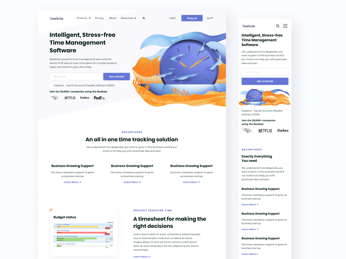
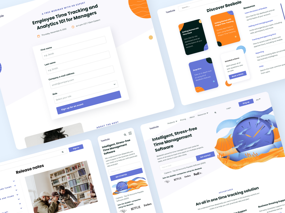
The custom illustrations created by Zuza inspired the design of Beebole's website. We followed the color palette from the illustrations and used it as a basis for the website's design. Additionally, we carefully selected legible fonts that supported multiple languages, ensuring that the website was accessible to a global audience.
We also made a conscious effort to play with whitespaces, using negative space to create a clean, uncluttered look and feel. It helped highlight the key elements of the website and draw the user's attention to the most important content. The result is a visually appealing and engaging website.
Style guide
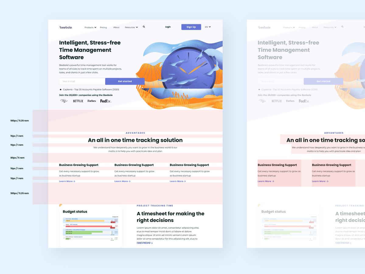
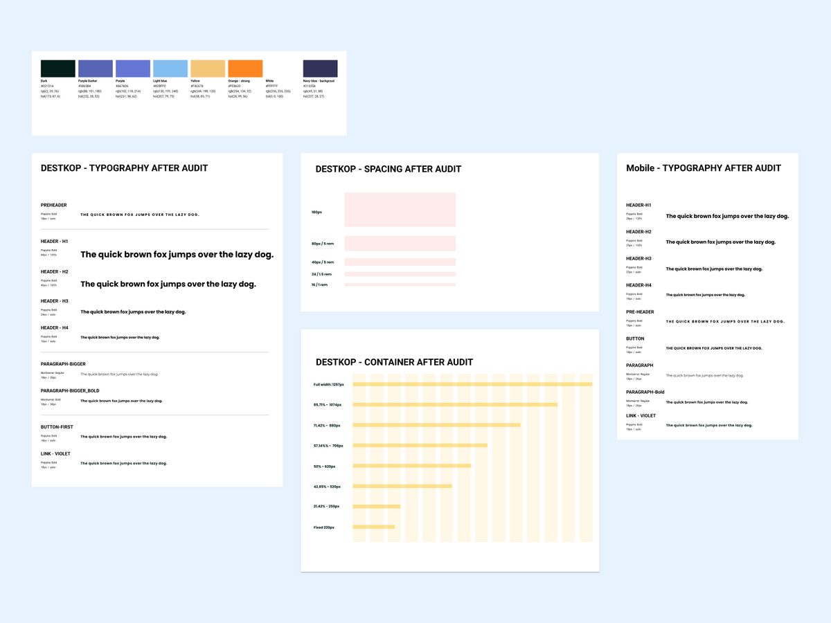
The style guide provides detailed information on the design elements, such as spacing, typography, and color. We created the spacing system for both mobile and desktop to ensure that the website was responsive and looked great on all devices. We then went through the designs once again to unify the typography and ensure that all text was consistent in size, weight, and style. Finally, we named and assigned colors in Figma, making it easier for the development team to implement the design and maintain consistency.
Development
The Beebole website was developed by our sister company, Bejamas.io. They used Gatsby - a modern, scalable, and fast framework for building websites and apps, and Storyblok - a headless CMS that facilitates content management and website updates.
The combination of these technologies allowed us to deliver a fast, dynamic, and responsive website that is also easy to use and maintain. Bejamas.io is a team of experienced developers. They brought our vision of the design to life and delivered a high-quality website that met all customer requirements. A well-established and reliable technology stack ensures the website is built to the highest standards and delivers a seamless and memorable user experience.
IV. Outcomes
The outcomes of the Beebole website project are numerous. The new website delivers a high-quality user experience and a visually appealing, intuitive UI, making it a valuable asset for Beebole.
- An aesthetically pleasing and memorable branding that stands out from competitors
- A responsive website that improves page speed
- An easy-to-use and scalable CMS
- Support for multiple languages
- A set of unique illustrations created in collaboration with Zuza
- A cohesive design with unified typography and color palette
- A style guide that ensures consistency throughout the development process
- A high-quality, seamless user experience across all devices
- Easy and cost-effective website maintenance
V. Conclusion
The Beebole website is a successful product of our collaboration with the client. Our UX team tackled several challenges, including branding, improving page speed, and supporting multiple languages, by conducting thorough research and utilizing our expertise and modern technology. The website is scalable, visually appealing, and demonstrates the effects of a user-centered design approach. We are pleased with the outcome and believe it showcases the value of research and utilizing a user-centered design approach in website design and development.
The illustrations created by Zuza and Dodonut for our commercial website gave it a real soul. In a time where most websites use the same empty pictures, I am really happy to stand out with a much more personal design. We could also see a jump in the number of trials since the launch of the new website, so I am certainly not the only one to have been touched by Dodonut work.
