Brand Refresh for Trajectory Web Design
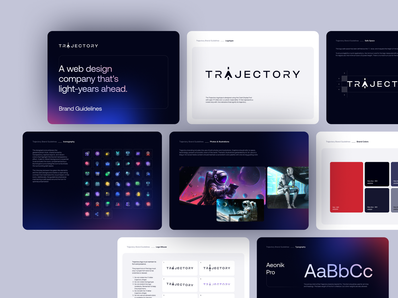
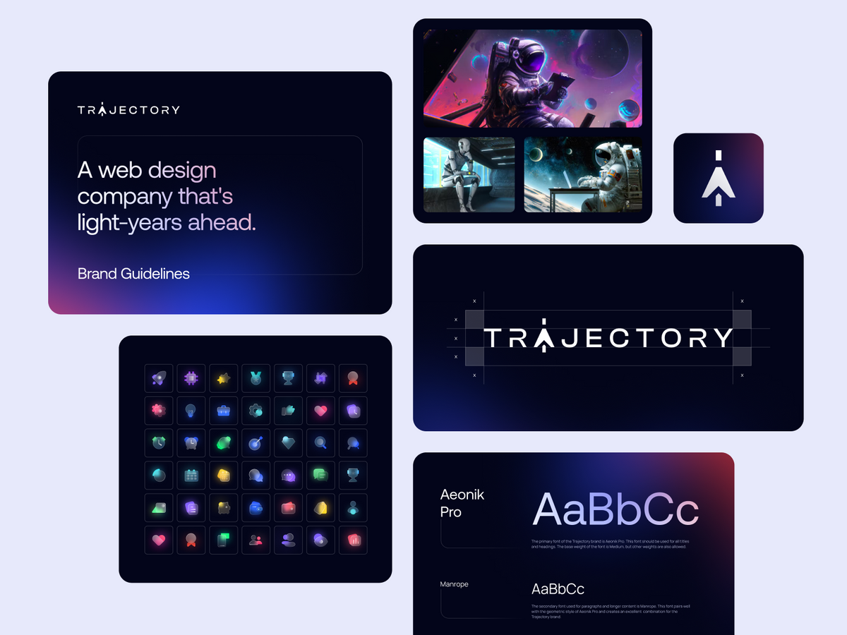
We performed a strategic brand refresh for Atlanta's Trajectory Web Design. The project involved logo redesign, typography selection, color scheme update, and brand book creation, enhancing the agency's market presence while preserving brand familiarity.

- Client
- Trajectory Web Design
- Type
- Branding
- Industries
- Agency
- Services
- Branding
Introduction
Trajectory Web Design, based in Atlanta, is an agency known for creating exceptional websites with excellent performance. Recognizing the need for a brand refresh, Trajectory Web Design reached out to us.
The Challenge
Trajectory's logo mark had a strong presence and was recognizable to their customers. While it was clear that an update was needed, the challenge was to modernize the logo without revolutionizing it and maintain the brand familiarity that Trajectory had cultivated over time.
Our Role
In this significnt project, our role was multi-dimensional. We were tasked with providing a comprehensive rebranding service for Trajectory Web Design. This not only involved a creative rethinking of their visual assets, but also required us to deeply understand the brand's essence, its values, and its target audience. We strived to deliver a rebranding solution that would reflect the brand's evolution and future trajectory while preserving its existing recognition and customer loyalty.
Branding
Our approach to the rebranding process was highly structured, deliberate, and strategic. We developed a step-by-step plan that allowed us to focus on each aspect of the brand individually - from the logo to the typography and color scheme, while also considering how these elements interacted as a whole. This meticulous process ensured a successful outcome, ultimately leading to a cohesive and refreshed brand identity that not only resonated with Trajectory Web Design's audience but also aligned with their core values and strategic vision.
Step 1: Understanding the Existing Brand
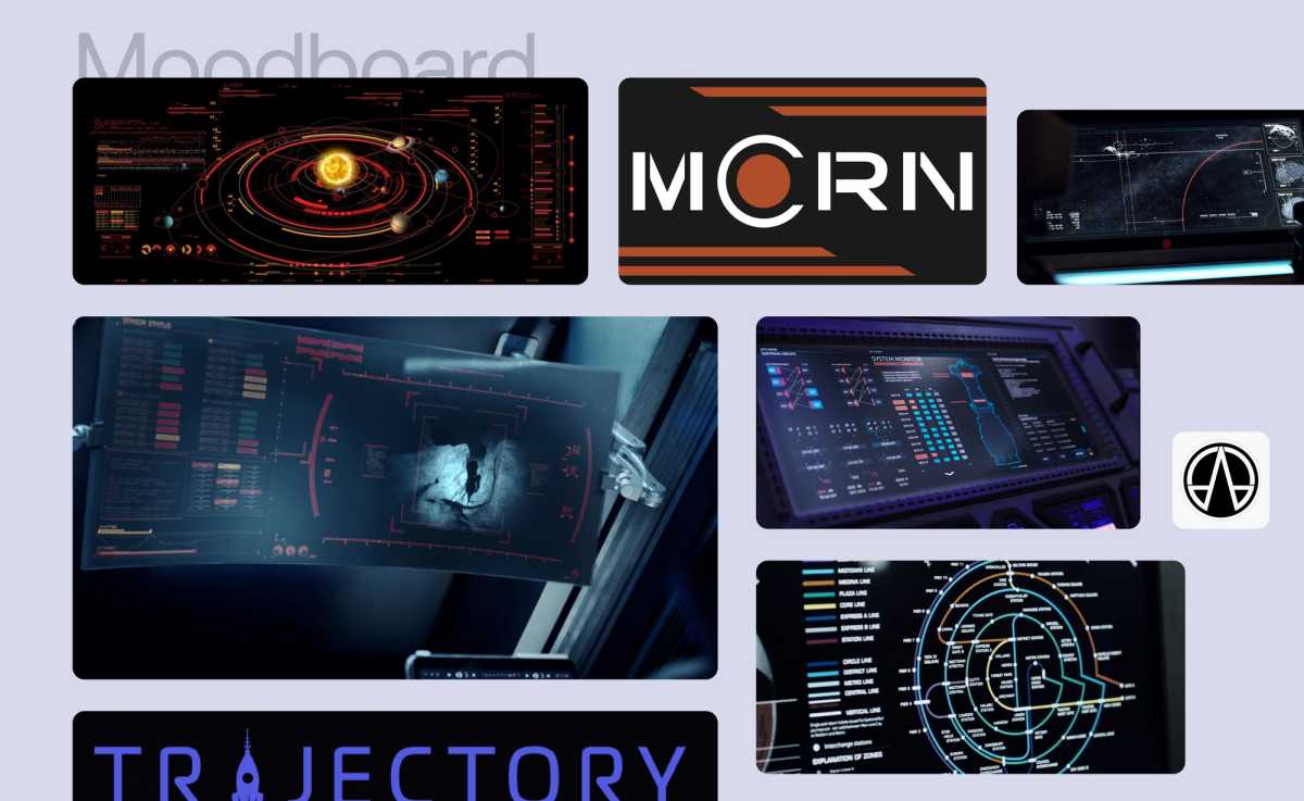
Before diving into design, we first took time to understand Trajectory's existing brand, its values, and how the current logo mark was perceived by their customers.
Step 2: Redefining the Logo Mark
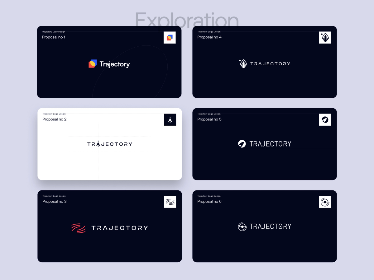
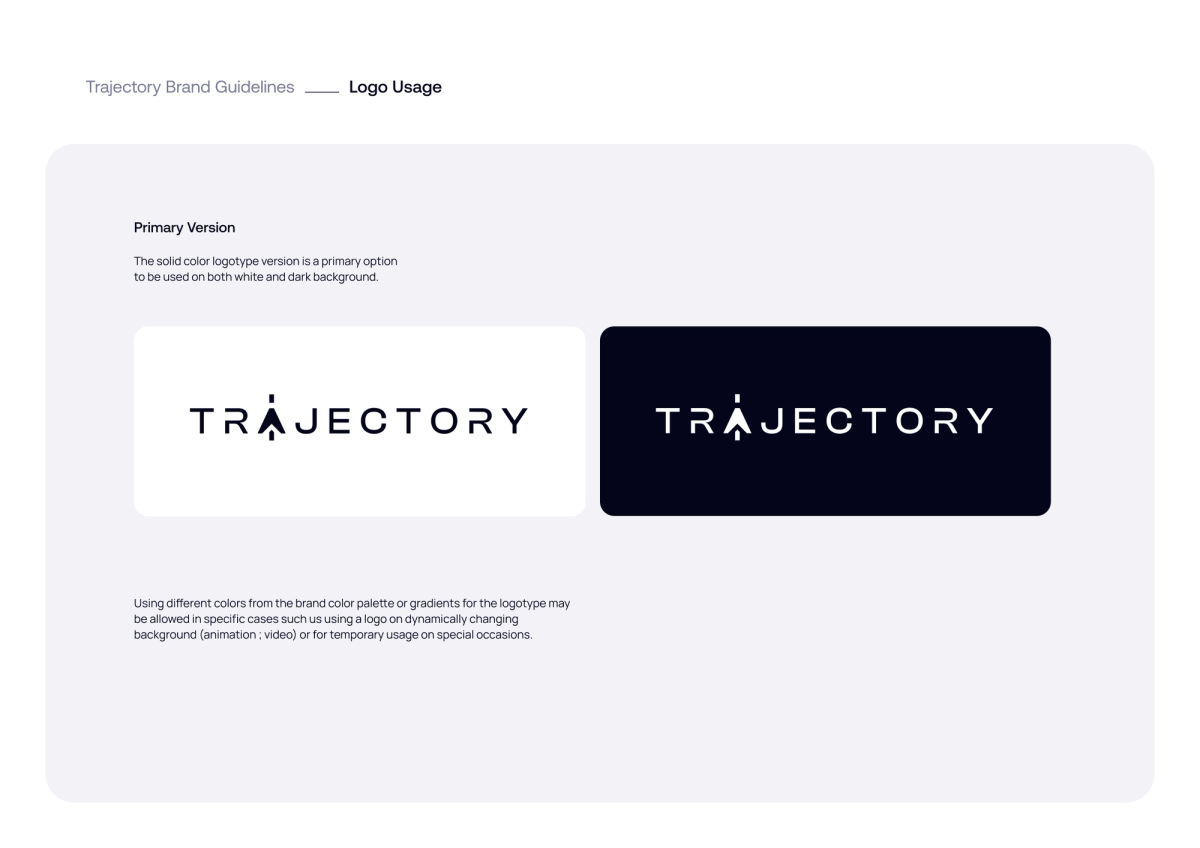
With a solid understanding of the existing brand, we started redefining the logo mark. Our goal was to create a logo that preserved the original's recognizability while reflecting Trajectory Web Design's innovative spirit in a modern way.
Step 3: Typography Selection and Logo Iteration
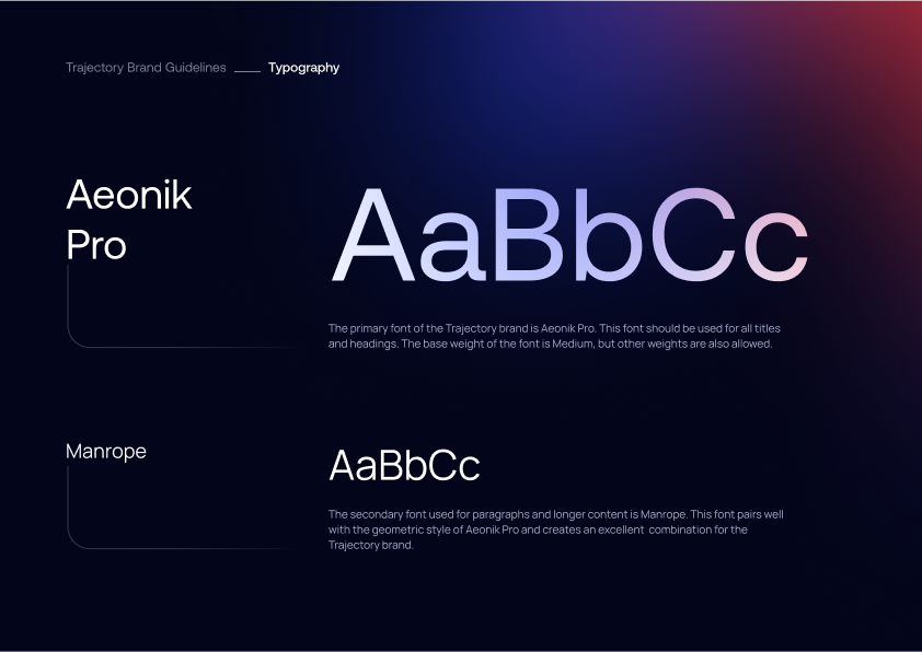
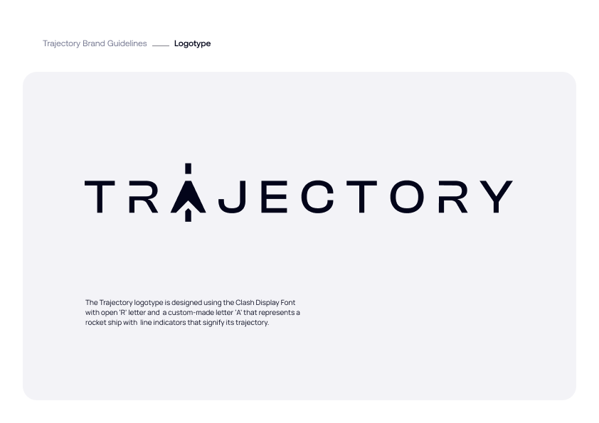
In this phase, our focus was dual-pronged. We centered our attention on typography, striving to find an ideal balance between style and readability. Our goal was to select a typeface that would resonate with Trajectory's audience and enhance the brand's visibility and recognition.
Simultaneously, we revisited the logo mark selected in the previous step. We embarked on a series of iterations, refining and tweaking the logo mark to ensure it perfectly aligned with the new typography and overall brand refresh
Step 4: Choosing the Color Scheme
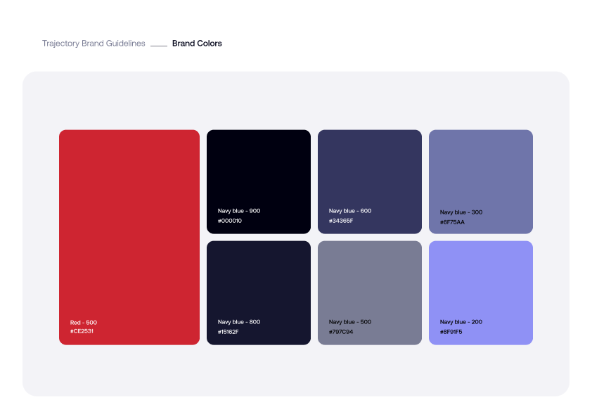
Lastly, we updated the color scheme. We selected new colors that complemented the updated logo and typography, evoking the right emotions and giving a fresh perspective to the brand.
Step 5: Basic Brand Book Creation
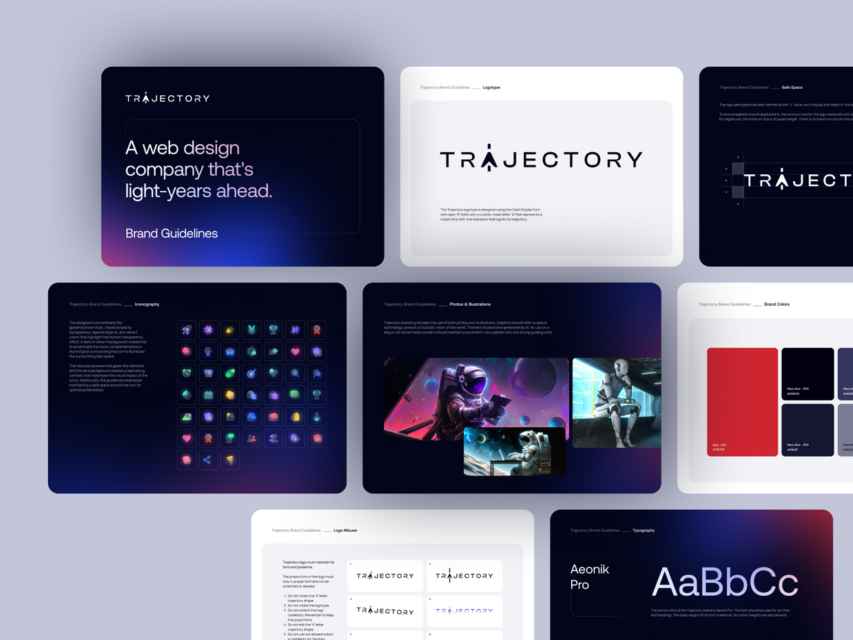
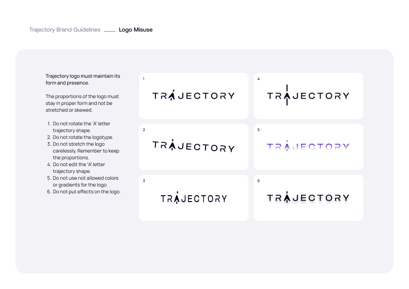
Once the logo mark, typography, and color scheme were finalized, we moved to the next essential step - creating a basic brand book. This brand book served as a guide for Trajectory Web Design, outlining the proper use of the newly refreshed brand elements.
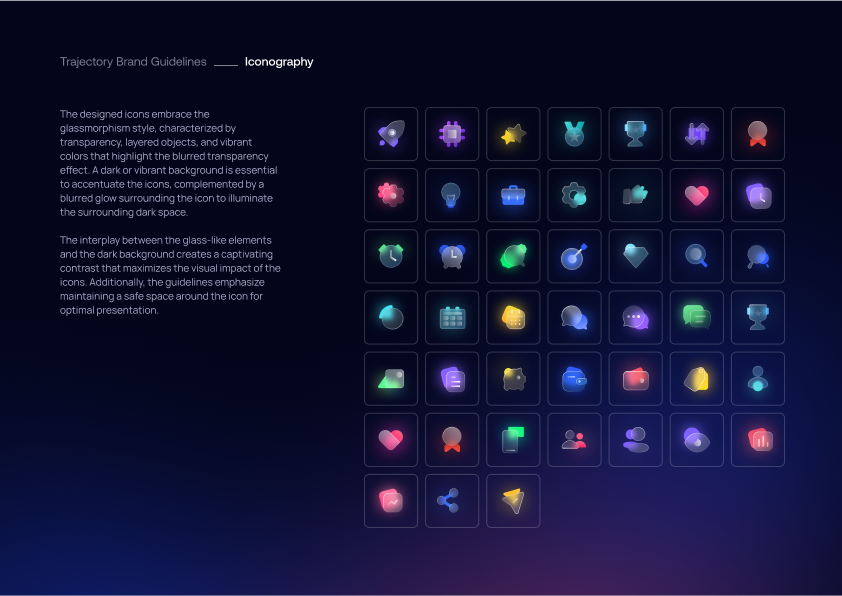
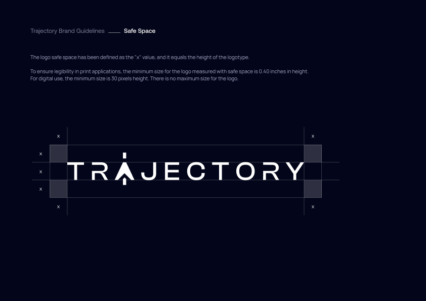
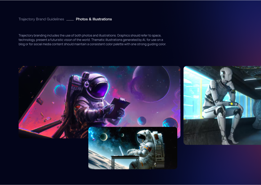
The brand book included guidelines on logo usage, typography, color palette, and other visual elements. It served as a comprehensive reference, ensuring consistency in the brand's representation across different platforms and mediums. This document is a crucial tool for maintaining the integrity and consistency of the refreshed Trajectory Web Design brand moving forward.

Conclusion
The brand refresh for Trajectory Web Design was a successful project that demonstrated our ability to reimagine an existing brand while preserving its core identity. The updated logo, typography, and color scheme have given a new dimension to Trajectory Web Design's brand identity, reinvigorating their presence without losing the familiarity cherished by its customers.
This project reaffirms our commitment to delivering high-quality branding solutions that resonate with our client's values and audience. We're proud to have partnered with Trajectory Web Design on this exciting journey and look forward to future collaborations.
Dodonut consistently delivers beautiful design that hits the mark. They are my go-to team for web UX/UI!
