Climate Central - Intuitive access to resources on climate change
Climate Central is a well-known and valued organization that reports and analyzes climate science. It has an impressive database of content used by many journalists and scientists to promote knowledge about climate change. However, its previous way of filtering was difficult and not user-friendly. By redesigning the Resources page, Dodonut overcame its previous challenges and simplified the way of finding and adjusting visual content.

- Client
- Climate Central
- Type
- Corporate website, Web development
- Industries
- Climate science, climate news
- Services
- UX Design, UI Design, Development by Bejamas
Project Overview
-
The Client
Climate Central is a nonprofit news organization founded in 2008 that reports and analyzes climate science. The organization is created by scientists and journalists who conduct climate change research across U.S. states, cities, and the whole country, as well as globally. As a result of their work, they publish reliable scientific articles and produce multimedia content that Climate Central distributes through their website and media partners.
Many prominent U.S. news sources have featured Climate Central, including The New York Times, the Associated Press, Reuters, NBC Nightly News, Time, NBC Nightly News, National Public Radio, PBS, Scientific American, and The Washington Post. The organization helps journalists bring climate science into reporting, showing climate change impacts and possible solutions.
Climate Central is the only climate communications group that produces and disseminates localized and visual content weekly and at national scale; co-houses scientists, journalists, and technologists; and conducts and catalyzes original, peer-reviewed scientific research to fill critical communication gaps.
We have built strong relationships with thousands of trusted, mostly local messengers who deliver our content. Local relevance and credibility make our communications effective; the broad scale of our efforts help advance national and global conversations.
Climate Central
-
Needs
The main goal for the company was to:
- Improving UX on the Resources page. The previous one was limited in its design and development: elements didn't fit on a fold, buttons were too large, and it was tough to navigate across the page and search items.
- Rebuilding the Resources page to be able to search for archival materials.
- Create a new way of categorizing and filtrating the Climate Central resources database.
- Design additional features to configure and download graphics and multimedia, which Climate Central prepares for usage by journalists, meteorologists, and other climate change researchers that help easily adjust the content to their needs.
-
Problem Statement
The background of the problem
The organization has a vast and constantly growing database of scientific articles, research, and multimedia that show climate change from various perspectives. Their website is created within texts and visual materials illustrating this climate impact.
Scientific research shows how climate change affects people's lives in different parts of the U.S. and world. Their resources relate, for instance, to temperature rising, sea level rise, extreme and destroying weather phenomena, or wildfire.
Their Resources page comprises more than a thousand articles and multimedia that can be downloaded, quoted, and published through different channels by researchers, journalists, and media specialists. From the research and observation of the Climate Central team, the previous way of filtering this colossal database was difficult and not user-friendly.
Who was affected?
Categorizing and filtering resource databases was complex and affected journalists and other users. They reported problems finding specific information and adjusting the visual content to their needs and channels in which it would be presented.
The impact on the company
The outdated way to filter and download resources on Climate Central didn't provide the best possible user experience, affecting the institution's ability to support its network of trusted messengers.
Our Role
The primary goal of the Dodonut team was to rethink the way Climate Central previously filtered its resources and design more user-friendly alternatives. We also change the way multimedia can be edited, customized, and downloaded by journalists, media specialists, and researchers.
We were working on:
- UX (user experience) issues on the Resources page,
- The new logic of the filtering tool,
- The UI visual style of the Resources page, filtering tool, and multimedia customization tool,
- Implementing WCAG recommendations,
- Acting closely and almost simultaneously with the development team from Bejamas.
Our team recommended and provided solutions for improved user experience, accessibility, and website performance of the Resources page.
-
Project Timeline
The Dodonut team conducted a project design phase for two weeks. It included: customer needs research, desk research related to optimizing filtering tools, providing different versions of filtering tools, UI design of Resources page, user testing made internally and with the Climate Central team, UI design of multimedia customization tool, and design version for desktop and mobile.
Phase 1:
Kick-off: Exploring the Problem
- Kick-off Workshop
Climate Central was our client before, so we made a quick kick-off workshop. Company representatives showed up at the previous website during the workshop and explained their pain points and what their users complained about. We talked about what their needs would be regarding the Resources page. We revised their top users and content and what are the most frequent use cases of the Climate Central resources. We discussed what we want to achieve by redesigning the way and logic of filtering, configuring, and downloading resources.
During the workshop, we defined these critical problems:
- More user-friendly view of the Resources page,
- The more intuitive, achievable, and manageable way to filter articles and multimedia,
- Designing a configurator tool to customize multimedia sources,
- Reorganizing the rich scientific content on the Resources page,
Optimizing mobile user experience.
Phase 2:
Discovery & Research
In the discovery and research phase, we conducted internal desk research on the best practices in filtering and organizing massive databases.
- Desk research
We searched for other examples of great website designs and excellent and intuitive ways of filtering databases. Firstly we focused on those representing similar solutions while dealing with large databases. However, finally, the better elements and the way of data presentation we found on websites selling flight tickets like Kiwi.com or Skyscanner.net. We also compared and took lessons from AirB&B and their way of categorizing topics and types of content. We also searched for good case studies of filtrating and searching tools on Dribbble.
- Project scope
The main idea was to change the design, UX, alignment of components and interface of the Resources page and its search, configurator of multimedia, and its search tool. It was crucial to focus on how articles and other visual content were presented on these pages. We had to figure out a more intuitive, detailed way of filtrating content and less frustrating the whole process. In this project, we worked closely with a developer who was experienced in database creation and its limitations.
- Target users
Climate Central is a platform created by scientists that show their research about climate change issues related to the U.S. as well as globally. Articles, analyses, multimedia, animations, and charts are made for other journalists, media professionals, nonprofit climate policy groups, policymakers and planners, and internal fundraisers. They can download, quote, and share this knowledge about climate change through their channels. Most of Climate Central's users use a computer to explore the content. Therefore we primarily focused on the desktop experience.
Phase 3:
UX and UI design
As we worked on the ready design, we had to redesign and optimize it, so we didn’t have to create wireframes from the beginning. We used already made components based on the provided style guide. However, some of them we should change to make them look more modern and readable. Hence, in this case, the UX phase was closely linked to the UI phase.
- Moodboard
We collected good website design examples and several visual inspirations from other companies. We created a moodboard for UI and UX based on other websites and good examples from Dribbble, Awwwards, Webframe.xyz, and existing apps of airline companies.

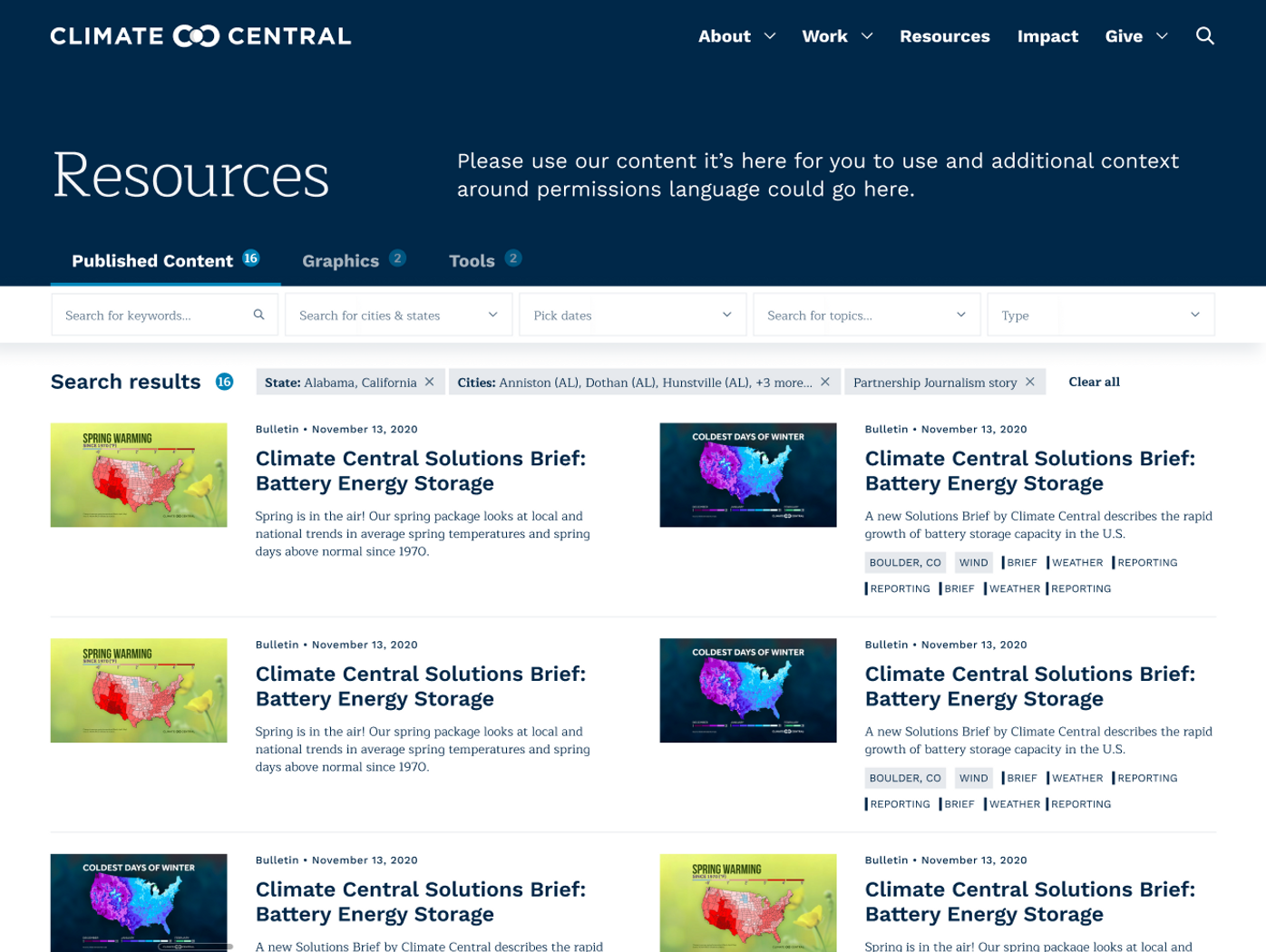
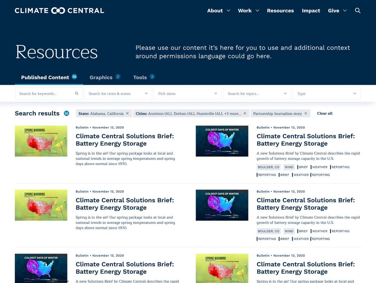
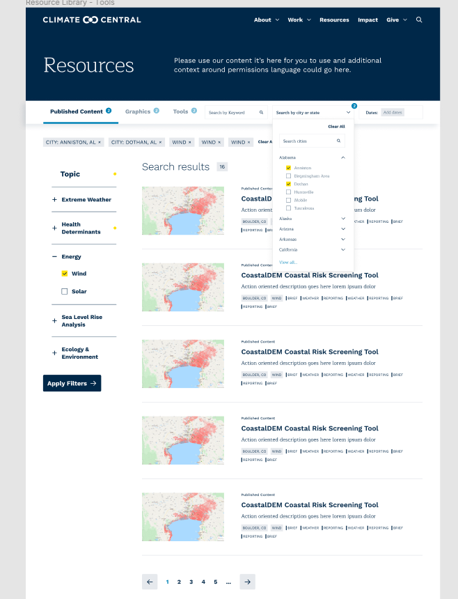
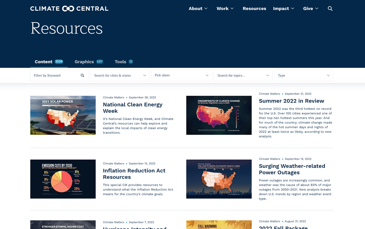
- Search bar and filtering the content
The biggest challenge in this process was to find the best way to design the form of filtering and categorizing content, and due to this design, the search bar. The previous one was on the sticky left sidebar, below the fold. Together with the Climate Central team, we decided to move it up and keep it above the fold. We also designed this section sticky, but the most important was to create a search section that is visible all the time, and the user doesn’t have to scroll through the content. We also decided that results searched with filters are visible on one fold and are filtered dynamically.
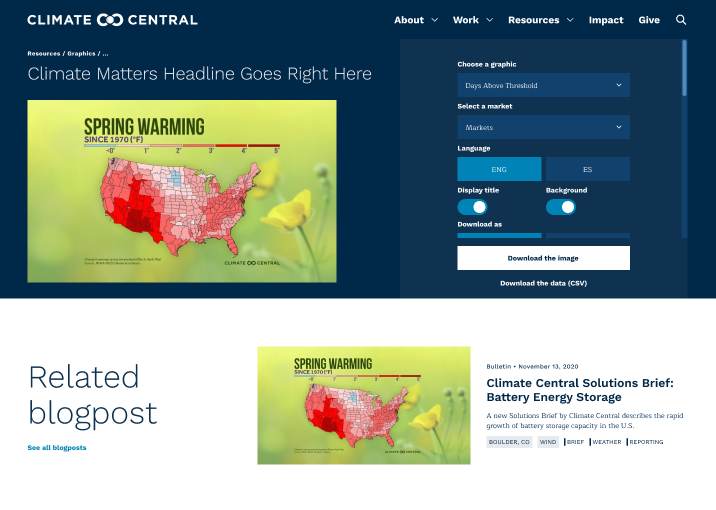
- Multimedia configurator
We also proposed a separate configurator for multimedia. Previously it was settled on the same page with articles below the fold. We proposed to change it to a different tool, which appeared above the fold when users selected visual adaptable content.
- WCAG
We cared about implementing WCAG recommendations, especially for the color and contrast. But we also added some clues for users that appear when they filter the content.
Phase 4:
Iterations and User Testing
Iteration 1
In the first iteration, we improved component sizes, but there was no significant difference between the initial design of the resources page. We kept the left filters and combined the tabs and the rest of the filters in the top-sticky bar, which created chaos in the design. We had too many options over the resources results.
Below visual content for downloading, we added the button that directed the user to the separated configurator. However, it was too small.
The company suggested this approach for minimum changes because it required the least time for development (the Resources page at that time was already coded). But later, we agreed that we needed to work on a better solution and find something in between.
Iteration 2
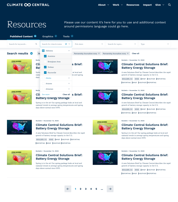
Here we removed the left filters and added them to the top sticky one. It helped us to keep everything above the fold. We decided to leave the listed view of the articles and multimedia and change them for the three-column view with the preview of animated content.
We also redesigned the UI of the multimedia configurator to a more accessible version by minimizing its options and allowing users to see live views of adapted changes by them.
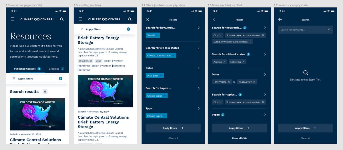
During this process, we also created the first mobile views. The challenge in the second iteration was to change the listed view of resources on mobile screens to two columns that would be more readable for mobile users.
The problem also was in detailed filters. We prepared filter options as separate tags in each input/dropdown. In this scenario, multiple tags were invisible, and we had a lot of filters selected at once.
Iteration 3
During the third iteration, we improved the UI and reduced the top sticky navigation size (it helped us show first-resources results above the fold). We removed multiple tags in each input/dropdown, and instead of that, we designed an ellipsis with the number of selected options in it.
We also grouped search results tags (e.g., states, cities, etc.) and adjusted mobile screens.
Also, we started discussing the project with the developer at that step. Jadzia Przebinda from the Bejamas team gave us a lot of advice, and she also sent us some ready components from some libraries. It helped us to deliver the design faster and implement it more effortlessly.
User testing
After conducting several internal user testing with the Dodonut team and checking its UX with Climate Center, the company decided to move the third iteration into the development stage.
We prepared all the files and views carefully and designed a set of components from the filter and configurator (e.g. categories, topics, and calendar with their different states).
Phase 5:
Techstack
For the development of the Resources page and multimedia configurator it was used Contentful, Next.js, Typescript, and PostCSS.
Sustainability
We aim to ensure that our website addresses the needs of both our clients and our environment. To do this, we consider sustainability an essential factor in every project we undertake. In the case of Climate Central, an institution that makes people aware of climate change, sustainability was especially crucial.
During the design phase, we checked what is possible from the sustainability side of this project, and finally, we achieved it through several steps:
- We developed Resources pages and a configurator tool in the Jamstack framework, which significantly impacts page weight.
- We used the Agile methodology with three iterations for the whole design process to avoid waste and improvements in the development stage.
- We used open source libraries with components such as react-slick, react-dates, react-hook-form, react-modal, and react-paginate on the Resources page and react-select for dropdown menus.
- For the images, we implemented lazy loading and blurred placeholders while loading.
- We choose the pagination instead of loading the content while scrolling.
- We improved the site navigation - everything is achievable within the fold and with a maximum of three clicks.
- We compressed the code and used page caching, CDN, and edge computing.
- The page uses green hosting.
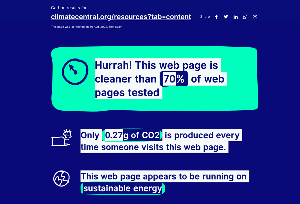
It was a challenge to keep the Climate Central website as sustainable as possible with the vast written and visual content database. However, together with the organization, we achieved pretty good results, which the calculation of the Website Carbon Calculator can confirm. With such gigantic content, it is somewhat surprising that every visiting Resources page by the user generates only 0.27 g of CO2.
Key takeaways and conclusion
As the final product, we created a High Fidelity Prototype of Climate Central's Resources Page for desktop and mobile interfaces. The new interface for filtering data and downloading multimedia allowed us to overcome previous challenges with the website. We encouraged journalists, researchers, and public members to visit Climate Central's website, where they can learn about climate change, possible solutions and popularize them with their channels.
The Dodonut team helped Climate Central to deliver a better user experience by balancing a creative, open approach to our challenges against the need to work within the structure already in place. The result is an intuitive, flexible tool that makes it far easier for our visitors to find and use our materials, but also integrates seamlessly into our overall website experience. Dodonut worked to understand our users and their needs at every stage of this project, and the solution they developed is making a meaningful difference for Climate Central.
Team:
Lead Designer - Tomasz Osowski
UX/UI Designer - Damian Bednarz
Front-End Developer - Jadzia Przebinda