Human Science - documentation tailored to the Asian market
The Human Science company provides IT & language services such as localization and translation, machine translation, data annotation, and IT services. Their main reasons for coming to Dodonut were to migrate their documentation from a not particularly flexible template, upgrade their look to be more professional, modern, and user-friendly, implement code snippets, and make the page faster.

- Client
- Human Science
- Type
- Web app
- Industries
- IT & Communication
- Services
- Product Design, Web development

Overview
Human Science is a Japanese company that offers IT & language services like localization and translation, machine translation, data annotation, and IT services, as well as their own tool.
They came to us to migrate their documentation from a not particularly flexible template to a template tailored to their needs and a fast, small app made in Next.js.
The Scope
The scope of work included challenges such as:
- Creating an app that works in different languages, especially Japanese and English
- Refreshing the style to make it look more professional and modern
- Designing a layout that is easy to understand and navigate for developers
- Implementing the code snippet
- The whole documentation is extremely content-heavy, and it might contain different types of content in the future.
- Optimization of the app speed and overall performance
Process - Initial kick-off
We held a preliminary kick-off, where we discussed problems with the existing template:
- The page was very slow.
- It was hard to highlight the snippet and present it in a friendly way.
- The font needed to support Japanese and English.
- Our customer mentioned Stripe as a design reference.
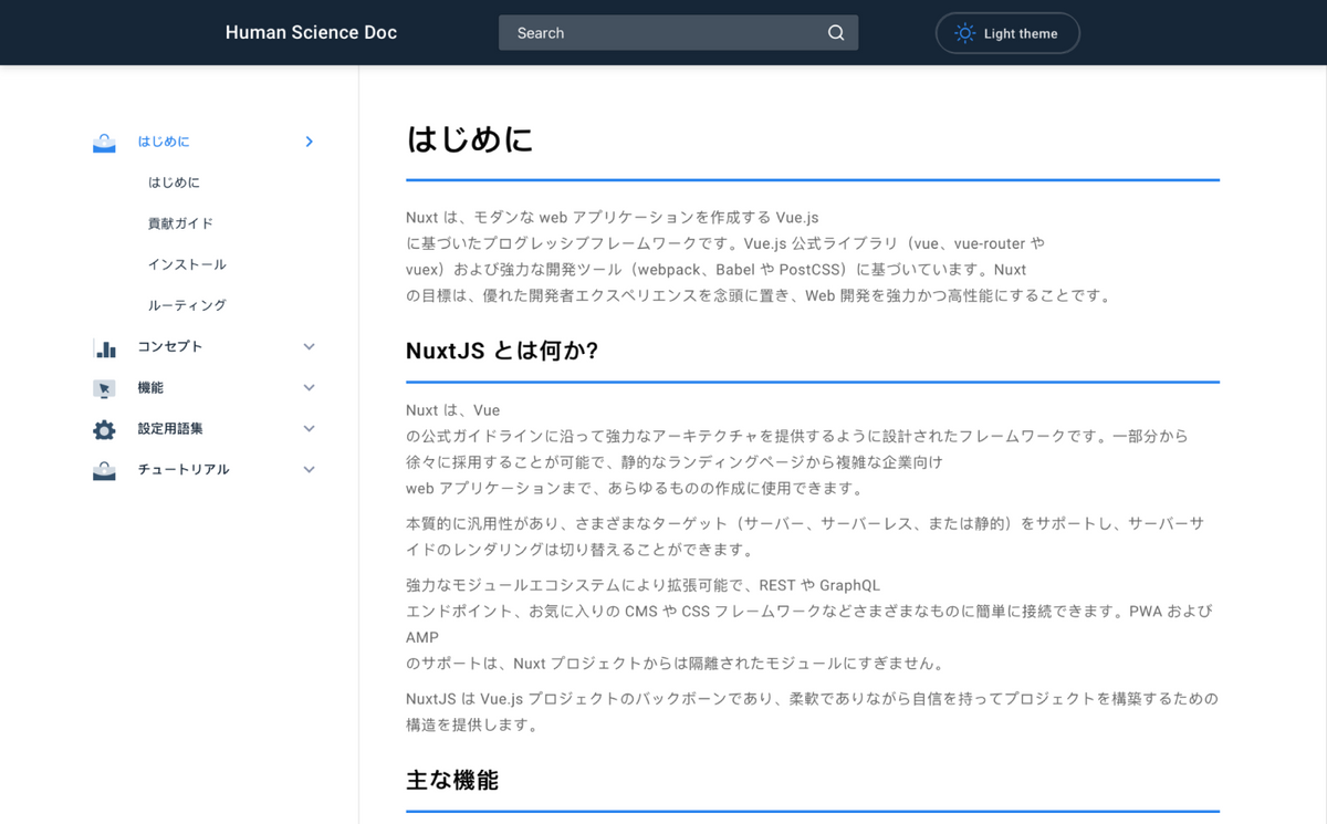
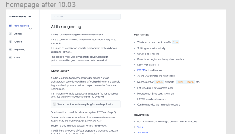
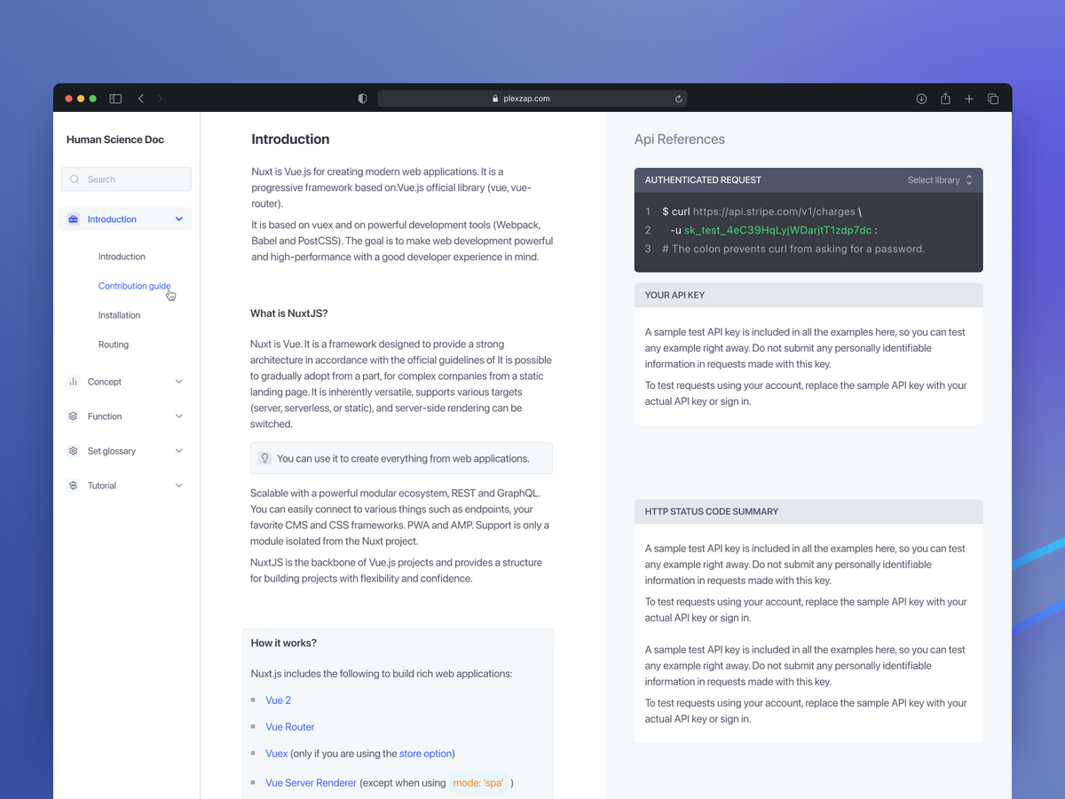
The view before the redesign:
Research
- We started with research. We asked our developers what kind of documentation they liked and disliked.
- It turned out they prefer good syntax support, clear navigation, and precise semantics across all pages.
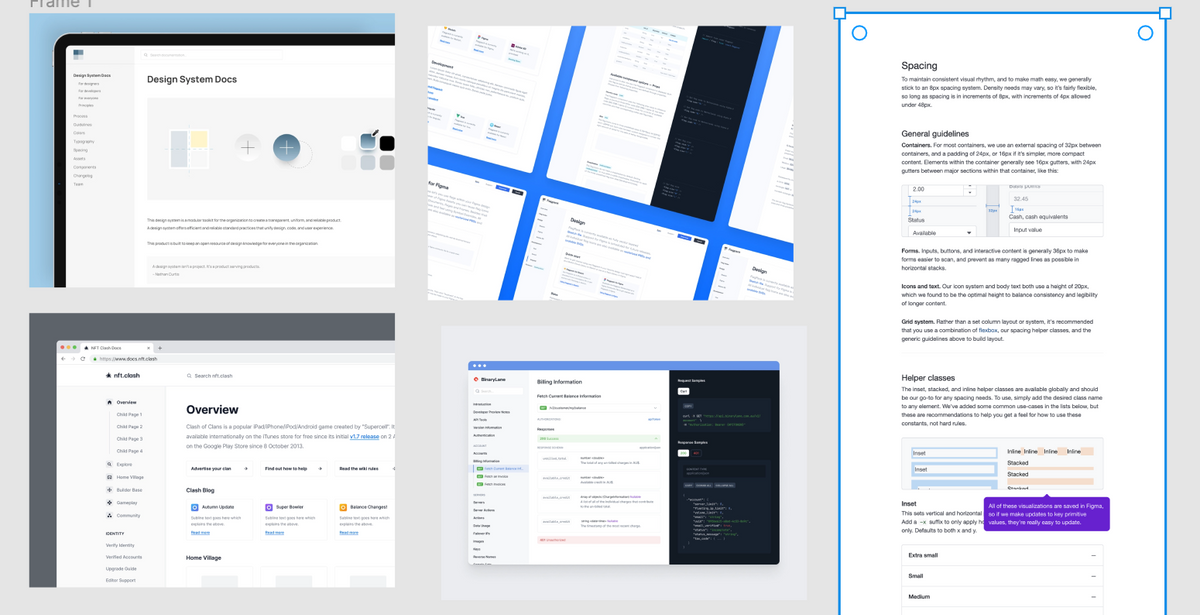
- They mentioned the documentation they liked:
- Gatsbyjs.com
- Eslint
- BinaryLane
- Next.js
The conclusion from the research:
- The code snippet should support full syntax colors.
- It is good to put syntax on a highly contrastive background.
- Most documentation follows the three-column schema.
- It is not a good idea to put more than 90 characters in a single line because it makes reading harder for a user.
Wireframes
We made the first iteration with three different approaches to the layout.
- In the first version, we put the navigation on the left, and then we prepared 2 columns for content. After a quick iteration, we knew that content in 2 columns caused too much cognitive load for users and made it difficult to convey the structure of the content.
- In the second attempt, we tried to limit it to 2 columns, but during the internal guerrilla tests, the users reckoned that there was too much white space.
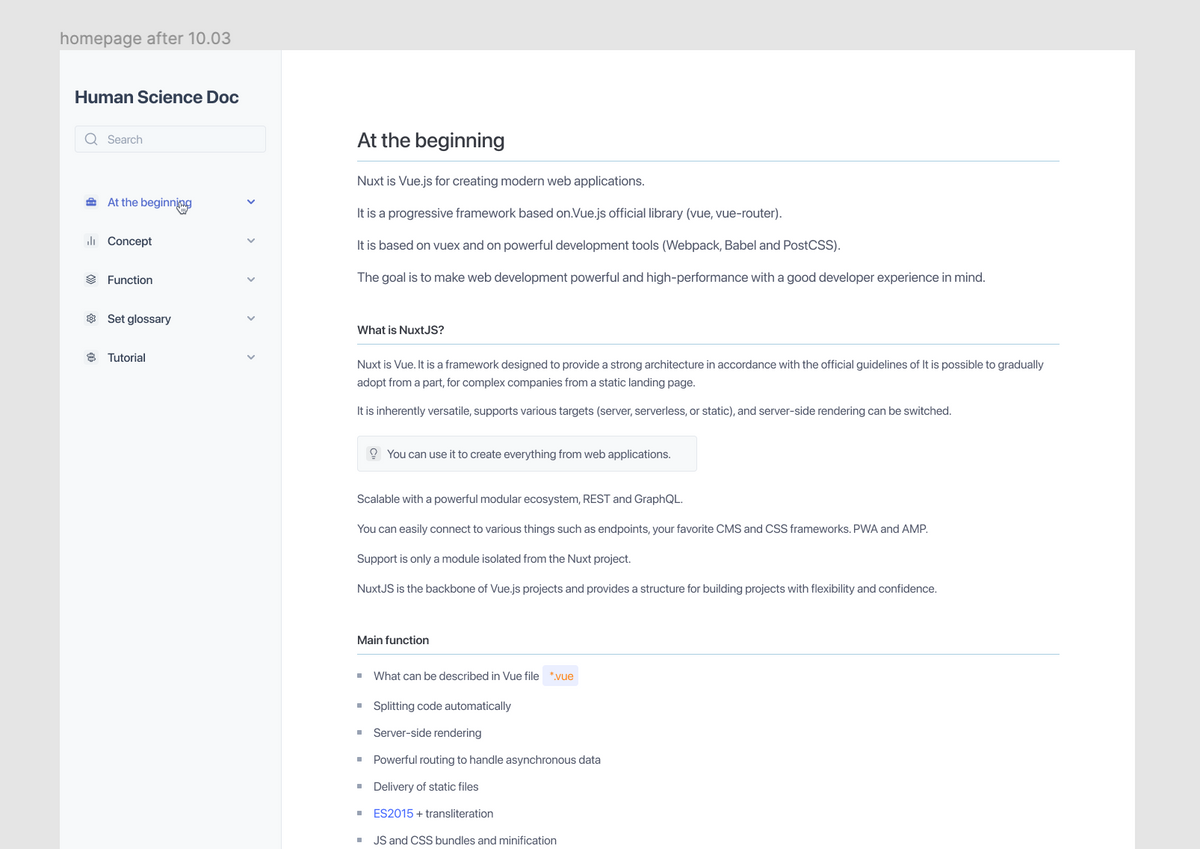
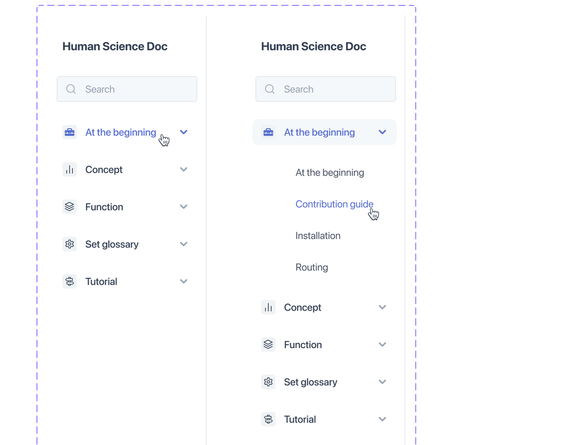
- In the third version, we placed the table of content on the right, the navigation on the left, and the content in the middle.
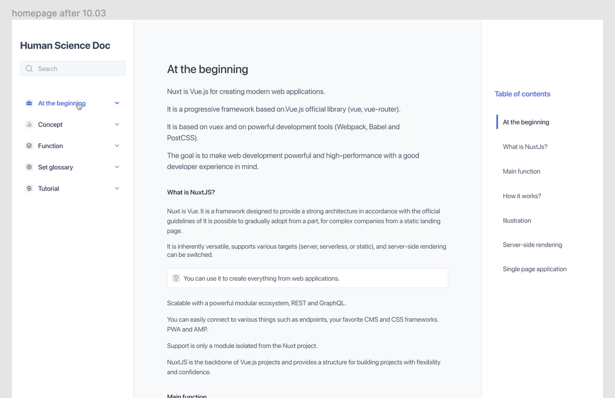
After an internal discussion, we were pretty happy with the third version but decided to look for a way to highlight more code snippets. Therefore, we created a fourth version with a sticky element that floats contextually on the right side. This version was accepted by the client.
Design
- We've started working on the design based on the mood board and design requirements.
- Because of the two challenges (performance and accessibility for English and Japanese), we did additional research on the fonts aspect
- We definitely didn't want to use any Google fonts because having so many characters (Japanese and Latin scripts) would affect the performance.
- We decided to use system fonts (San Francisco for Mac and Segoe UI for Windows).
- Using system fonts ensures that the font loading file is very light (basically, close to zero), and all use cases for foreign characters are covered.
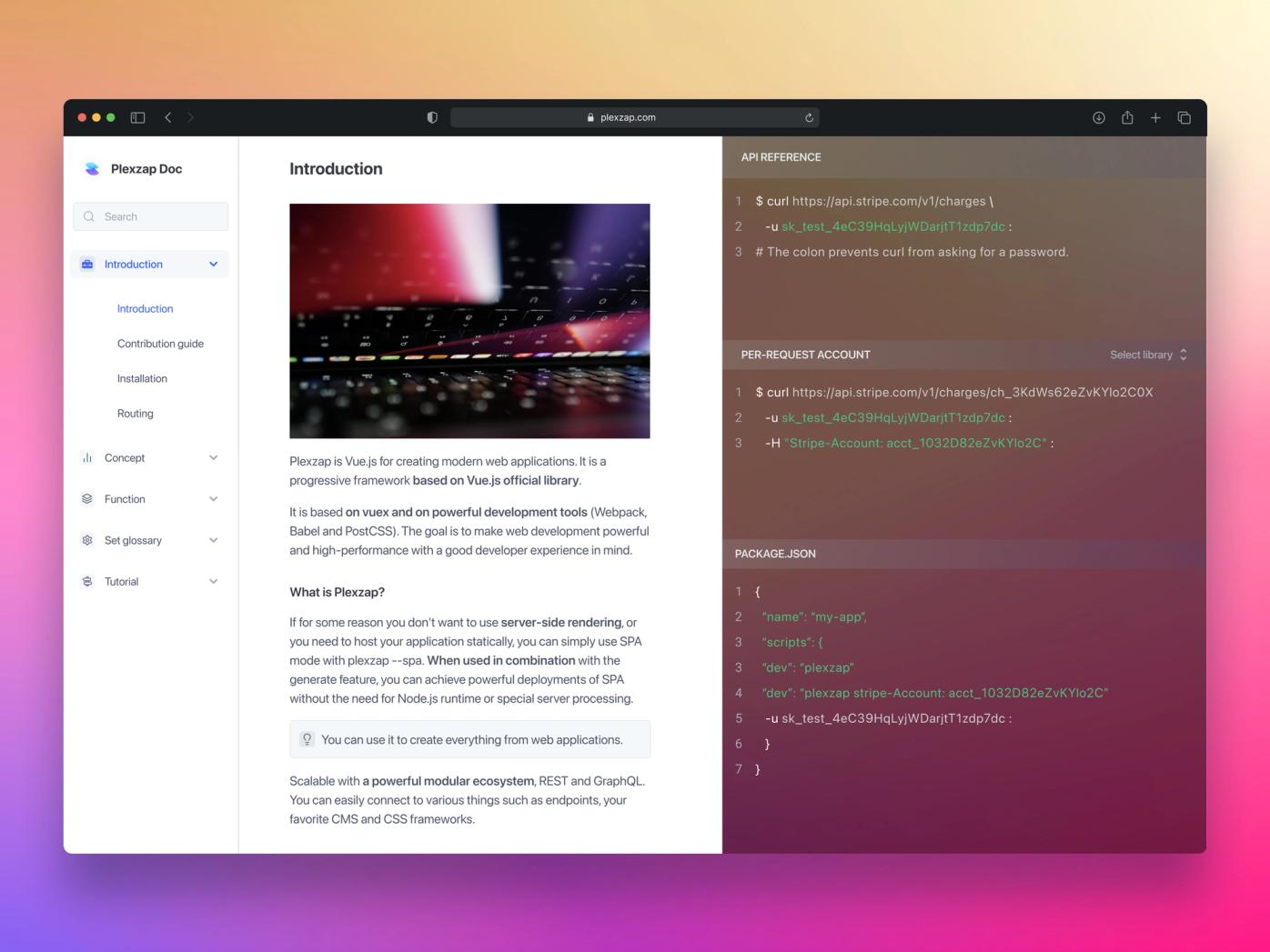
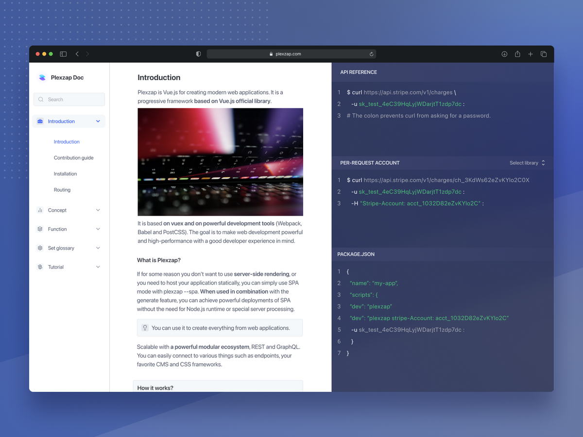
- The final accepted proposition looks like this:
- We created all states based on the approved template.
- We supported all headers, snippets, bullet points, and order lists.
- We determined what the media, such as images, videos, and voice recordings, should look.
- We prepared default, hover, active, and focus for all elements and components in our app.
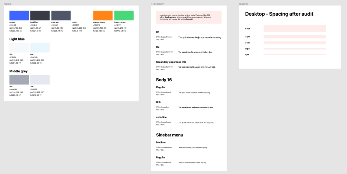
- We created a small style guide.
- We ensured conformity with the AA accessibility level.
- The smallest font size is 16px for a paragraph and 14px for a caption (in capital letters)
- We also used an 8px grid to improve the spacing system in the app.
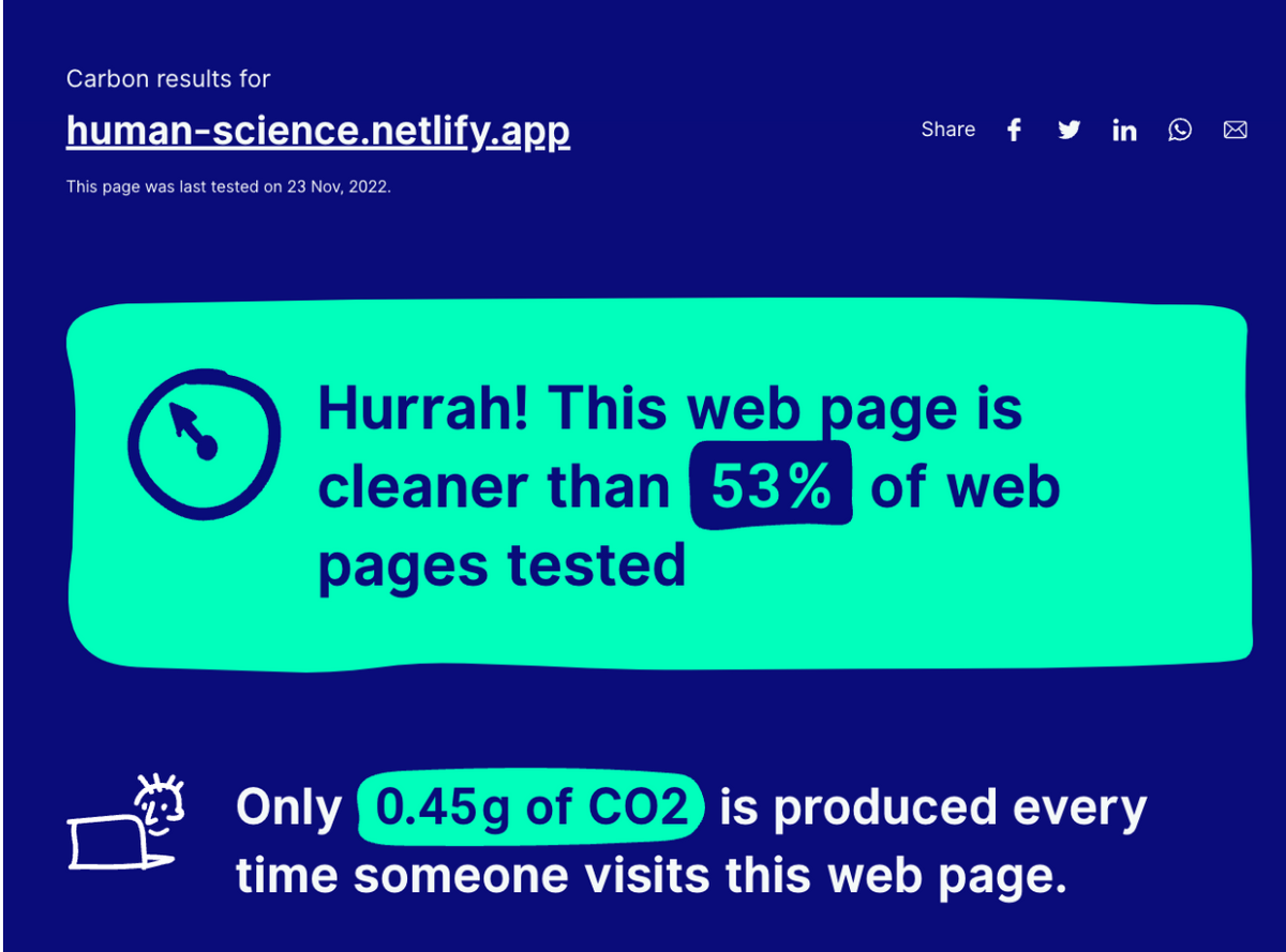
Although the site is content-heavy, we have achieved satisfactory carbon footprint results through a number of optimizations.
Summary
Initially, this project seemed very simple, but it was extremely important to think from the ground up. A good architecture and a holistic view of all use cases were crucial to this project.
Dodonut helped us with creating a design that is appealing to our target customer and we love the simplicity of the site and the ease of use. They are very open to changes and always make constructive suggestions to improve the website.
Kaoru Omiya
Project Manager at Human Science