10 Dark Patterns in UX Design and How to Avoid Them

Sign up to our newsletter


Alex is a freelance UX/UI designer, content writer, and architect. Passionate about design in all its forms.
Date added
Read time
11 minDark patterns in UX design are manipulative tactics that deceive and trick users into taking actions that primarily benefit companies, often at the expense of the user's experience.
- Common dark patterns include confirmshaming, fake urgency, bait and switch, privacy suckering, nagging, sneaking, disguised ads, intentional misdirection, the roach motel pattern, preselection, price comparison prevention, trick questions, sneaking into the basket, friend spam, and forced continuity.
- These patterns exploit human psychology to drive profits but can harm user trust and engagement.
- To avoid dark patterns, designers should prioritize transparency, user control, and ethical design practices, fostering positive user experiences and long-term customer loyalty.
Table of contents:
What Are Dark Patterns in User Experience?
A dark pattern is a term created by designer Harry Brignull. These patterns urge or persuade the user to perform actions or accept conditions they did not intend to. Companies use them to trick users into doing things that can bring them profits.
For example, some dark patterns trick users or pressure them to buy additional items, subscribe to newsletters, or spend more time on an app. Designer Sally Woellner, as part of her TED talk about Dark Patterns, calls them “worryingly effective,” and this is because they are. They focus on human psychology and marketing to hit the user’s most primitive emotional and neurological response.
Dark patterns are not present in user experiences by mistake. They are carefully crafted to appear during a certain moment of the user interaction process. Sometimes, there are design errors, and, by mistake, the interface or user flow happens to benefit the company and confuse or mislead the user. But when companies realize this creates a benefit for them and then intentionally keep it that way, it becomes a dark pattern.
Why do people fall for dark patterns?
Users often fall for dark patterns because of emotional or contextual ‘triggers,’ such as:
- Fear of missing out (your friend tagged you in this post; open the app to check it out!),
- Sunk-cost fallacy (having to accept terms and conditions or subscribing to newsletters to finish a signing-up process)
- Frustration (desisting from actions that are hidden or unnecessarily complicated).
- Confusion (ambiguous or hidden content or results from actions).
- Guilt ("Are you sure you want to leave? Your friends will miss you!").
If dark patterns are bad, why do companies use them?
At this point, it’s common to think: Why would companies use them in the first place? And you won’t be surprised to learn that the answer is money.
Industries generate more profit by creating a user experience that manipulates users to buy more, stay longer, or invite their friends to use their platforms. This usually only works in the short term, often at the expense of creating a frustrating experience. People remember bad experiences and negative emotions rather than positive ones.
— Howard Lax, Bad is Stronger than Good: Lessons for Customer Experience and Employee Engagement (and Life) LinkedIn (2018)
What are the common types of dark patterns?
Let’s discuss some of the most common dark patterns in UX and what to do instead.
Confirmshaming
This is one of the most common dark patterns. Confirmshaming means appealing to emotional blackmail to persuade people to confirm or stop actions from taking place. It’s okay to ask users if they are aware of and wish to proceed with their decisions. However, the wording and the way that it is presented can quickly turn into a dark pattern.
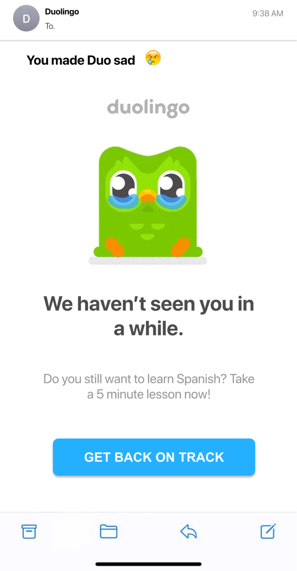
For example, the platform Duolingo sends you an email with their signature pet (an owl) crying. This is one of the most universal -yet effective- communication methods: showing sadness or vulnerability. We know an owl can’t feel sad because we’re leaving a service. Most importantly, we know the owl is not even real! However, there is something that goes beyond logic and goes straight to our emotional core.
According to The Verge, they have even redesigned Duolingo’s signature pet over the years to widen their (apparent) facial expressions and cause an emotional reaction.
Fake Urgency and the Fear of Missing Out
Similarly, creating fake urgency is another typical dark pattern in UX.
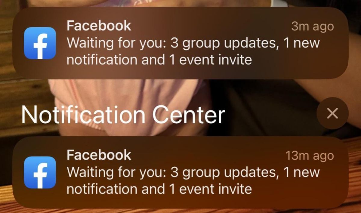
Dark patterns focus solely on the interest’s company while disregarding the user’s interest. However, they use wording and emotional manipulation to present this urgent notification as something valuable to the user. Most social media platforms nowadays create this fear of missing out (FOMO) by hinting that something is happening within the app but without explaining in detail what that means.
A good example is a notification along the lines of “Your friends miss you” or “You have been invited to an event” to encourage you and find out what this is. Once you click or tap on the notification, you are inside the app, and it can show you endless content and make you stay for hours.
We all know and understand that companies want their customers to spend as much time as possible on their apps. But this gets out of scale often, and in reality, it invades the user’s lives while providing very little value.
Nagging
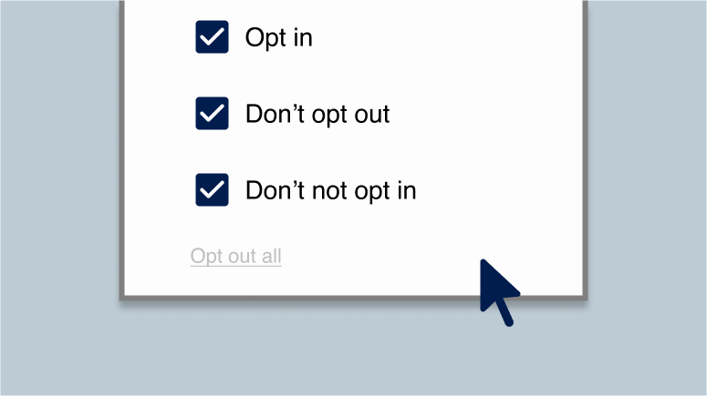
Nagging is, in other words, not accepting a ‘No’ for an answer.
The most obvious example is suggesting premium subscriptions or newsletters but without allowing the user to refuse permanently. Replacing the “No” option with a “Not now,” “Not yet,” or “Maybe later” removes the choice from the user to benefit the company. The user, eventually, may accept those conditions because they give up in a way after the platform has nagged them once a day, for example.
Sneaking
Also called obstruction, sneaking is the act of including a secondary action in the middle of (usually towards the end of) a primary action. The user wants to complete the primary action but is not entirely aware of or is manipulated into accepting the secondary action.
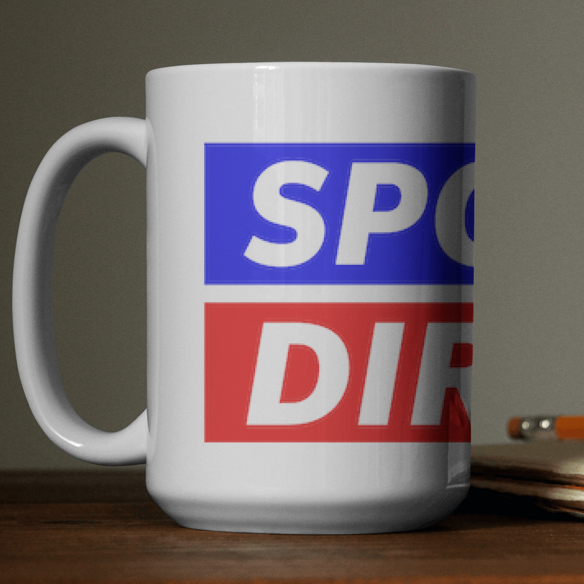
In the past, companies, mostly from e-commerce, have already used sneaking to include additional cheap products (such as mugs) or hidden costs in the final step of the action. Because the additional amount is so small, most users won't complain or ask for a refund.
The Deceptive Patterns page has talked about this in the past with the Sports Direct case.
Companies can (and should) suggest items that may be valuable to the user, either by common sense or by data (e.g., items that users buy in tandem). But it becomes a dark UX pattern when they outright place products or services that the user does not care for, and would have never thought of getting them otherwise.
Disguised Ads
Social media sites disguise ads very easily nowadays because they present the content, as cards or “blocks” with infinite scrolling.
This allows them to “sneak” an ad seamlessly and present it as another post. They disclose the fact that they are including ads, but in a very discreet way that goes unnoticed. The user ends up confusing ads with the “real” content they want to see. This often causes the user to end up on a different website than intended.
Other times, they just end up viewing content they are not interested in, or that provides no value.
Intentional Misdirection
Intentional misdirection is the use of visual or text content that creates an outcome that is ambiguous, vague or, even worse, the opposite of the desired or expected outcome.
Let’s think of an example: a user wants to cancel a subscription to a newsletter. When asking to confirm this action, a button with the word ‘Cancel’ may have two meanings: either ‘confirm’ the cancellation or ‘cancel’ the cancellation. This can happen by unintentional or poor wording or visual indicators (color, shape).
The Roach Motel Pattern
We see the roach motel pattern when actions that benefit the company are sometimes intuitive, enticing, and even pushy. Conversely, actions that benefit the user and not the company are complex, ambiguous, and tedious.
Companies often use this pattern to ‘lure’ the user into taking an action by confusing or manipulating them. They make this process extremely smooth and direct; once they perform those actions, it’s hard to cancel or undo them.
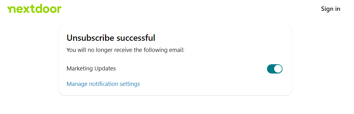
In most companies, subscribing to a newsletter is easy, straightforward, and pointed out with a big CTA. However, unsubscribing is done via email, and users need to find the word Unsubscribe with a small, gray font that goes easily unnoticed. Even after users try to unsubscribe, they are asked to confirm several times and fill out surveys that discourage them from continuing this process. Sometimes, they even need to make a phone call or even go to a physical office.
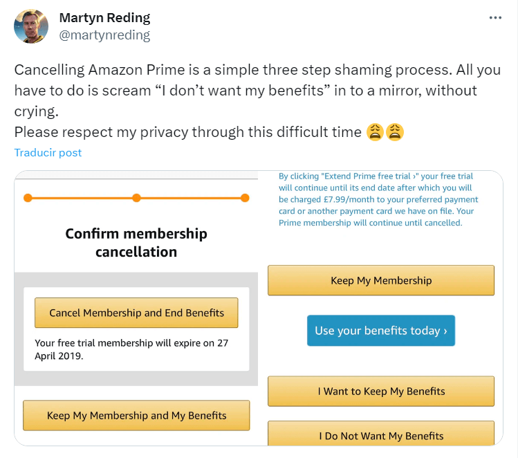
Amazon’s users have had issues when canceling their Amazon Prime subscription, and with deleting their accounts as well.
In fact, the company recently had to simplify the process required for canceling their Prime membership, to meet EU regulations.
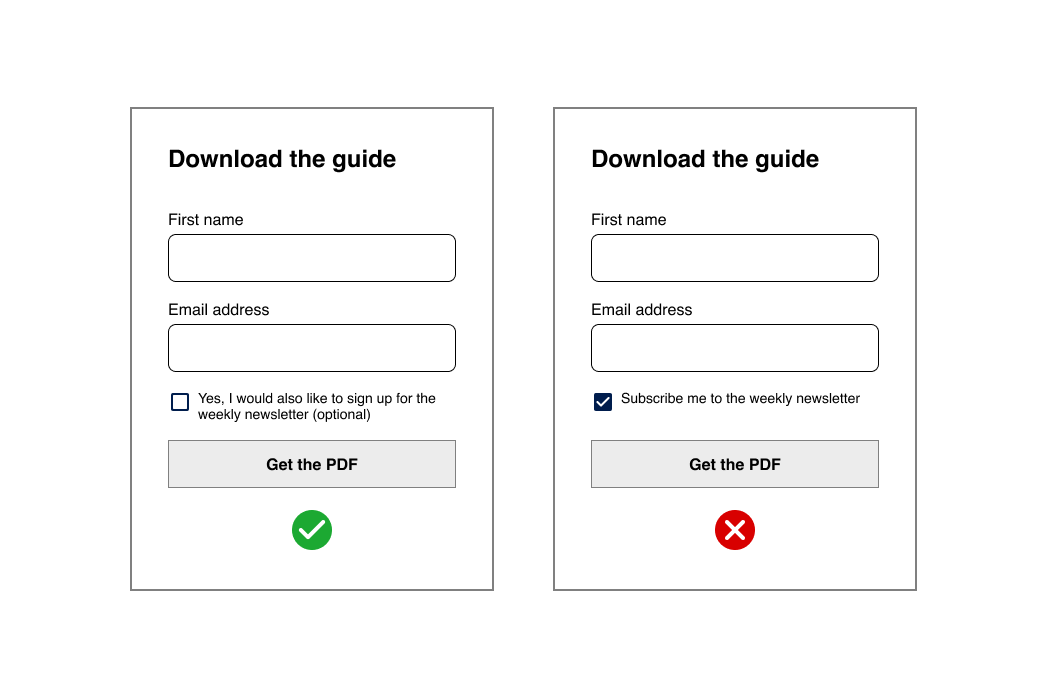
Preselection
We see this dark pattern often in conjunction with the roach motel pattern. With preselection, users aren’t even enticed or manipulated into taking actions: the platform already ‘pre-selected’ these actions for them. Again, this pattern applies to actions that benefit the company and that users wouldn’t usually choose by themselves.
With preselection, users end up subscribing to newsletters or getting premium travel insurance without noticing, for example. When the company creates actions that only benefit them and not the user, it should be completely up to them to agree to that action after being informed of the possible benefits and conditions.
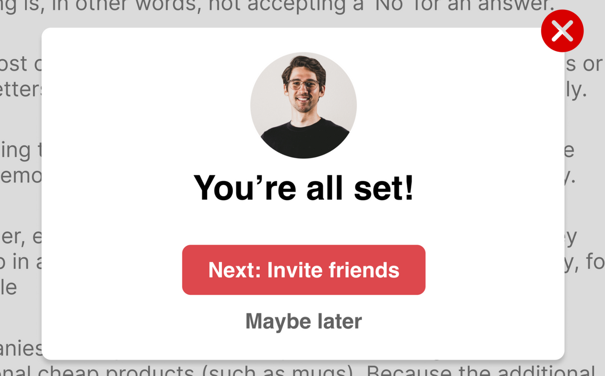
Friend Spam
Companies use friend spam to manipulate users into giving them social media permissions and access to their contacts.
They often disguise this action as ‘inviting your friends’ or similar actions that seem to offer a positive outcome to the user. IIn 2013, LinkedIn received a lawsuit for harvesting some of their user’s contacts, going as far as sending an email on the user’s behalf to all the people in their email contact list. This could go anywhere from their boss to a friend from high school.
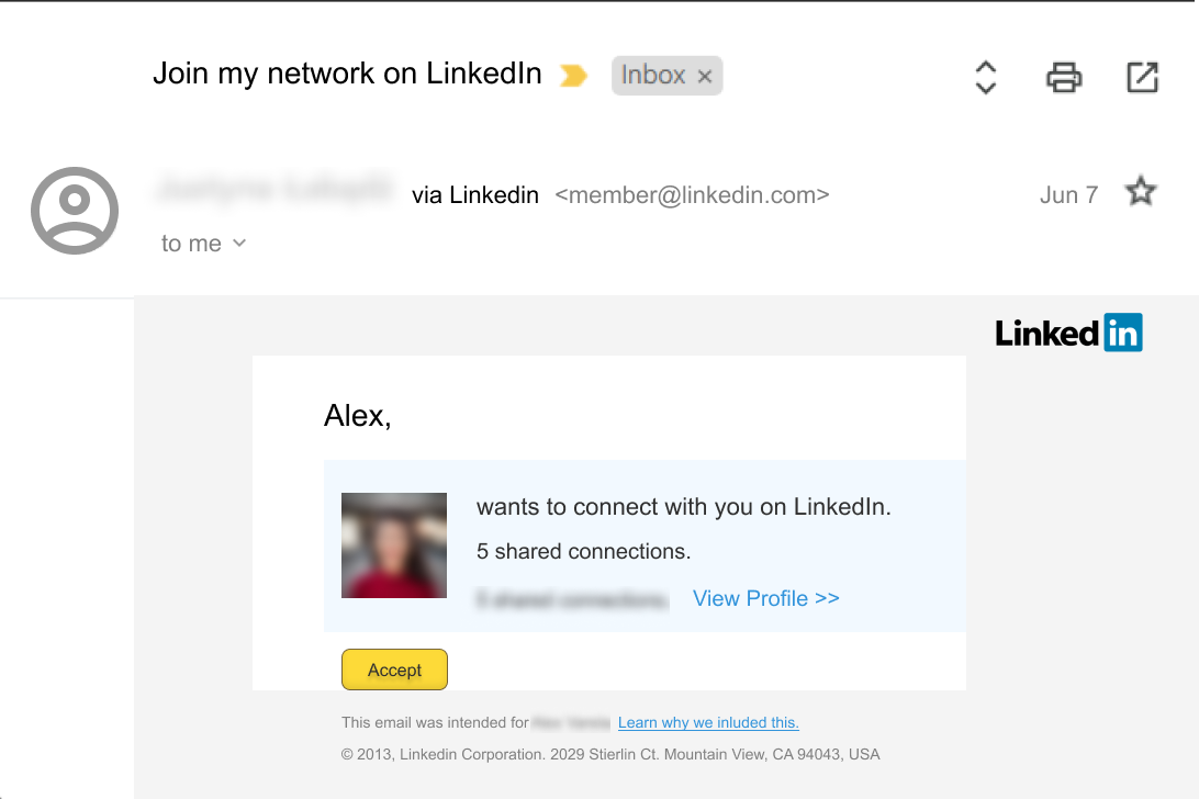
Jonathan Shariat speaks about this experience in his book:
— Jonathan Shariat and Cynthia Savard Saucier, “Tragic Design”, O’Reilly Media 2017
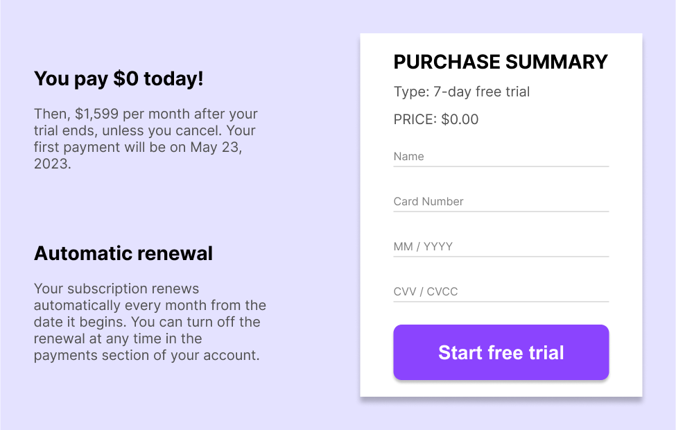
Negative Option Billing or Forced Continuity
With this another dark pattern, companies manipulate the user into giving their billing data or information, sometimes even promising a free trial or a discount in exchange for a product or service.
With time, they start charging a recurring billing or subscription with no chance to opt-out. They use wording and manipulation to assure the user they won’t be charged anything right now. They start charging money after a month or two when the user forgets the subscription.
In UX, it’s important to give the user control and freedom to the actions taking place on the platform. If these actions involve billing, it’s even more critical. This can be fixed easily by emailing the user to let them know they will start charging money 3-5 days before the end of the free trial.
How to Avoid Dark Patterns in UX Design
If we want to avoid dark patterns and deceptive design, we need a good combination of research and common sense.
Following research data to avoid Dark Patterns
- Competitive Analysis: For research, it's essential to be aware of the competition. What are some good examples of UX from similar platforms? Do their users complain about UX dark patterns? How do they convince users to subscribe to newsletters or buy their products or services?
- User Testing is a great way to detect design errors that can potentially become dark patterns and also to see how users react to the wording, interface, and user flow (e.g., suggesting a premium subscription is too pushy or the wording makes them feel manipulated).
Following common sense to avoid Dark Patterns
As designers and users of digital products, it’s safe to say we have increased our attunement and common sense over time. Platforms usually have similar dark patterns because they share similar goals: sell a product, offer a service, or increase outreach (e.g., newsletters, followers).
Here are some common sense tips to avoid dark patterns in UX:
- Be transparent with the user to earn their trust and give them control and freedom to make an informed decision before taking an action.
- Test and iterate your product until there’s a balance between the user’s and the company’s best interests.
- Follow the best design principles and usability heuristics to keep the design user-centered and avoid common mistakes.
- Create design patterns that benefit the user, even if it harms the company. At some point, the user wants to feel valued and heard and that they control the platform, not the other way around.
There are many ways to make the user feel valued and heard, even if it doesn’t directly benefit the company.
YouTube included two reminders to take a break and close the app every X minutes and also a bedtime reminder to stop using the app between 11 p.m. and 8 a.m., for example.
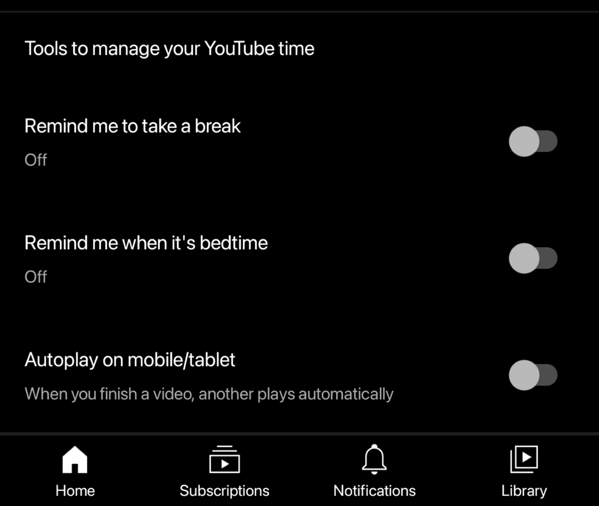
The YouTube mobile app includes tools to manage time spent on the app. Even though the platform encourages the user to spend more time, these reminders help balance the user’s experience and avoid burnout.
Ryanair has a dark pattern history, hiding their “Don’t insure me” option inside an unrelated dropdown menu. This was heavily criticized in the past and is now illegal in the UK and the European Union. Since then, they have changed it for a much more friendly user interface.
With these strategies, users will leave a genuine, positive impression. This leads to satisfaction, positive reviews, and profit in the long term. Also, it helps to create more sustainable websites because it reduces content on a website, emails, newsletters, and unnecessary information in general.
Conclusion
We all know that companies want to make money by offering products and services, and there’s nothing wrong with that!
But there’s a difference between inviting the user to interact with the platform in a certain way while still giving them a positive experience and pressuring the user to do things that do not benefit them or punishing them for acting in a way that does not benefit the company.
Companies can find several reasons to avoid dark patterns. By following best design practices, they can build a positive brand image, maintain customer trust, and adhere to legal and ethical standards. In a long-distance it promotes transparency and a long-term focus on customer satisfaction and loyalty, ultimately benefiting the company's growth and sustainability.
As UX designers, it’s not easy to balance out company profit and positive user experiences. Sometimes, we don’t even notice the design process we create causes frustration and even makes people lose money. But by learning more about dark patterns, we can understand further how to avoid them and enhance the user experience. After all, we can always strive to be more transparent and ethical to our target audience and, why not, to ourselves as well.
References
-
Brignull, Harry (2023). Deceptive Patterns: exposing the tricks tech companies use. Testimonium Ltd.
-
Royal-Lawson James and Axbom, Per, hosts. “#150 Dark Patterns with Harry Brignull”. UXPodcast. February 03, 2017
-
Shariat, Jonathan and Savard, Cynthia (2017). Tragic Design: the impact of bad design and how to fix it. O’Reilly Media.
-
Woellner, Sally (2021, November). Dark Patterns: How design seeks to control us. TedxSydney. Retrieved August 01, 2023
Need a Full-Stack Design Team?
Our team handles all aspects of design, making your ideas a reality.
This article emits ~0.23g of CO2.


