Minimalist Color Palette and Typography in Web Design

Sign up to our newsletter


Aleru is a versatile pro in design, software, and tech writing. Passion for tech and design. Enjoys history, tea, and adventure.
Date added
Read time
8 minAdopting a minimalist color palette and typography in web design represents a design philosophy that goes beyond aesthetics with a clean and uncluttered design. It's a conscious choice that:
- simplifies the user experience,
- fosters a sense of clarity and focus,
- enhances accessibility,
- and significantly reduces a website's environmental impact.
Discover the principles of minimalist color palettes and typography on the website to craft the best user experience, boost your brand image and keep your visitors engaged to your digital product or service.
Table of contents:
The Impact of Color Palettes on User Perception in Minimalist Web Design
When used judiciously, color can transform a minimalist design from bland to breathtaking. Understanding the impact of color palettes on user perception is of paramount importance. How colors are employed in minimalist design can significantly influence how users perceive and engage with a website.
A cohesive minimalist color palette typically comprises a limited selection of neutral and muted colors. These colors create a clean, sophisticated look, making essential elements stand out. Here's an example of a minimalist color palette with their HEX codes and the way how they influence users:
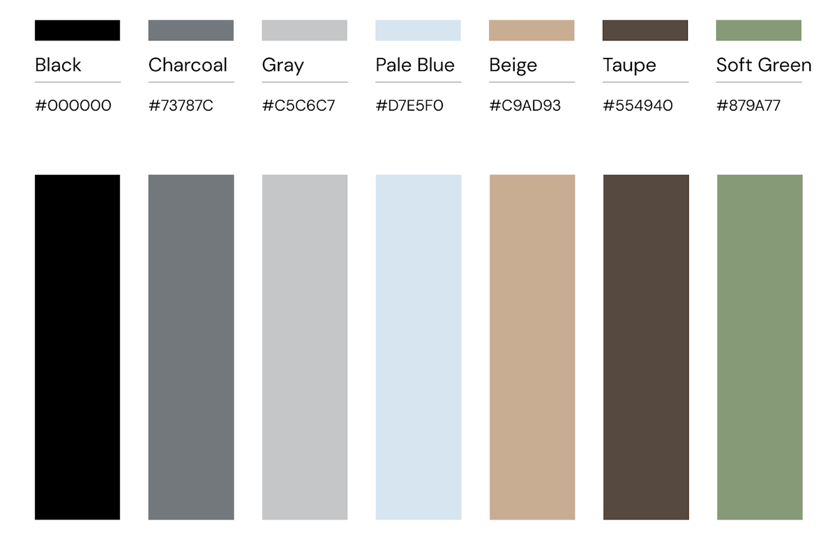
White: White is the epitome of minimalism. It represents purity, simplicity, and cleanliness. It serves as an excellent background color and creates a sense of spaciousness.
Black: Black provides a solid contrast to white and adds a touch of elegance and luxury. Designers can use it for text, headings, or as an accent color to generate visual appeal.
Gray: Gray comes in light and dark shades. Designers can use it for background elements or as a subtle accent. Light gray offers a softer look, while dark gray can add depth and sophistication.
Light Beige or Cream: These warm, neutral colors can add warmth to your minimalist palette. They work well for backgrounds or as an alternative to white, providing a softer look.
Pale Blue: A muted or pastel blue can bring calmness and serenity to your palette. It is an excellent choice for accent elements or subtle highlights.
Soft Green: A muted green can evoke a sense of nature and tranquility. Designers can use it sparingly for buttons, icons, or other interactive elements.
Charcoal: A slightly darker gray, such as charcoal gray, can add contrast and depth without straying too far from the minimalist aesthetic.
Taupe: Taupe is a neutral color with a hint of brown and gray. It can add warmth and sophistication to your palette, especially for text or subtle accents.
Colors combination employed in minimalist design can significantly influence how users perceive and engage with a website. Check out how the color theory works in practice and how a sophisticated color palette can breathe personality into brand design.
Clarity and Simplicity
Minimalist web design hinges on clarity and simplicity. A limited color palette, often featuring neutral tones like whites, grays, and blacks, can contribute to a sense of elegance and sophistication. Such color choices allow for a clean canvas where essential elements like content and navigation can take center stage.
Users encountering a minimalist website with a well-chosen color palette may perceive it as more straightforward, professional, and user-friendly. The absence of unnecessary visual clutter can enhance the overall user experience.

Focus on Content
Content reigns supreme in minimalist design. Color palettes are pivotal in digital marketing to not overwhelm the users and direct their attention to essential content and call to action. Selective use of color can make headlines, buttons, and key messages stand out against a subdued background.
For instance, sparingly using a bold accent color for buttons or links can draw users' eyes to interactive elements, encouraging them to take desired actions. This strategic use of color enhances user perception by guiding them toward critical information and interactions.

Branding and Identity
While minimalist design favors simplicity, it does not preclude the establishment of a strong brand identity. Designers can strategically use color palettes in minimalist web design to reinforce brand recognition and values.
Consistency in color choices across a minimalist website aligns with the brand's identity and can foster a sense of trust and reliability. Minimalist design's emphasis on precision can amplify the impact of a brand's chosen colors, making them even more memorable to users.
Photo credit: Sequence
Accessibility and Inclusivity
Minimalist web design should prioritize accessibility and inclusivity. Even with a limited color palette, designers must ensure the site remains accessible to all users, including those with visual impairments.
High contrast between text and background is crucial for readability, and designers should adhere to accessibility guidelines to guarantee that color choices do not hinder content comprehension. Proper use of color contrast and alternative text for color-coded information can enhance the user experience for everyone.
A/B Testing and Iteration
To truly understand the impact of color palettes on user perception in minimalist web design, designers can turn to A/B testing. By creating different versions of a website with variations in colorpalette and analyzing user responses, designers can fine-tune their choices based on data-driven insights.
A/B testing ensures that color palettes are not chosen arbitrarily but tailored to the target audience's specific preferences and behaviors, optimizing user perception and engagement.
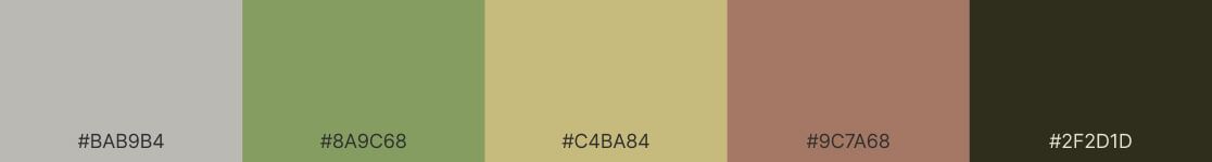
15 Minimalist Color Palettes For Your Next Design
Step into the design world with our handpicked selection of 17 minimalist color palettes. Each palette has been thoughtfully curated to reflect the beauty of simplicity and sophistication. Whether you're a designer, artist, or simply seeking inspiration for the project mood board, these color schemes offer a diverse range of options, from monochromatic elegance to nature-inspired serenity. Dive in and discover the ready-to-use set of minimalist color palette for your brand.


Typography choices for readability and elegance
Simplicity and clarity characterize minimalist web design. It strips away the unnecessary, focusing on essential elements to provide users with a clean, uncluttered experience. Typography does not just play a role in such a design—it takes center stage. Without the distractions of excessive graphics or colors, the typeface, size, and text arrangement become paramount.
Typography quietly but powerfully shapes user experiences. It becomes the unsung hero, especially in minimalist web design, where every element is purposefully chosen and placed. It's also about presenting words and conveying messages, emotions, and brand identity.
Why Typography Matters
Where visuals often steal the limelight, typography subtly yet significantly influences user interactions. Typography is pivotal, especially in minimalist web design, where simplicity is favored over clutter.
Beyond aesthetics, typography plays a crucial role in web font optimization. In this vein, it's worth highlighting the value of system fonts. These default fonts, pre-installed on various operating systems, bring several advantages to the table. By utilizing system fonts, websites can achieve faster loading times since these fonts are native to the user's device. This not only streamlines user experience (UX) by reducing load times but also bolsters sustainability through minimized data transfer. The familiarity and consistency of system fonts further enhance the UX, making them a strategic choice for efficient and user-friendly web design.
For a comprehensive dive into web font optimization and its significance, you can refer to our blog post on Web Font Optimization.
Key Points to Consider in Minimalist Typography
Hierarchy: Establishing a clear typographic hierarchy is essential. This means differentiating headings, subheadings, and body text using varying font sizes, weights, and sometimes even typefaces. It guides the reader's eye and structures your content, making it easily digestible.
Optimal Line Spacing and Length: The space between lines, known as leading, can affect the overall legibility of text. Too little space can make text feel cramped, while too much can disconnect lines of text. Similarly, the optimal line length (or measure) ensures readers can comfortably move from one line to the next. A good rule is to aim for 50-75 characters per line.
Emphasis on Restraint: In minimalist design, less truly is more. While it is essential to emphasize key points, over-styling (using italics, bold, underlines, and caps) can disrupt the flow. Use these styles sparingly and intentionally.
Minimalist color palette and typography for sustainability
A minimalist approach to choosing both color palettes and typography for your brand has multifaceted benefits that encompass environmental sustainability and user experience optimization. By deliberately curating your design choices, you can significantly lower your website's carbon footprint and enhance its overall efficiency.
Sustainable web design can go with many different styles, such as neubrutalism (that we used on the Dodonut website), brutalism, or skeuomorphism. In each case, when used properly, it can minimize the environmental impact of the website.
Color Palette and Energy Efficiency
One crucial aspect of color palette selection is the consideration of specific colors and their associated energy requirements. For instance, vivid and bright colors, such as electric blues, typically necessitate a larger amount of energy to be accurately rendered on screens. This heightened energy consumption arises from the need for more intensive backlighting in the case of displays like LED or OLED screens.
By opting for a minimalist color palette, you intentionally mitigate the use of energy-intensive shades, focusing instead on more subdued, energy-efficient colors. Earthy tones and softer pastels, for example, are gentler on energy consumption while still providing an appealing visual aesthetic. By making such conscious choices, you reduce the carbon footprint connected to the operation of digital devices and servers.
Typography and User Experience
Typography plays a pivotal role in the user experience. Selecting a minimalistic and legible font not only ensures a visually pleasing design but also enhances readability and comprehension. A clean and straightforward typeface improves the overall accessibility of your content, making it easier for users to engage with your website.
Dark Mode for Lower Energy Consumption
In addition to color palette choices, you can implement a dark mode feature on your website, significantly reducing energy consumption, especially on devices with OLED or AMOLED screens. Dark mode features dark background colors and lighter text, resulting in less power-hungry pixels being illuminated. This not only saves energy but also extends the battery life of portable devices, further contributing to an eco-conscious approach.
Opting for Darker Colors
While dark mode is an effective way to reduce energy consumption, you can also incorporate darker colors into your perfect color palette. Deep grays and dark blues, for instance, are energy-efficient choices that still convey sophistication and modernity. These colors are not only pleasing to the eye but also environmentally responsible in terms of energy consumption.
Conclusion
In sum, minimalist color palettes and typography are more than design elements; they're gateways to a cleaner, more accessible, and eco-friendly digital future. By adopting these principles, designers create a harmonious blend of form and function, ensuring that websites for brands, products and services are not just visually pleasing but also serve as sustainable, user-friendly, and brand-reinforcing platforms. So, whether you're revamping an existing website or embarking on a new design project, consider the minimalist approach as a powerful ally in the ever-evolving world of web design.
References
-
Color matters, https://www.colormatters.com/
Need a Full-Stack Design Team?
Our team handles all aspects of design, making your ideas a reality.
This article emits ~0.23g of CO2.


