Minimalist Web Design: Emphasizing Clean, Simple Layouts and Essential Elements in Modern Websites


Aleru is a versatile pro in design, software, and tech writing. Passion for tech and design. Enjoys history, tea, and adventure.
Date added
Read time
14 minMinimalist web design emphasizes simplicity, utility, and user-centricity. It incorporates simplicity, essential focus, negative space utilization, and intuitive navigation. This approach offers improved user experiences, optimized performance, and enhanced mobile responsiveness, all while maintaining brand identity through carefully chosen typography and color palettes.
- Principles: Simplicity, essential elements, negative space, intuitive navigation.
- Benefits: Improved user experience, performance optimization, mobile responsiveness, and enhanced brand identity.
- Design Elements: Typography and color palettes are critical for aesthetics and conveying messages.
- Design Tips: Start with wireframes, balance minimalism with functionality, and prioritize content.
- Challenges: Maintaining brand identity and handling complex content structures.
Table of contents:
Introduction
Minimalist web design is about highlighting clarity, simplicity, and utility. Rather than overwhelming the user with many components and detailed designs, it aims to showcase what is crucial in a clean and direct style. Picture entering a well-organized room where each item has a specific role; this reflects the spirit of minimalist digital design: a user-centric space that boosts readability and guarantees smooth navigation.
This design ethos does not advocate for stripping away all ornamental features. Instead, it is about deciding which elements to showcase and which to omit. Within this design framework, every detail, from font choices to color palettes, serves a function and is meticulously selected to enhance the design and message.
As this article progresses, we'll delve into the specifics of this popular design approach, understand its foundational principles, and see its role as a refreshing contrast to the sometimes-overloaded online design world. We also show some excellent examples of minimalist aesthetic in graphic design. By grasping the subtleties of minimalist web design, designers and developers can create online platforms that satisfy both beauty and efficiency. Want to learn how to leverage minimalism to create attractive but simple website designs? Let's explore this topic in depth.
The Principles of Minimalist Web Design
Minimalist web design transcends merely a trend for 2023. It is instead a reaction to the information overload users often experience on the web. It offers a clean and concise user experience, emphasizing content and functionality over unnecessary design elements. Here are some of the foundational principles of minimalist web design.
Simplicity
Minimalist websites live by the principle "simplicity is the ultimate sophistication." It is not about reducing the number of elements on a page but ensuring that what remains is what is necessary. This principle recognizes that the best UI designs don't distract users but guide them through content and toward a desired action.
Key Characteristics of Simplicity in Web Design
- Limited Color Palette: Minimalist designs often utilize monochromatic or limited color palettes. This creates a cohesive look and feel and draws attention to specific interest points.
- Clean Fonts: Stick to one or two simple, legible fonts for consistent typography. Avoid stylized fonts that can be difficult to read.
- Flat Design: This approach prioritizes flat textures and icons over gradients, shadows, and 3D animations, creating a cleaner interface.
Focus on Essential Elements
Minimalist web design isn’t about removing as much content as possible but emphasizing the most essential content. By stripping away non-essential elements, users can focus on what matters.
Strategies to Focus on Essentials
- Prioritize Content: Determine what the most critical message or action for your audience is and design around that.
- Limit Features and Functionalities: Only include features that provide value to your primary objective.
- High-Quality Imagery: When using images, choose high-quality ones that resonate with your message. Instead of multiple mediocre images, one impactful image can deliver the message more effectively.
White Space and Balance
Negative space, often called "white space," is the unmarked space between elements. It does not have to be white; it refers to the space in the design. Negative space keeps the viewer or user focused on the essential elements of the page. That's why it is often used in minimalist websites. Negative space can lead to a balanced and harmonious layout when used correctly.
By eliminating elements unrelated to the page's objective, designers guarantee a more enjoyable and less stressful user experience. The most demanding part of employing negative space lies in striking the right balance; removing too much might lead users to need more time to search for essential features, which would contradict the essence of minimal design.
Benefits of Negative Space
- Improves Readability: Ample space between text and visual elements can make content more digestible.
- Emphasizes Important Elements: Providing space around an element draws attention and becomes a focal point.
- Creates a Balanced Layout: A well-spaced layout feels more aesthetically pleasing and organized, leading to a more enjoyable user experience.
Intuitive Navigation
One of the hallmarks of a successful minimalist website is information architecture (IA). Information architecture (IA) is the practice of organizing information to make it easily accessible to users. It is a crucial component of user experience, ensuring that content is structured logically allowing users to navigate and find what they need efficiently. The website fails its primary function if users cannot easily find what they want. When IA is done right, it leads to intuitive navigation, allowing users to seamlessly find the information or features they seek. In essence, intuitive navigation is a direct outcome of well-implemented information architecture.
How to Ensure Intuitive Navigation:
- Consistent Navigation: Keep your primary navigation consistent across all pages. Users should not have to guess where to find the menu or search bar.
- Descriptive Labels: Use clear and concise wording for navigation links. Avoid vague or trendy labels that might confuse visitors.
- Mobile Responsiveness: Ensure that navigation is just as intuitive on mobile devices. A collapsible menu or a simple bottom navigation bar can streamline things for mobile users.
The Benefits of Minimalist Website Design
A minimalist website focuses on the essentials, delivering content and functionality without overwhelming or confusing the user. Minimalism in web design also offers functional advantages. Let’s explore some of the benefits of adopting a minimalist approach.
Improved user experience
A minimalist approach removes unnecessary elements, allowing users to navigate with ease. This simplicity ensures visitors can focus on the content without distractions, leading to a more enjoyable and intuitive browsing journey.
Accessibility
Another benefit of the minimalist website is simple structure and enhanced accessibility. By reducing clutter and focusing on essentials, minimalist websites become more navigable for individuals with disabilities. This simplicity aids those using screen readers, people with cognitive disabilities, those with changing motor skills, and the aging population. A minimalist approach ensures that digital spaces are inclusive, accommodating a broader range of users with diverse needs.
Optimizing performance
With fewer elements to load, minimalist designs ensure faster loading times and reduced data usage. This streamlined approach minimizes lag, keeping visitors engaged and reducing bounce rates.
Sustainability
Adopting a minimalist web design not only optimizes performance but also promotes sustainability in web design. Fewer elements mean less data to transfer, reducing energy consumption for servers and end-user devices. This approach contributes to a reduced carbon footprint, emphasizing the importance of eco-friendly practices in the digital space.
Enhanced mobile responsiveness
Minimalist designs naturally adapt to various screen sizes, making them ideal for mobile browsing. By eliminating excessive graphics and content, users on handheld devices can easily access and interact with the site's main features.
Brand identity and memorability
Minimalist web design emphasizes essential elements, allowing brands to highlight their unique attributes and messages. This clear and focused presentation reinforces brand identity and enhances memorability. Eliminating distractions accentuates the primary content and calls-to-action (CTAs), potentially leading to better engagement and higher conversion rates. As a result, the brand becomes more trusted and memorable among its audience.
Best Minimalist Websites Example
Let's check how to apply minimalistic aesthetics by exploring chosen examples of minimalist website design and investigating their approach and overall design style. We have collected a few examples of minimalist website design and represented companies' approach to implementing a minimalist vibe:
1. Google Search
Website type: Web search engine
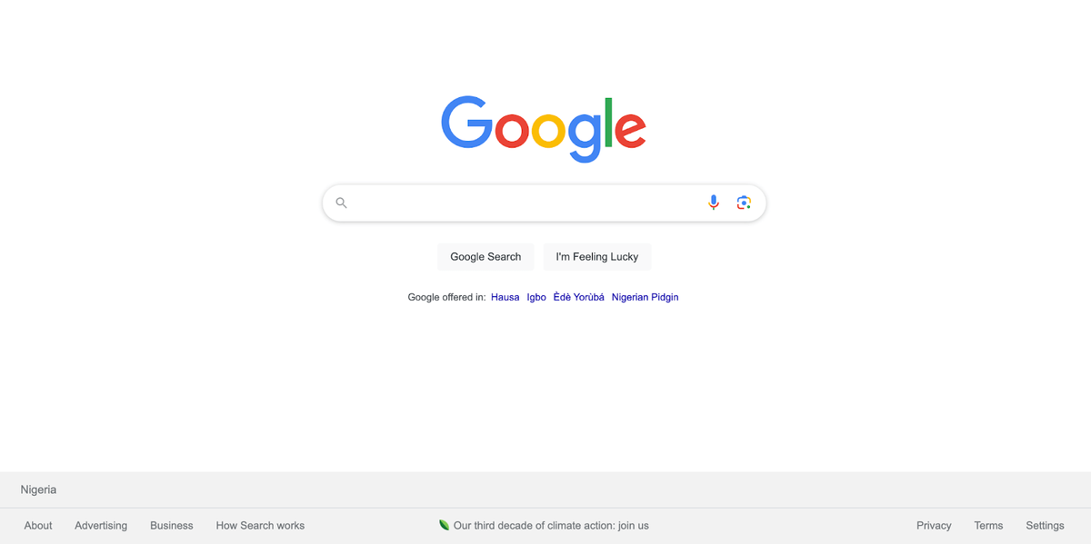
Review of Google's Minimalist Web Design
- Clean Design: Google's search page is free from unnecessary graphics and ads, with a white background contrasting its colorful logo.
- Simplicity: The design centers around the search bar, ensuring even first-time users can navigate easily.
- Focus on Function: By eliminating distractions, users are directed solely to the search function.
Advantages of Google Design
- User-Friendly: Suitable for all ages and tech levels.
- Fast Loading: Minimal elements mean quicker page loads.
- Adaptable: Works seamlessly across devices.
- Reduced Cognitive Load: Users can focus on their primary task without distractions.
2. Sequence
Website type: Quote to Revenue
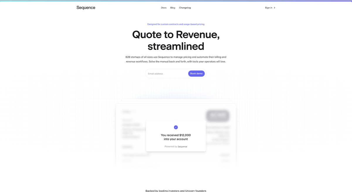
Review of Sequence's Minimalist Design
- Clear Messaging: Sequence's homepage immediately conveys its core offering: a platform designed for revenue operations, particularly for businesses with custom contracts and usage-based pricing.
- Structured Layout: The website uses and presents information logically, starting with its primary features. As you scroll, you can explore its advantages, testimonials, and a call to action.
- Visual Consistency: The design maintains a consistent color scheme and typography, reinforcing brand identity and ensuring a cohesive user experience.
Advantages of Sequence Design
- User Navigation: The site's layout is intuitive, with clear headings and sections that guide visitors through its offerings.
- Engaging Visuals: The use of graphics and icons complements the textual content, making it more engaging and easier to digest.
- Comprehensive Information: The site offers detailed insights into its features, benefits, and how it integrates with other platforms, ensuring visitors have all the information they need.
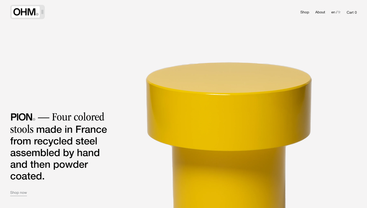
3. Giopato & Coombes
Website type: Design Studio
Review of Giopato & Coombes' Minimalist Design
- Elegant Aesthetics: The website exudes a sense of luxury and sophistication, aligning with the brand's positioning in the high-end lighting market.
- Clear Brand Messaging: The site effectively communicates its mission of bringing wonder to living spaces through its unique lighting designs.
- Structured Layout: Information is presented logically, from collections to custom-made designs, installations, and commissions.
Advantages of Giopato & Coombes Design
- Intuitive Navigation: The site's layout is user-friendly, with clear headings and sections that guide visitors through its offerings.
- Engaging Visuals: The website likely uses high-quality images of its products (based on textual content), complementing the textual descriptions and enhancing user engagement.
- Personal Touch: The emphasis on custom-made designs and the brand's journey adds a personal touch, making the brand more relatable to visitors.
- Comprehensive Information: From collections to custom-made solutions and installations, the site offers a holistic view of what Giopato & Coombes offer.
4. Proximity
Website type: Blockchain
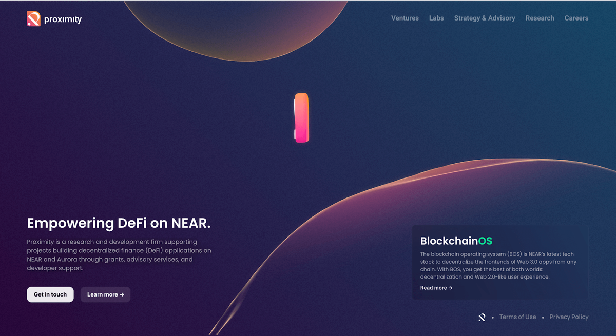
Review of Proximity's Minimalist Design
- Clear Messaging: The website immediately communicates its core mission: empowering decentralized finance (DeFi) on NEAR. This clarity ensures visitors understand the site's purpose right away.
- Simplicity in Design: The design is straightforward, focusing on the essential information about their services and the technologies they support.
- Call to Action: The "get in touch" and "learn more" prompts are clear calls to action, guiding visitors on the next steps.
Advantages of Proximity Design
- User-Friendly: The site's layout is intuitive, making it easy for visitors to navigate and understand the services offered.
- Modern Aesthetics: The design feels contemporary, aligning with the cutting-edge nature of blockchain and DeFi.
- Focused Content: The content is concise and centered on Proximity's expertise in supporting DeFi projects on NEAR and Aurora.
5. 425 Park Avenue
Website type: Real Estate
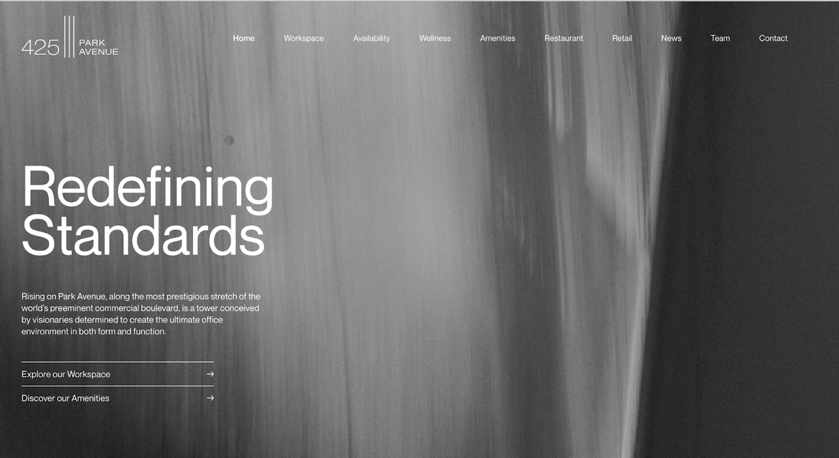
Review of 425 Park Avenue's Web Design
- Sophisticated Aesthetics: The website likely presents a luxurious and refined design, aligning with the brand's positioning in the high-end real estate market.
- Clear Brand Messaging: The site communicates the brand's mission of offering premium office spaces in a prime location.
- Structured Layout: Information is likely presented logically, showcasing the building's features, amenities, location, and architectural significance.
Advantages of 425 Park Avenue Design
- Intuitive Navigation: The site's layout is expected to be user-friendly, guiding visitors through its offerings with clear headings and sections.
- Engaging Visuals: High-quality images of the building, interiors, and surrounding areas would enhance user engagement and provide a visual treat.
- Detailed Information: The website likely offers comprehensive insights into the building's features, amenities, and the unique value proposition it brings to potential tenants.
- Location Emphasis: Given its prime location, the site probably emphasizes the advantages of being situated at such a prestigious address.
Overall, the key elements of minimal website designs include ample white space, simple typography, a limited color palette, clean lines, and a focus on essential information. These examples demonstrate how companies incorporate these elements into their websites to achieve a minimalistic aesthetic.
Explore many minimalist web design examples in Awwards and Dribbble to inspire your minimalist portfolio website showcases or create your website with a minimalist design aesthetic in mind.
Designing for Minimalism: Tips and Best Practices
Now, we’ll explore two key aspects of designing for minimalism: starting with wireframes and prototypes and balancing minimalism with functionality.
Wireframes and Prototypes
Wireframes and prototypes are fundamental tools in the design process, and they are especially important when pursuing a minimalist site design. These early-stage visual representations of your project allow you to lay the groundwork for a clean and uncluttered final product.
- Focus on Structure: Begin by sketching your design's basic structure and layout. Wireframes are like the blueprint of a building; they establish the foundation. Keep these initial sketches simple, outlining the key elements without delving into visual details.
- Embrace Negative Space: Minimalism often relies on generous negative space to create a sense of calm and focus. Use wireframes and prototypes to experiment with the placement of elements and space distribution. Strive for a harmonious balance that enhances usability.
- Iterate and Refine: Prototyping is the next step, where you breathe life into your wireframes. Start with a low-fidelity prototype to test the functionality and user flow. This iterative approach allows you to identify and resolve design complexities early, ensuring that your minimalistic design remains user-centric.
- Limit Color Palette and Typography: During the prototyping phase, carefully consider your color palette and typography choices. Minimalistic web designs favor a limited color scheme and clean, readable fonts. Experiment with these elements to achieve the desired aesthetic while maintaining simplicity.
Balancing Minimalism with Functionality
One common misconception about minimalism is that it sacrifices functionality for aesthetics. However, an effective minimalist design combines both aspects, providing a streamlined and user-friendly experience.
- Focus on Content: In minimalist design, content is king. Ensure that your design prioritizes the content that matters most to the user. Use prototypes to refine how information is presented and accessed without overwhelming the user with unnecessary elements.
- Intuitive Navigation: Minimalist designs should make navigation a breeze. Test your prototypes to ensure that users can effortlessly find what they need. Consider using intuitive icons, straightforward menus, and clear calls to action to guide them through your design.
- Mobile Responsiveness: As mobile devices become the primary means of accessing digital content, designing for mobile responsiveness is crucial. Use prototypes to evaluate how your minimalist design adapts to different screen sizes and orientations, maintaining its elegance and functionality.
- User Testing: Throughout the design process, engage in user testing to gather feedback and make informed decisions. Prototypes are invaluable for conducting usability tests, allowing you to refine your design based on user interactions and preferences.
Designing for minimalism involves a thoughtful and iterative process that starts with wireframes and prototypes. These early-stage tools help you establish a solid foundation while allowing for experimentation and refinement. Striking the right balance between minimalism and functionality is essential to creating user-friendly designs that are both visually appealing and highly effective. Following these tips and best practices, you can craft minimalist designs that resonate with your audience and deliver a superior user experience.
Potential Challenges in Minimal Websites and How to Overcome Them
Two challenges faced in minimalist design include:
- Finding the right balance between keeping things simple and ensuring your brand's identity shines through.
- Managing lots of information when you want to keep the design simple.
Let's look at these challenges and figure out how to deal with them.
Striking a Balance Between Minimalism and Branding
One of the challenges in minimalist design is finding the right balance between adhering to minimalistic principles and maintaining a distinct brand identity. While minimalism advocates simplicity and reducing visual clutter, brands must also convey their unique personality and values. Here's how to navigate this challenge:
- Establishing Your Brand Identity: Clearly define your brand's core values and personality. Understand what distinguishes your brand from others. This foundational step will guide your design choices while staying true to your brand.
- Minimalist Brand Elements: Identify specific brand elements that can be incorporated into a simplistic design, such as a minimalist color palette, typography, or a unique logo. Designers can integrate these subtle brand cues seamlessly without overwhelming the minimalist aesthetics.
- Consistency is Key: Ensure consistency in your design elements across all brand touchpoints, whether your website, app, or marketing materials. Consistency helps establish a strong brand presence, even in a minimalist context.
- Usability and User Experience: Prioritize usability and user experience in your design. A minimalist design should maintain the ease of navigation and interaction. Focus on creating an intuitive and enjoyable user journey.
- Test and Iterate: Continuously gather feedback from users and stakeholders. Iterate your design based on their input to strike the right balance between minimalism and branding. Remember, it is an ongoing process.
Handling Complex Content Structures in Minimalist Design
Minimalist design principles sometimes clash with the need to present complex or information-rich content. Overcoming this challenge requires thoughtful strategies:
- Content Hierarchy: Establish a clear content hierarchy to prioritize what is most important for the entire website. Use typography, color, and spacing to guide users' attention to key information. Break down complex content into digestible sections.
- Progressive Disclosure: Implement progressive disclosure techniques to reveal additional content gradually. Use expandable sections, accordions, or tooltips to keep the initial interface uncluttered while providing access to detailed information.
- Visual Storytelling: Leverage visuals, such as icons, infographics, or imagery, to convey complex information more intuitively. Visual storytelling can simplify complex concepts and make them more engaging.
- Whitespace Management: While minimalism embraces whitespace, ensure using it strategically to separate content elements and enhance readability.
- Responsive Design: Consider how your design adapts to different screen sizes and orientations. Responsive design ensures that complex content remains accessible and legible on various devices.
Conclusion
Minimalist web design symbolizes simplicity and user-centeredness in the constantly evolving digital world. Its lasting appeal lies in its capacity to eliminate distractions and provide users with a clean and purposeful digital journey.
Throughout this article, we've uncovered the fundamental tenets of minimalism, including simplicity, essentialism, the strategic use of negative space, and intuitive navigation, unveiling how to create a minimalist website through interesting design. These principles are a sturdy foundation for building digital spaces that prioritize user-friendliness and transparency.
Looking ahead, minimal web design remains relevant in an ever-changing digital landscape. Its simplicity and user focus principles ensure that it remains a valuable approach. Minimalism is not just a design trend but a philosophy that respects users' time and attention.
As designers and developers, let's commit to upholding these principles and crafting digital environments emphasizing clarity and functionality. Minimalism, with its timeless sophistication, serves as a reminder that less can indeed be more in the digital realm.
To leverage the expertise of our Dodonut design agency, reach out to us through the contact form provided on our website. We can provide tailored solutions and professional guidance to use attractive but simple design to make your website more accessible to skim, read, and navigate and, at the end of the day, to create a visually stunning minimalist website that aligns with your business needs.
References
-
Color matters, https://www.colormatters.com/
-
Babich Nick, Everything You Need to Know About Wireframe Design and Prototypes, Nov 24, 2020
Need a Full-Stack Design Team?
Our team handles all aspects of design, making your ideas a reality.
This article emits ~0.23g of CO2.


