Adek - Make a customer-friendly approach visible on your website
ADEK, as a leading computer manufacturer, tailors solutions to their customers by designing and building customized computer systems. However, they also needed our solutions for how they presented content on their website. By redesigning it, the Dodonut team could add new functionalities and improve communications between the company and its clients.

- Client
- ADEK Industrial Computers
- Type
- Corporate website, Web development
- Industries
- Computer manufacturing
- Services
- UX, UI, mobile optimization, development by Bejamas
Project Overview
The Client
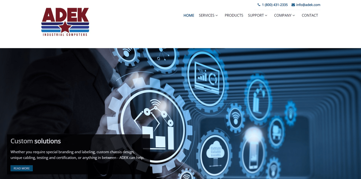
ADEK is a leading computer manufacturer, mainly operating locally in Raymond, New Hampshire, USA. They design and build custom computer systems based on customers’ specifications and requirements. ADEK offers a wide variety of industrial computers and commercial grade systems, including rack mount, panel mount, mid-tower, desktop, and other configurations. And one of their characteristics is that they steer away from eCommerce sales because they prefer to focus on personally tailored solutions for their customers.
We’re large enough to meet all your hardware needs, yet small enough to provide you with a high level of personal support. That is precisely the reason we do not offer any e-commerce sales. We believe you deserve more personal assistance and always welcome your telephone calls to discuss your requirements so that we can provide the perfect solutions.
ADEK Industrial Computers

~ ADEK Industrial Computers, About Us
Needs
We started by analyzing the existing website and asking questions from ADEK employees about their needs. We investigated what kind of information they want to present on their website and what type of functionality they need in specific areas.
The main goal for the company was to:
- refresh UI of the website,
- improve mobile experience,
- improve information architecture, so there would be easy access to all products,
- improve the user experience of support sections,
- organize content dedicated to a sector.
The background of the problem
The way of presenting the content and products on the ADEK website was complicated, not intuitive, and unattractive.
Who was affected?
It caused customers to be unable to find the information they were looking for.
The impact on the company
It resulted in many doubts among customers during direct conversations with the company's representatives and possible abandonment of the offer or lack of interest.
Our Role
The role of the Dodonut team was to take into account the current needs of ADEK to design and prepare for the development of a new website optimized for different devices. We were working on:
- UX (user experience) issues,
- the UI visual style of the website,
- preparing its components for the Bejamas development team,
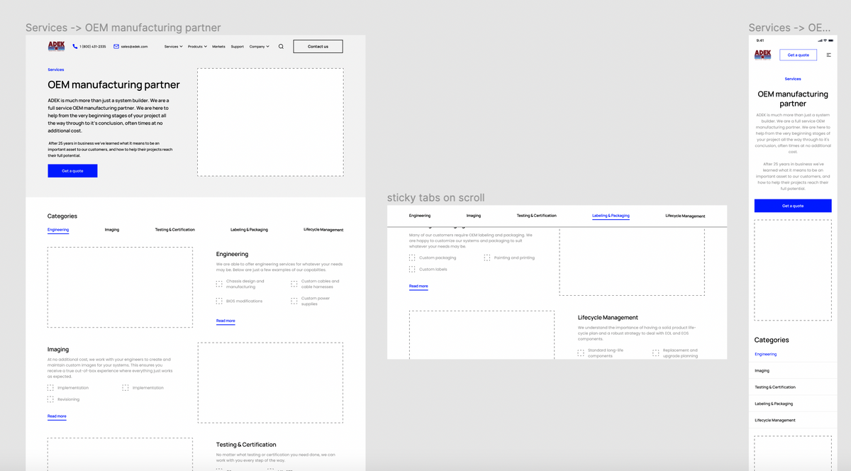
- inventing a way to present the second-level category in the sitemap and the computer components.
We recommended and provided solutions for the best user experience and the most efficient website performance.
Project Timeline
The Dodonut team conducted a design phase of the project for about eight weeks. It included: customer needs research, competitive analysis, providing different versions of mockups, and preparing a design system, documentation and styleguide.
Phase 1: Kick-off. Exploring the Problem
Kick-off Workshop
We start every cooperation with a kick-off workshop that lets us get to know each other. During the whole-day workshop with ADEK representatives, we discuss the core value and issue using tools like Team Canvas, Lean Canvas, Unique Value Proposition Canvas (UVP), Proto-Personas, and Personas, and others. Thanks to them, we examined the company's background, the expectations of the leading teams, and what we wanted to achieve by redesigning and redeveloping the website.
During the workshop, we defined these critical problems:
- optimizing mobile user experience,
- reorganizing product page for better presenting data and specifications of each product,
- better layout of a single product,
- redesigning the menu and making it easier to navigate.
We also talked about ADEK’s competitors and defined the company’s unique value proposition.
Phase 2:
Discovery & Research
Preliminary Research
Preliminary research included insights collected during the workshop and additional materials sent by the client (list of main competitors).
- Competitive analysis Thanks to the client's list, we compared several competitors' websites. We mainly focused on their UX - how they organized product pages and presented support pages and categories. We compared their features.
- Target users We got insights from the client during the workshop. We found out that ADEK's customers came from a local area visiting them personally in the office and are likely to contact the company in person or by calling. Therefore, we have to pay more attention to good information about this contact way and make it easier to contact via email.
- Project scope The main idea was to change the website to be more user-friendly. Improve how products and services are presented, CTA buttons, and prepare different contact forms about complaints or support. We also needed to organize the menu better so the user would have access everywhere within two clicks. It was also essential to focus on improving the mobile experience.
A New Sitemap
We started the design process by structuring the information presented on the website in the form of a sitemap. We don’t like to reinvent the wheel. Therefore we always use working solutions and apply them to the new one. In the ADEK’s case, we also reused some parts of the old information architecture upon which we built a new site with new labels and more clear product presentation. As the client wanted, we added section Markets - the offer directed especially to manufacturing facilities.
Phase 3:
Wireframes
We began visualizing the new website organization through wireframing with the actualized sitemap. Using Figma tools, we designed every page and section on the website. At the same time, we created a website view both for desktop (how the company’s customers visit mostly the website) and for mobile. As deliverables from this phase, we prepared Lo-Fi wireframes. From this point, we started to iterate them a few times to revise the structure and content and find the best solutions through guerrilla tests.
Phase 4:
UI Design
Moodboard
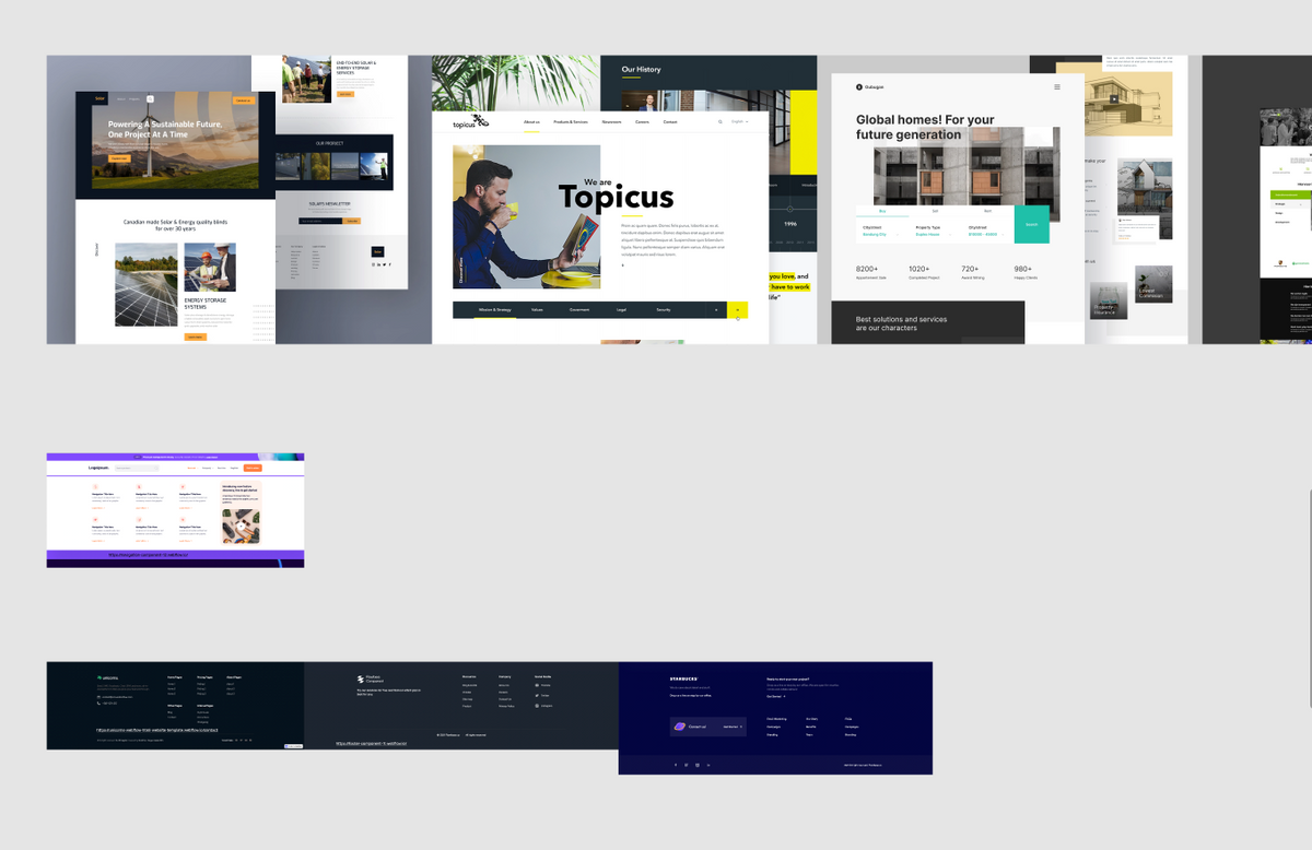
We collected several visual inspirations based on similar industries' websites and layouts. Thanks to them, we created a moodboard that pointed to the most popular solutions and visions that work well in the computer manufacturing industry.
UI design
Our process on visual aspects of the new website started when we finally approved together with the company wireframes. How did we conduct it?
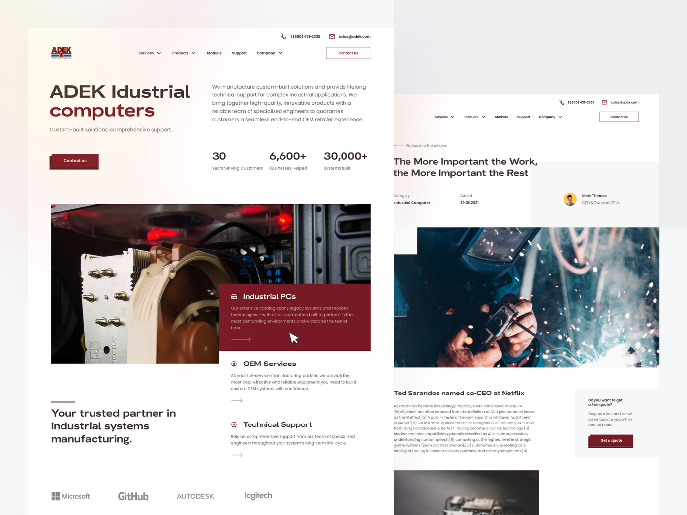
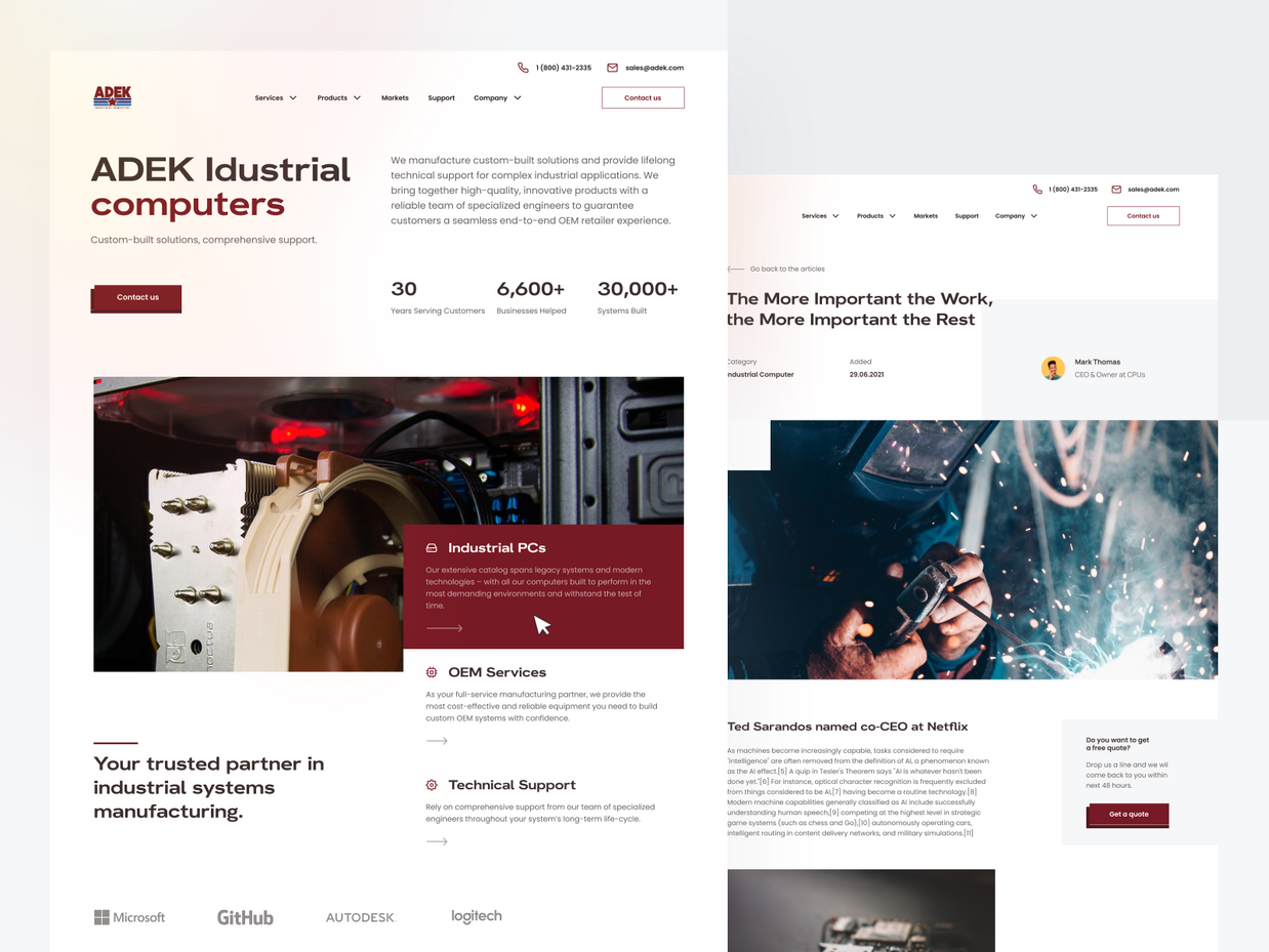
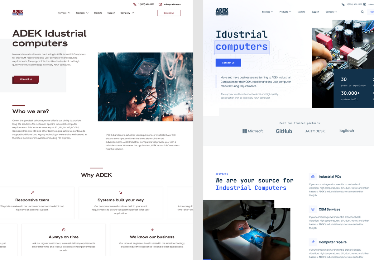
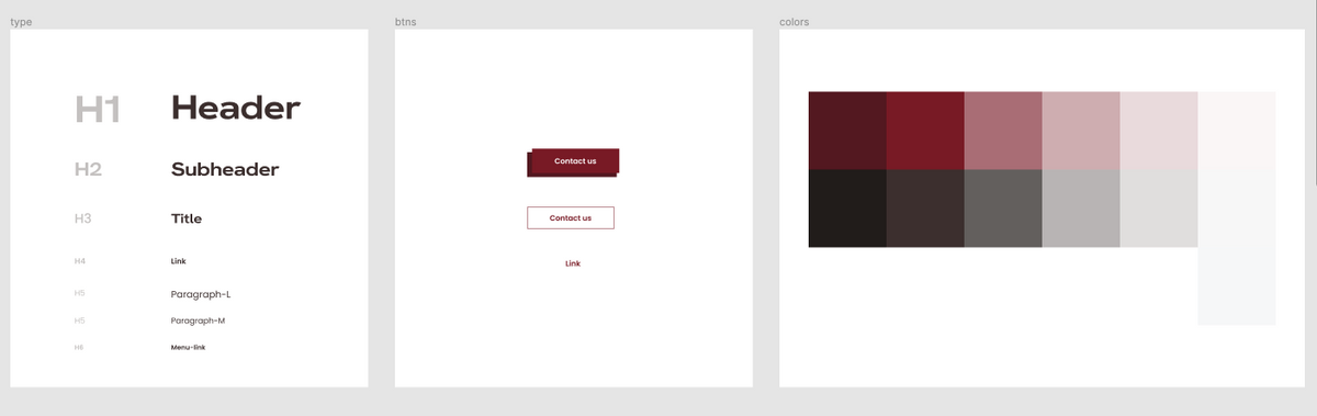
- We created a grid system. We used a 16 columns grid because it is more modern and gives us more flexibility regarding spacing.
- We picked typography and decided on the paid font HK Grotesk wide. It comes from a wide font family, representing a very fresh and modern approach.
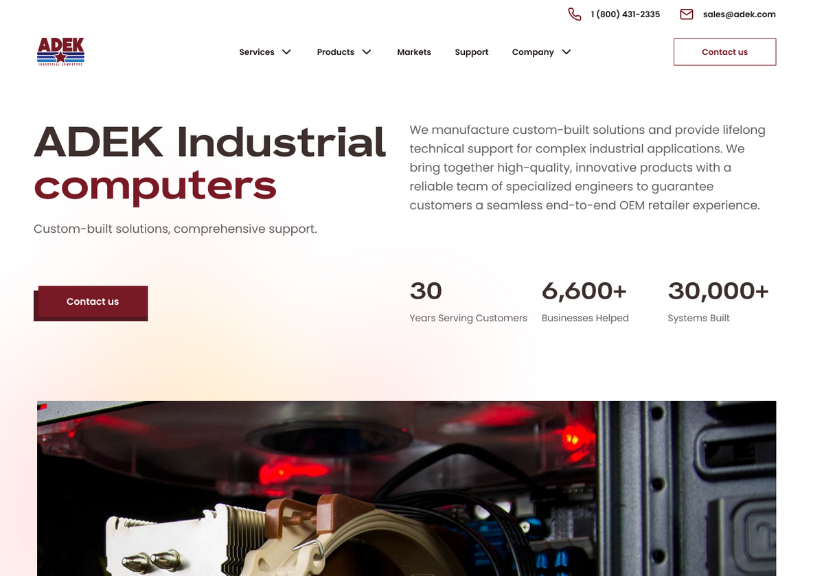
- We adjusted the color palette for the digital experience. We designed a clear background site with a few different color versions. One of them even included the blue color. Finally, we decided to stick to the dark red, which was used directly from the ADEK logo. Later we decided to play with gradients and buttons in neubrutalism style.
- Finally, we picked brand new photos and images. We resigned from a few previous photos that didn't connect their meaning to the industry and were of bad quality. We proposed new appropriate ones chosen carefully from the stock.
Phase 5:
Design Iterations
Homepage
As usual, we prepared two versions of the homepage. This time, they were different in their color palette and their composition.
All screens optimization
When the company decided which design we would implement, we started to design it for all screens. We focused mainly on desktop and mobile optimization to present ADEK’s products, services, and company contacts. We prepared three iterations of UI mockups.
Documentation and Styleguide
We prepared complex documentation from molecules to organisms. It covered a styleguide with components and their different states: buttons, fonts, icons, and colors. Moreover, documentation included designed interaction and animation descriptions.
WCAG
We implemented for the new ADEK website AA criteria level of the accessibility requirements included in WCAG. We had at least a 16pt font size for the content and checked the contrast ratio to make the website components visible to all users.
Phase 6:
Techstack
We prepare the accepted design with clear guidance and components library for the development process. The Bejamas team used Netlify and Next.js.
Key takeaways and conclusion
As the final product, we created the High Fidelity Prototype of a new website that responds to the needs of many stakeholders, both the company and its customers. Carefully researching and discussing with the company about their industry characteristics led us to propose appropriate visual solutions. We recommended them for future insights and better customer understanding, implementing Google and Hotjar analytics. Thanks to new functionalities, we could help the company resolve its previous challenges and make their new website customer-friendly.
The team at Bejamas has been extremely responsive, detail-oriented, and a pleasure to work with. Every single question, comment, or concern that I had throughout the design process was addressed promptly and thoroughly. I’m completely thrilled about our new design, and I can’t thank them enough for being such a professional and accommodating team.