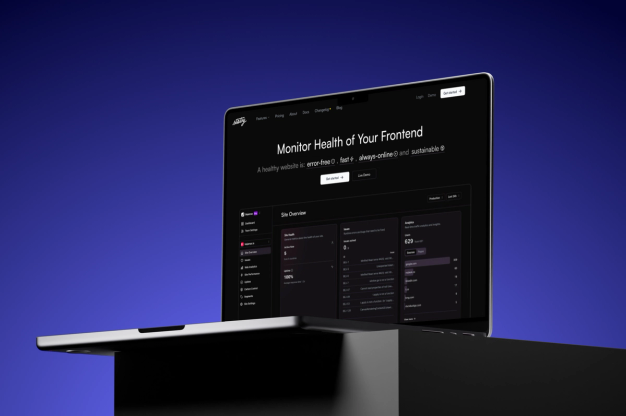
ZipTie - Easy management and results presentation for SEO SaaS

ZipTie provides actionable data to get your website indexed and ranking well. The app helps you maintain and track how many of your pages are indexed in Search results, The app helps users to monitor the conditions of your website in Google Search Results. Our job was to prepare a working saas application that allows you to manage all processes and easily present user results and actions they need to take.

- Client
- Ziptie
- Type
- SaaS application
- Industries
- SEO
- Services
- Product Design
Overview
With ZipTie, users can access valuable data to improve their website's indexing and search ranking. The app enables them to keep track of how many of their pages are appearing in search results and monitor their website's performance on Google. The goal of our project was to create a user-friendly SaaS application that streamlines the management process and clearly displays the necessary actions for users to take
Disclaimer
Below we presented our initial process. The product design is a very intensive process, so if you check the app right now, you will see many components presented below, but some have already been updated. That means that the product is doing good, stakeholders still care about growth, and we are more than happy to be part of it!
Initial kick-off
We held a preliminary kick-off where we discussed the topics listed below:
- The project goal - create an MVP using UI components from a previous project provided by the client to save development hours.
- Account for the limitations of Bubble.io because that was the primary tool used for the development.
- Help customers with general product design challenges
- Proper onboarding
- Pricing & subscription flow
- Credits
- Project management inside the app
- Eventually - create a modern-looking app.
User flow & Architecture
- We started the cooperation with interviews with stakeholders to understand what the project was about. Based on these interviews, we wrote down user stories that allowed us to continue our research.
- After getting a general idea of the project, we started seeking inspiration for our products to have an overview of the project.
- Based on the initial design, we divided the project into five main flows.
- Subscription for new and existing users
- Maintaining a project
- Creating a new project
- Sign up/ sign in
- Main Dashboard & Settings
Product Design Process
When creating digital products, we usually follow the lean UX process.
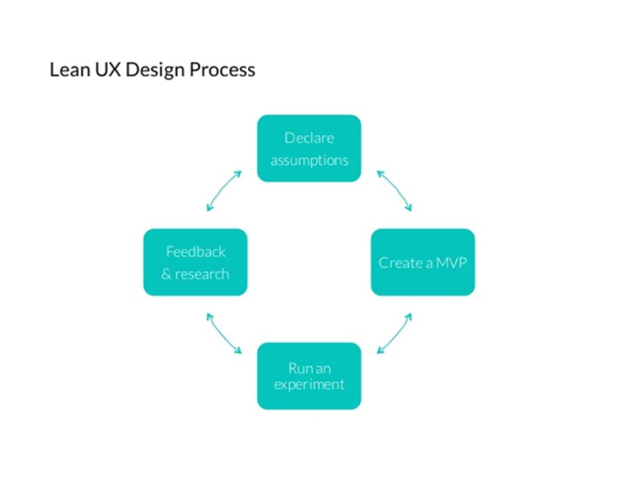
We can describe it in a few steps:
- First, we choose the flow we want to create.
- We write down all use cases and edge cases. We try to create high-level MVP.
- We gather many insights and alternatives.
- We prepare the first version and iterate on it. We present the results to stakeholders and users in Guerilla Tests to make sure the flow is understandable.
- We implement changes based on the gathered feedback. Only after the entire flow is complete, we move on to the next feature.
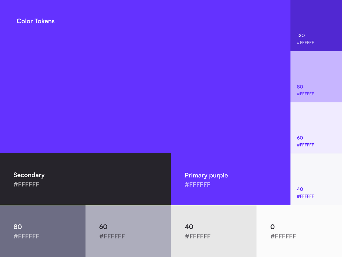
Design Style
It is worth noting that in this project, we had strict instructions to follow bootstrap recommendations. The design should look fresh and modern but can not be too complicated. The app was implemented using Bubble.io.
Before jumping into UI, we gathered a few inspirations to get a vibe that the final UI should have. Our assumptions were as follows:
- one strong color in the app,
- modern and fresh but also clean look,
- friendly vibe - initially we thought about rounded elements
- On their primary website, the client used funky illustrations that should be reused in the app.
Layout & Project management screen
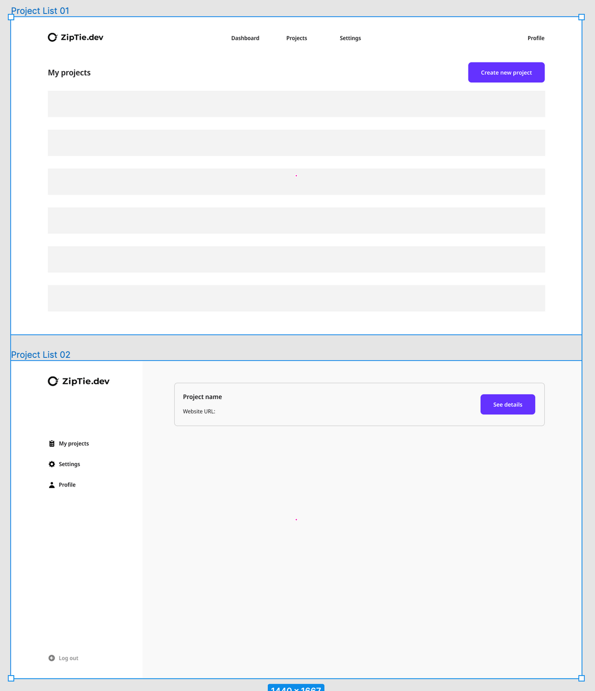
We started work by creating general layouts and grids for the app. To do that, we picked one of the most complicated and important pages - a list of all projects in the app. The project list is a page where we display all websites added to the app. We call them projects, not websites, because a single website can have several options for getting a list of the indexed pages, e.g., crawling or uploading a sitemap manually.
As we described in our process, we gathered a few inspirations for the project view. We tried to find similar solutions that currently exist on the market. One of the use cases is that a user may have one or two projects, so displaying them as a list didn’t make any sense. We decided to go with a tiles screen whenever there are fewer than 8 projects.
After the research phase, we jumped into Figma. We prepared a layout with a sidebar menu instead of the top navigation, however, we decided to ditch the idea in one of the iterations because the app is not very complicated and does not require numerous tabs on the left. Users found it easy to navigate using only the top part of the interface.
After we set up the layout, we could focus on the UI aspect. We took the feedback we got from the mood board phase and created the style presented below:
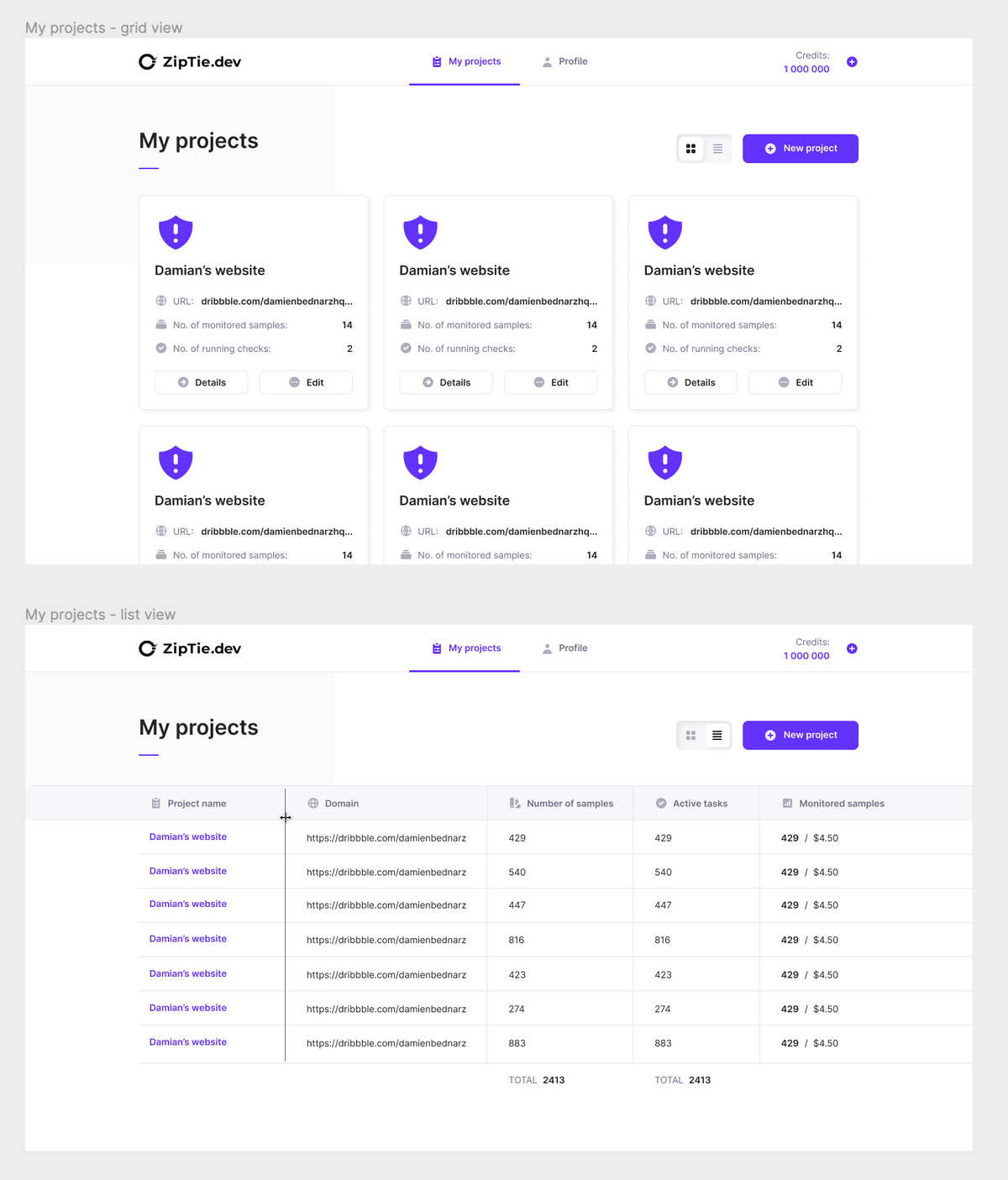
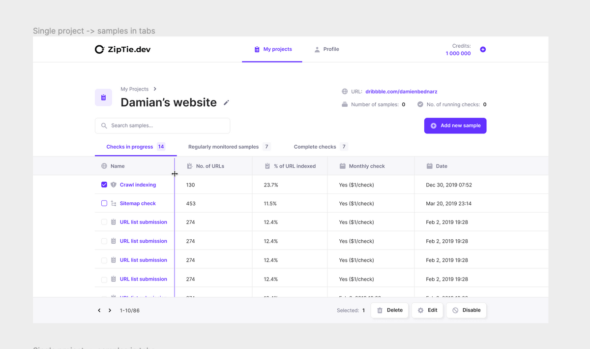
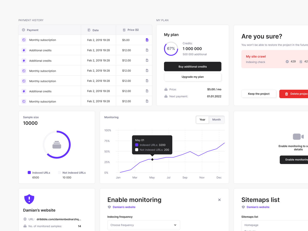
We used a similar process to create the project details page. Because we had a lot of data, we knew there would be plenty of details on one project page. Therefore, we gathered a lot of inspirations for SaaS products, where the details are displayed in a table.
It is a good practice to reuse patterns in the app, so we adopted the table from the project’s list view. It makes interfaces more friendly because users are already familiar with the layout. The difference is the header, where we put all project details. We also added a sticky bottom bar. The table might be extremely long, so having the sticky element makes it easier to navigate.
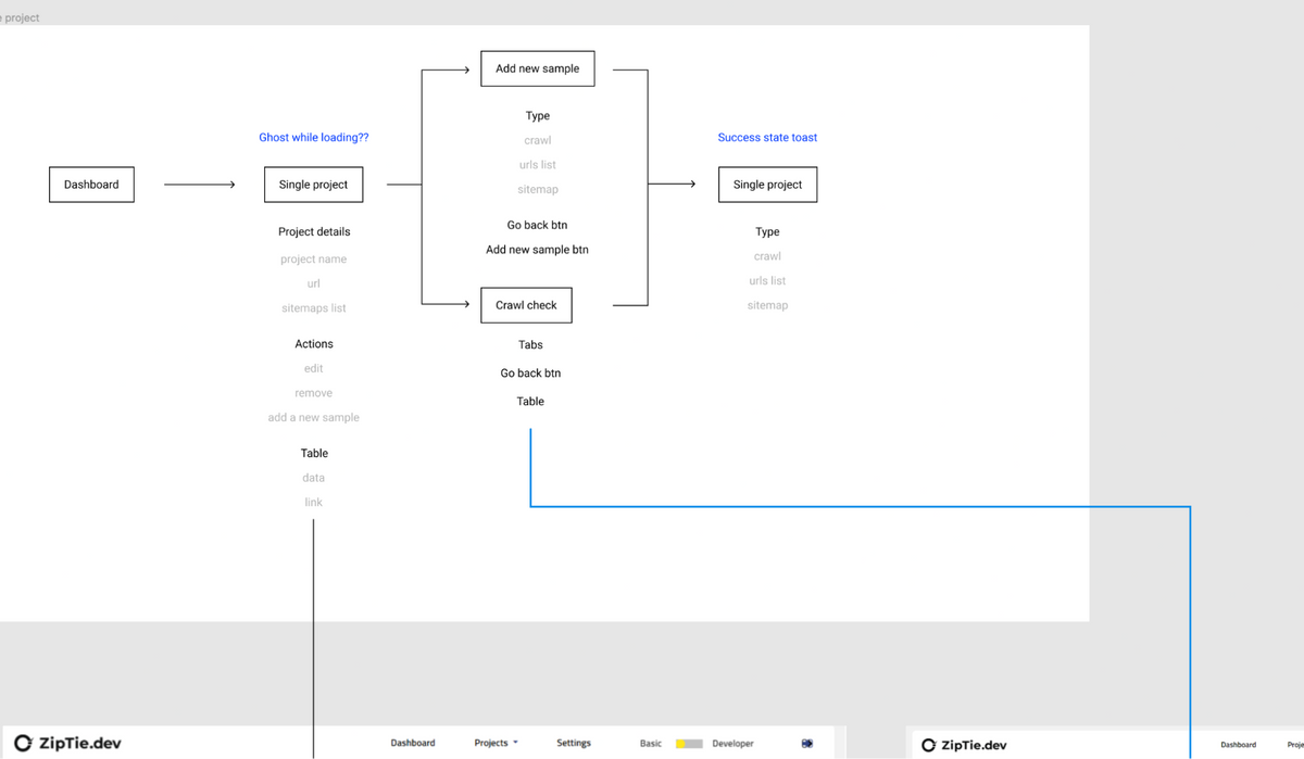
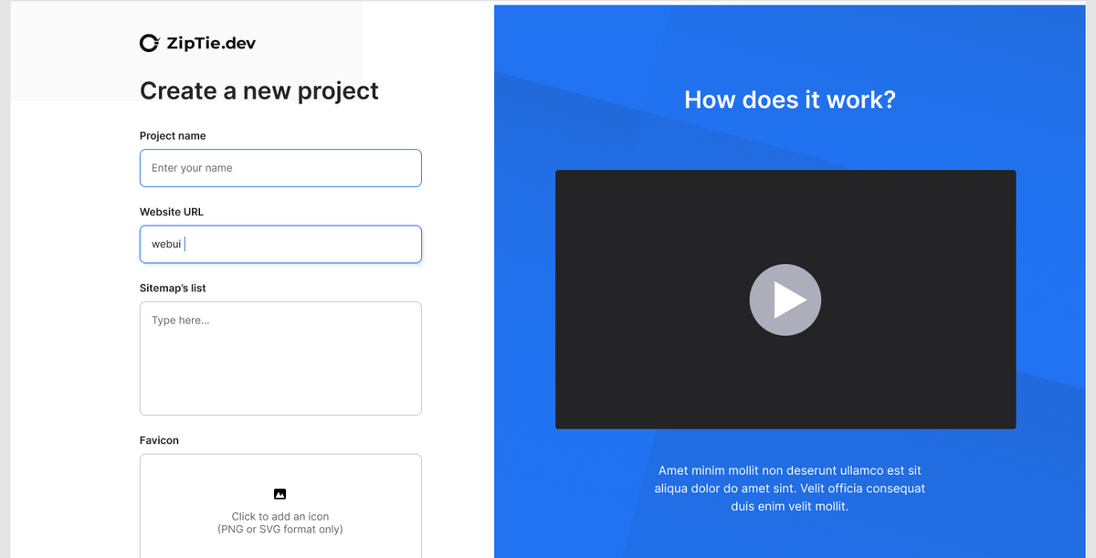
Adding a new project
One of the most challenging flows was “adding a new project”. The main issue was to communicate different methods for importing pages from a website in a comprehensible way. We needed to explain to users the difference between importing a project using a sitemap file, a list of URLs, or using the crawling system.
At first, we thought a video would be the best solution, but we learned it wasn't the most efficient way of presenting solutions as only a few users hit the play button.
Instead of the video, we decided to prepare a three-step clarification. We created a simplified version of the UI and highlighted the most important differences. We blurred unimportant elements of the interfaces not to distract users from the crucial UI components.
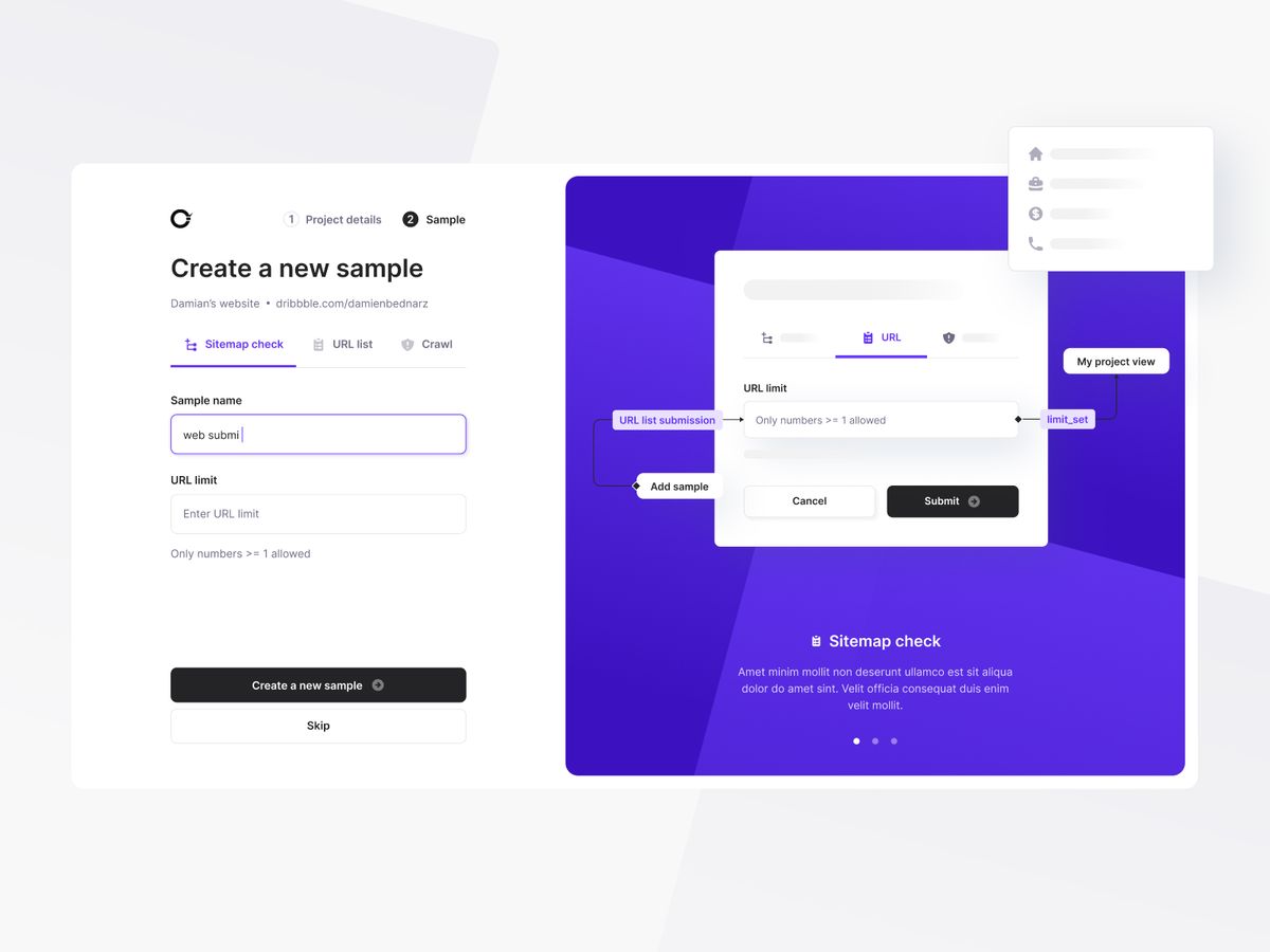
Each import method had different requirements and inputs, but we used the same single-page layout for all of them.
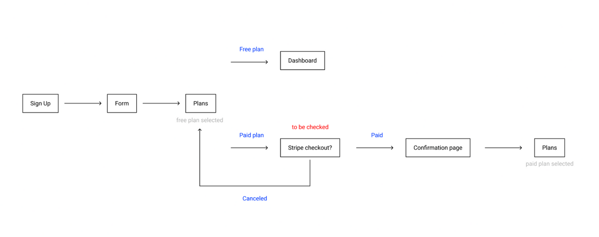
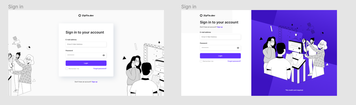
Registration flow & trial period
After the onboarding, we moved on to the login page. We started from the first page where we ask users to provide standard data such as email and password. In the first iteration, we tried to use the layout from the onboarding page (an illustration on the right), but eventually, we created an alternative version with centered content. We wanted to avoid distracting a user with a large illustration that looked nice but didn't add value, so we decided to use the layout with centered login information.
Even though all apps have similar flows, we still had many questions:
- When is the right time to ask for credit card details? After the free trial period or right in the sign-up flow? Because it was a business consideration, we decided with the client to ask for it on the second screen during the registration process. We were aware it would drive down the number of trial accounts, but the goal was to monetize the app as soon as possible.
- Based on that decision, we needed to work a bit on the sign-up page to maximize conversions. We did research and used best practices. We communicated the free trial period duration and the date when we would start charging the user.
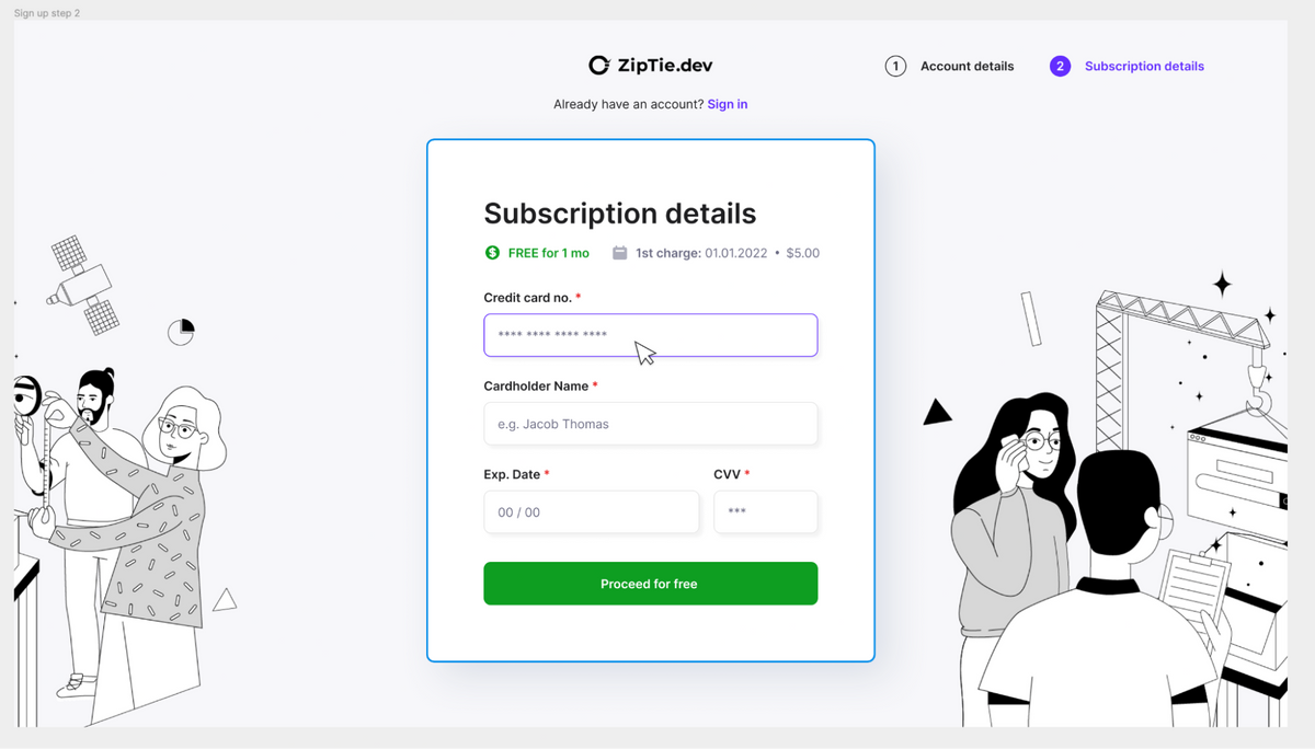
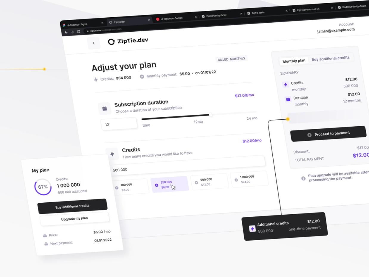
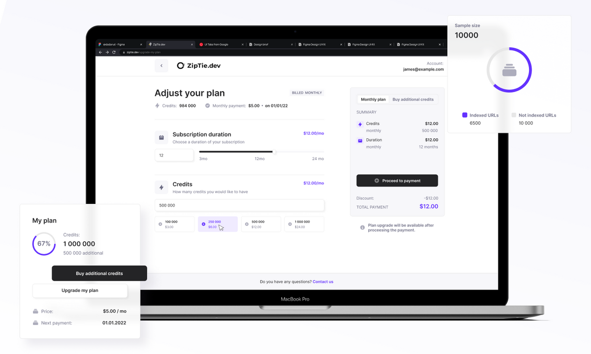
Payment flow
The card details page was part of the sign-up flow and payment & subscription flow.
The primary challenge was that a user could have 3-4 projects with a small number of pages, or one project with thousands of pages.
The app scans a website multiple times (you can set up how often), monitors the page conditions, and sends an alert whenever a page is not crawled by robots.
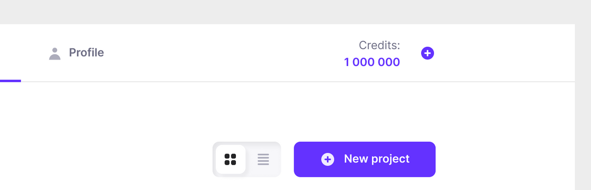
Based on this concept, customers propose a credit points approach. A single monit costs one credit. A user can buy a subscription for a declared number of points which will renew each month. If a user runs out of credits, they can buy extra credits.
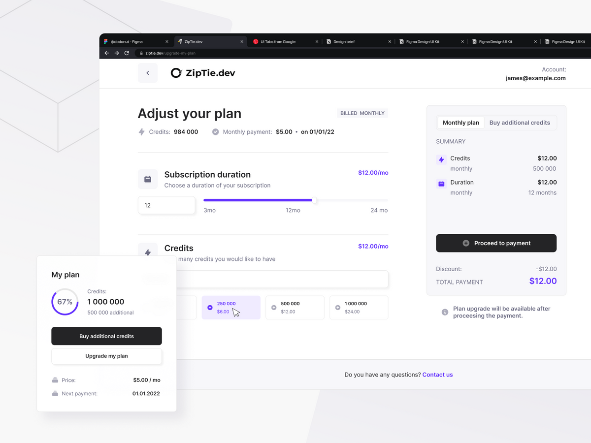
After creating a project, the system should suggest how many credits a user needs. We added many notifications across the app to highlight this system. We also decided to make a button “ buy additional credits” visible in the main navigation.
Styleguide
The last step was preparing a style guide for developers to make the handoff process as smooth as possible. A library of components was crucial for us to keep the consistency of all deliverables, but it also made the developers' lives easier.
Summary
ZipTie is a great example of how creating a good MVP can quickly validate the market demand. Currently, the app is growing and the stakeholders are developing new features, but everything is based on what we prepared.
We are well-satisfied with the cooperation with Bejamas, especially with Damian and Tomasz who were in charge of UI/UX. The graphic design meets our expectations - it is modern, eye-pleasing, and cler. We were also happy about our day-to-day communication. At each stage of the project, we were informed about what they were working on, and we consulted the design and its subsequent elements on an ongoing basis via Slack. I can recommend the Bejamas team with a clear conscience!