Design Tokens – What Are They and How to Use Them?


Adrian is a graphic designer, film director, and design researcher in design at the University of Palermo (Argentina).
Date added
Read time
11 min
Design tokens are repeatable design decisions: name and value pairings representing visual properties in building interfaces, covering features and UI elements such as colors, typography, shadows, and spacing.
- Why use design tokens? To achieve consistency in the design system, boost the workflow, and improve design handoff and communication between designers and developers.
- Architecting tokens. Use design token generators like Tokens Studio for Figma plugin, store or manage them in the central repository or style guide, and automatically update project styles.
Check our brief guide to design tokens and boost your team workflow.
Table of contents:
Graphic designers are currently the great creators of visual experiences in the world. That's the reason why the digital design field is constantly evolving. New technologies, methodologies, and other elements complement our work as creatives emerge daily. This is where design tokens come into play. These small design units are revolutionizing how designers create and maintain visual brand consistency across the various digital products and cooperate with front-end dev teams, automating the process and improving communication.
In this article, we will explore the world of design tokens, their purpose, how they work, their importance, how to create your design system, and how we can take advantage of this powerful tool. Let's explore how design tokens make repeatable design decisions quickly and efficiently.
Introduction
Let's mention one of the most prominent headaches for web developers and designers. Imagine that you have just delivered to a client the landing page of the website you have been developing for weeks, and the user is delighted with your work. However, it asks you to create a new page with the purpose of selling their products digitally. What is the big problem in this scenario? You must constantly review what you have done on the previous pages to maintain consistency: the size of the buttons, the typography, font size, background color, text color, line height, the color palette, the line spacing, the borders of the platform, etc. These modifications, however small they seem, can be implemented on a website for several days and weeks. Modifying each variant and applying the previous structure is exhausting.
You have two options in this scenario:
1. Check the previous pages to analyze and apply design elements in the new ones.
2. Read this article and discover how to use different design tokens.
Suppose you choose the first option, ok! Good luck figuring out how to make those changes and taking your time to develop new pages.
If you choose the second option, great! Follow me to discover the amazing universe of design tokens.
What are design tokens?
Design tokens are basically repeatable design decisions: name and value pairings that represent visual properties in building interfaces, covering features such as color, typography, shadows, and spacing, among others. The key characteristic of design tokens is consistency across platforms. They are used by developers throughout a product and can be adapted to several formats like web, mobile devices, or applications. Salesforce's design system team, the creators of Design Tokens (the term coined by Jina Anne), define them as:
Saleforce's Lightning Design System
Following this definition, design tokens are design attributes you package with the purpose of using them over and over again to keep visual consistency in a digital platform.
Like many different companies, Salesforce struggled with the challenge of cross-platform scaling design across multiple platforms, factors, and devices. Design tokens helped them to find solutions for complex problems that appeared in the collaboration of designers and engineers.
Living Design System by Sönke Rohde
Now let's look at how design tokens work and are used. Let’s take a button as an example. This element consists of several parts, each of which is represented by a design token. Those elements allow the developer to build and modify the button's visual characteristics globally.
The button itself is the atom, and the design decisions that define it include margin, colors, border, radius, padding, font weight, font family, and more.
Why use design tokens? Benefits.
Design tokens play a crucial role in improving web design efficiency. These powerful tools enable us to establish a centralized system for managing and maintaining design attributes by creating a token system based on scalability, structure, practicality, and efficiency.
With design tokens, designers can easily update and reproduce design changes throughout the project, eliminating the tedious need to manually update elements individually. They save time and effort and ensure flawless visual consistency throughout the design process.
We can distinguish 4 main advantages of design tokens:
- Consistency Maintaining consistency is easy when you're the only designer and creator of a whole project. However, in real scenarios, we usually work head-to-head with other designers and developers on the same project. That's a challenge because the production could have varying versions of some elements. Example: A "subscribe" button with different shades of blue on each page.
- Efficiency With design tokens in place following a system, you'll witness a remarkable boost in delivery speed. No more precious time wasted on unnecessary decisions. Forget about deciding between +1000 fonts, colors, spacing, and more. Design Tokens are built to simplify this task.
- Easy to apply Imagine that during a project, a new designer is joining the team. Updating the new member with the whole process can be very demanding. But don't worry. Here is the design token's system to save the day, as it can simplify how design decisions are informed and applied.Design tokens are recommended to use when the design team is constantly growing. Thanks to them, newcomers will quickly grasp the company's design standards and practices. The learning curve becomes less steep, and they can seamlessly dive into their work, applying the appropriate look and feel, embracing the philosophy, and adhering to the core design principles.
- Documentation Working with design tokens makes life easier for both designers and developers. It simplifies maintenance and provides reliable documentation, representing anything defined by design used in place of hard-coded values. You'll have a crystal-clear understanding of what's in the system, why it's there, and how it functions.
Creating a design token types and system
Let's solve the big question: how are design tokens created? The success of this tool is based on how you build them and where. Deepak Choudhary from UX Planet and Yana Ballantyne from Inside Design explains in a simple way how these elements are created.
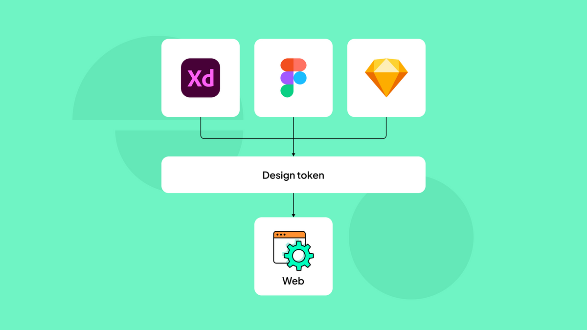
First of all, design tokens are stored in a Single Source of Truth (SSOT), such as InVision DSM, which provides a user-friendly interface to create and manage your centralized design tokens. When you're ready to implement a change, you can execute a modification and design platform-specific values for tokens using tools like Amazon's Style Dictionary or Salesforce's Theo. These platforms streamline the process and ensure that your design tokens are transformed into the appropriate values for the target platform or technology.
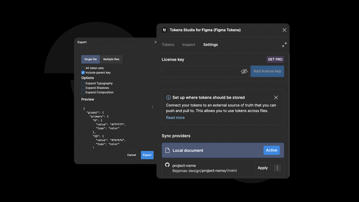
In Figma, we can use a powerful plugin called "Tokens Studio for Figma," which lets us save all the tokens & merge color + text styles from the design tool into the plugin. Then, we have several options to sync tokens.
1. The most efficient one - connection with GitHub, GitLab, etc. Basically, we can connect our account with one of the tools that our developers use. Then we can merge the tokens into their branch. Once they use the .json file we have sent into, e.g., GitHub, they can load it into the project. In this case, when we update existing tokens or add a new one, we can simply update the previous file.
2. .JSON file export, the developers can use the raw file which was exported from the Figma plugin.
When implementing design tokens, you can create them based on the desired level of abstraction in your system architecture. Design tokens allow for a customizable approach that perfectly aligns with your specific design and development needs. Typically, you can choose from up to three levels of abstraction, each offering its own advantages and considerations to optimize your token implementation.
Design tokens are represented with specific primitive values. For example, color as a HEX or RGB value, opacity as a number, and animation ease as Bezier coordinates.
Let's check different types of design tokens, depending on their complexity:
First level:
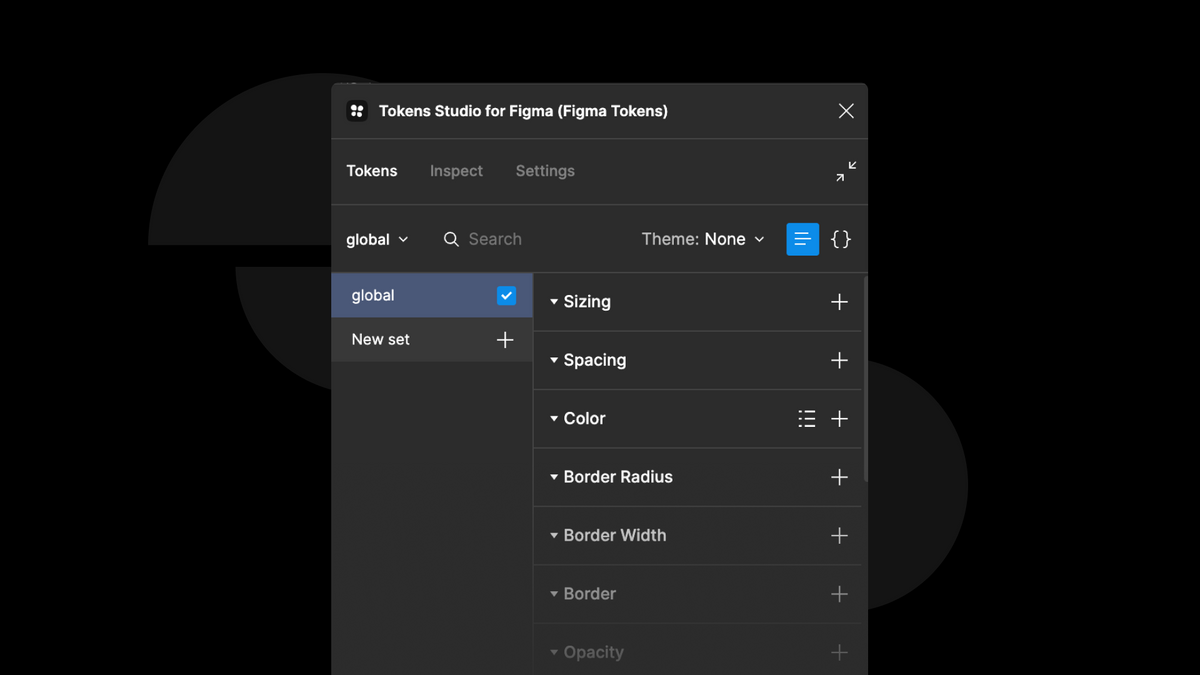
At the first level, we have the main tokens that form the foundation of the entity. You can keep things simple by creating tokens with a basic structure. These tokens consist of key-value pairs that define essential design attributes like:
- Grid: Defines the grid system and layout structure.
- Icons: Represents the collection of icons used throughout the design.
- Shadow Levels and Opacity: Specifies various elements' different shadow levels and opacity values.
- Color Composition: Includes the primary color, secondary colors and derivatives of the main color.
- Fonts: Consists of the main and secondary font options and their respective styles and variations.
- Spacing, Breakpoints, Transitions, Stacking Contexts: Determines the spacing between elements, breakpoints for responsive design, transitions for smooth animations, and stacking contexts for layering elements.
These tokens form the core building blocks that provide consistency and flexibility throughout the design system.
Design Token Example:
primary-color = #004C97, secondary-color = #05C3DE
Second level:
In the second level, we define the high-level structures associated with the tokens from the first level. This is where we make design decisions that relate to the visual aspects of the general interface elements like:
- Primary Color: This is specifically defined for the main context links, providing a consistent visual representation.
- App Main Text Font: We establish the main font choice for the text used throughout the application, ensuring a cohesive typographic style.
By defining these entities at the second level, we further refine and enhance the visual nature of the interface, maintaining a cohesive and harmonious design language.
Design Token Example:
LEVEL 1: red-500 = #DC2323
LEVEL 2: primary-border-color = {red-500}, primary-icon-color = {red-500}
Third level:
At the third level of the design token hierarchy, a world of possibilities opens up for more complex design systems. This level deepens into the intricate details of each component in the user interface, where specific tokens closely relate to the second-level tokens, defining particular cases within the interface. It introduces an additional layer of component tokens, providing the opportunity to limit contextual usage and create dynamic theming and color modes. This higher level of abstraction empowers designers with greater control over individual design elements within different components, making it ideal for projects that prioritize customization and adaptability.
Design Token Example:
LEVEL 1: purple-500 = #CC8899
LEVEL 2: primary-background-color = {purple-500}
LEVEL 3: button-primary-background-color = {primary-background-color}
This orchestration of tokens is crucial in creating a consistent and scalable tokenization framework that can evolve over time. One notable example of this approach can be observed in the context of Salesforce's Lightning Design System, where design tokens play a significant role in maintaining a cohesive and adaptable visual system.
As you move up the levels of abstraction, things may become more intricate. But don´t worry because increased complexity also brings enhanced flexibility, scalability, and the ability to meet diverse design requirements. The choice of which level to adopt depends on your project goals, team dynamics, and the complexity you want to apply to your design system.
What is the difference between global tokens and alias tokens?
Global tokens and alias tokens are both types of design tokens used in design systems, but they serve different purposes:
- Global Tokens: Global tokens directly represent a specific value or attribute. They are standalone tokens with a single value, such as colors, typography styles, spacing values, or breakpoints. Global tokens provide a centralized and consistent way to manage and apply these design attributes throughout a project. They are typically defined and used directly in the design system and are easily accessed and applied across different components and styles.
- Alias Tokens: Alias tokens are references or aliases to existing global tokens. Instead of representing a specific value, alias tokens point to or inherit the value from another global token. Alias tokens are helpful when creating variations or alternate names for the same design attribute without duplicating the actual value. They provide flexibility and enable designers and developers to create different aliases or aliases with modified values for specific use cases or variations.
How to implement design tokens effectively?
Now you know what design tokens are, how to create a design token system, and the importance of these elements in the design of various platforms. However, do you know how to implement design tokens effectively?
Implementing design tokens requires careful consideration of both design and development aspects. To improve the process of successfully implementing object style changes and creating for them design tokens, follow these few design tokens tips:
- It is essential to ensure that the library or UI kit used in tools like Sketch or Figma remains synchronized with the code provided to developers, containing components, patterns, templates, and more.
- Successful implementation relies on constant communication and collaboration between design and engineering teams. Designers should diligently update the design library with any changes or updates on the design tokens, ensuring developers can access the most recent versions. Developers, in turn, should apply these design tokens to maintain visual coherence and consistency when implementing components in the codebase.
- Establishing a clear and efficient workflow is crucial for smooth collaboration between product teams. Regular meetings, detailed documentation of the design tokens, integration of version control tools, and open communication channels all play vital roles in this process.
- Furthermore, establishing guidelines for token values and token's naming, structure, and documentation can encourage a shared understanding and facilitate effective token usage throughout the team. To scale and find tokens easily, the naming convention must be predictable.
Design tokens step-by-step process:
To make it crystal clear, let’s sum up the whole process and create a little guide through design tokens implementation:
- The designer makes a style update in a design tool.
- A design tokens generator automatically updates a centralized repository by generating platform-specific files (CSS, JSON or YAML).
- Engineers fetch the updated repository, incorporate any new tokens, and automatically update the project styles.
Conclusion
In conclusion, design tokens have revolutionized the digital design industry by providing designers with a powerful tool to achieve visual consistency and efficiency across projects. Designers can now easily create and manage a library of design tokens that can be used across different platforms and devices, such as brand colors, typography, spacing, and more.
Through active communication between designer-developer, creatives actively bridge the gap between design and development, fostering a smooth integration of visual and technical aspects. Design tokens have become indispensable in the designer's toolkit, revolutionizing how we approach graphic design and enabling us to shape the future of visual product experiences.
Overall, design tokens represent a major step forward in design thinking, providing a framework for creating more consistent, efficient, and adaptable design systems that can be used across various platforms and products. As the demand for responsive and adaptive design grows, design tokens will become even more essential in ensuring flexibility and unity across all products and seamless user experience across different screen sizes and devices.
Need a Full-Stack Design Team?
Our team handles all aspects of design, making your ideas a reality.
This article emits ~0.23g of CO2.


